
如何实现butterworth滤波器
如何实现butterworth滤波器
提问于 2022-10-09 08:49:34
我试图在jupyter中使用python实现一个蝴蝶过滤器。我是通过教程编写这段代码的。
数据来自CSV-File,它调用Samples.csv
Samples.csv中的数据如下
998,4778415
1009,209592
1006,619094
1001,785406
993,9426543
990,1408991
992,736118
995,8127334
1002,381664
1006,094429
1000,634799
999,3287747
1002,318812
999,3287747
1004,427698
1008,516733
1007,964781
1002,680906
1000,14449
994,257009
该列调用欧几里得Norm。数据的范围从0到1679.286158,它们是1838行。
这是木星的代码:
from scipy.signal import filtfilt
from scipy import stats
import csv
import pandas as pd
import numpy as np
import matplotlib.pyplot as plt
import scipy
def plot():
data=pd.read_csv('Samples.csv',sep=";", decimal=",")
sensor_data=data[['Euclidian Norm']]
sensor_data=np.array(sensor_data)
time=np.linspace(0,1679.286158,1838)
plt.plot(time,sensor_data)
plt.show()
filtered_signal=bandPassFilter(sensor_data)
plt.plot(time,sensor_data)
plt.show()
def bandPassFilter(signal):
fs = 4000.0
lowcut=20.0
highcut=50.0
nyq=0.5*fs
low=lowcut/nyq
high=highcut/nyq
order =2
b,a=scipy.signal.butter(order,[low,high],'bandpass',analog=False)
y=scipy.signal.filtfilt(b,a,signal,axis=0)
return(y)
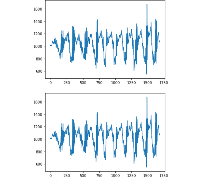
plot()我的问题是我的数据没有任何变化。它没有过滤我的数据。过滤后的数据的图形与源数据相同。有人知道会出什么问题吗?
第一个图是源数据,第二个图是过滤图。看起来很相似。就像同一张图
回答 1
Stack Overflow用户
回答已采纳
发布于 2022-10-09 09:05:35
我还不能发表评论。
您永远不会使用filtered_signal并两次使用相同参数的绘图。
下面是我的一个实现,添加了内插,非常类似于您的实现:
def butterFit(data, freq, order=2):
    ar = scipy.signal.butter(order, freq)       # Gets params for filttilt
    return spfilter.filtfilt(ar[0], ar[1], data)


def plotFilteredSplines(timeframe, data, amount_points):
    # Generate evenly spread indices for the data points.
    indices = np.arange(0, len(data), amount_points)

    cutoff_freq = 2 / (2/10 * len(timeframe))
    # Reshape the data with butter :)
    data = butterFit(data, cutoff_freq)

    # Plot Fitlered data
    plt.plot(timeframe, data, '-.')
    interpol_x = np.linspace(timeframe[0], timeframe[-1], 100)

    # Get the cubic spline approx function
    interpolation = sp.interpolate.interp1d(timeframe, data, kind='cubic')

    # Plot the interpolation over the extended time frame.
    plt.plot(interpol_x, interpolation(interpol_x), '-r')
页面原文内容由Stack Overflow提供。腾讯云小微IT领域专用引擎提供翻译支持
原文链接:
https://stackoverflow.com/questions/74003337
复制相关文章
相似问题
腾讯云开发者

Copyright © 2013 - 2026 Tencent Cloud. All Rights Reserved. 腾讯云 版权所有
深圳市腾讯计算机系统有限公司 ICP备案/许可证号:粤B2-20090059 ![]() 粤公网安备44030502008569号
粤公网安备44030502008569号
腾讯云计算(北京)有限责任公司 京ICP证150476号 | 京ICP备11018762号