
用保持大小的图像填充行内容
用保持大小的图像填充行内容
提问于 2022-10-05 11:08:43
我的问题是在引导行中包含图像。当我添加图像时,这并不包含适应行的大小,但是由于某种原因,它通过激活滚动来跟随它的大小。
我希望在调整图像大小时,图像可以放入容器中,而不会导致滚动。
当没有在行中添加任何元素时,这是正确的行为:
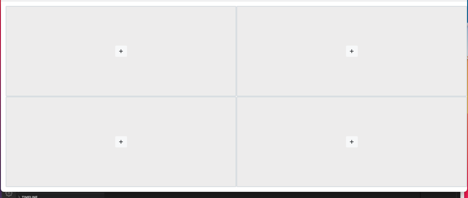
<div class="container-fluid">
    <div class="row justify-content-center min-vh-100 pt-3 ps-3 pb-3">

        <div class="col" style="background-color: rgba(0,0,0,.03);">

            <div class="d-flex flex-column h-100">


                <div class="row flex-grow-1 h-50 slot border border-3 rounded" slot="1">

                    <div class="container-fluid d-flex " style="background-color: rgba(0,0,0,.03);">

                        <div class="align-self-center mx-auto">
                            <button type="button" class="btn btn-xs btn-icon btn-round btn-light new-stream-btn" slot="1">
                                <i class="fa fa-plus text-dark"></i>
                            </button>
                        </div>

                    </div>

                </div>


            </div>

        </div>

        <div class="col" style="background-color: rgba(0,0,0,.03);">


            <div class="d-flex flex-column h-100">


                <div class="row flex-grow-1 h-50 slot border border-3 rounded" slot="1">

                    <div class="container-fluid d-flex " style="background-color: rgba(0,0,0,.03);">

                        <div class="align-self-center mx-auto">
                            <button type="button" class="btn btn-xs btn-icon btn-round btn-light new-stream-btn" slot="1">
                                <i class="fa fa-plus text-dark"></i>
                            </button>
                        </div>

                    </div>

                </div>


                <div class="row flex-grow-1 h-50 slot border border-3 rounded" slot="1">

                    <div class="container-fluid d-flex " style="background-color: rgba(0,0,0,.03);">

                        <div class="align-self-center mx-auto">
                            <button type="button" class="btn btn-xs btn-icon btn-round btn-light new-stream-btn" slot="1">
                                <i class="fa fa-plus text-dark"></i>
                            </button>
                        </div>

                    </div>

                </div>


            </div>


        </div>


    </div>
</div>
虽然这是我添加图像时的行为:
    <div class="container-fluid">
    <div class="row justify-content-center min-vh-100 pt-3 ps-3 pb-3">

        <div class="col" style="background-color: rgba(0,0,0,.03);">

            <div class="d-flex flex-column h-100">


                <div class="row  flex-grow-1 h-50 slot border border-3 rounded " slot="1">
                    <img class="img-responsive w-100 h-100  px-0 rounded"  src="https://www.logo.wine/a/logo/Stack_Overflow/Stack_Overflow-Logo.wine.svg">
                </div>


                <div class="row  flex-grow-1 h-50 slot border border-3 rounded " slot="1">
                    <img class="img-responsive w-100 h-100  px-0 rounded"  src="https://www.logo.wine/a/logo/Stack_Overflow/Stack_Overflow-Logo.wine.svg">
                </div>


            </div>

        </div>

        <div class="col" style="background-color: rgba(0,0,0,.03);">


            <div class="d-flex flex-column h-100">


                <div class="row flex-grow-1 h-50 slot border border-3 rounded" slot="1">

                    <div class="container-fluid d-flex " style="background-color: rgba(0,0,0,.03);">

                        <div class="align-self-center mx-auto">
                            <button type="button" class="btn btn-xs btn-icon btn-round btn-light new-stream-btn" slot="1">
                                <i class="fa fa-plus text-dark"></i>
                            </button>
                        </div>

                    </div>

                </div>


            </div>


        </div>


    </div>
</div>回答 1
Stack Overflow用户
回答已采纳
发布于 2022-10-05 11:49:28
您可以使用变巧大小图像,使其高度为0,最小高度为100%。
style="height:0;min-height:100%;"或通过自定义类(更好的实践)
想法:
<link href="https://cdnjs.cloudflare.com/ajax/libs/bootstrap/5.0.2/css/bootstrap.min.css" rel="stylesheet"/>
<div class="container-fluid">
  <div class="row justify-content-center min-vh-100 mh-100 pt-3 ps-3 pb-3">
    <div class="col" style="background-color: rgba(0,0,0,.03);">
      <div class="d-flex flex-column h-100 ">
        <div class="row  flex-grow-1 h-50 slot border border-3 rounded " slot="1">
          <img class="img-responsive   px-0 rounded" style="height:0;min-height:100%;" src="https://www.logo.wine/a/logo/Stack_Overflow/Stack_Overflow-Logo.wine.svg">
        </div>
        <div class="row  flex-grow-1 h-50 slot border border-3 rounded " slot="1">
          <img class="img-responsive    px-0 rounded" style="height:0;min-height:100%;" src="https://www.logo.wine/a/logo/Stack_Overflow/Stack_Overflow-Logo.wine.svg">
        </div>
      </div>
    </div>
    <div class="col" style="background-color: rgba(0,0,0,.03);">
      <div class="d-flex flex-column h-100">
        <div class="row flex-grow-1 h-50 slot border border-3 rounded" slot="1">
          <div class="container-fluid d-flex " style="background-color: rgba(0,0,0,.03);">
            <div class="align-self-center mx-auto">
              <button type="button" class="btn btn-xs btn-icon btn-round btn-light new-stream-btn" slot="1">
                <i class="fa fa-plus text-dark"></i>
              </button>
            </div>
          </div>
        </div>
      </div>
    </div>
  </div>
</div>
另一种可能也是设定一个最大的高度在桥接器上。
其他可能的例子:
.max-vh-100{max-height:calc(100vh - 2em);}/* takes into account : pt-3 p-s3 pb-3 that could be turned into p-3 */<link href="https://cdnjs.cloudflare.com/ajax/libs/bootstrap/5.0.2/css/bootstrap.min.css" rel="stylesheet"/>
<div class="container-fluid">
<div class="row justify-content-center min-vh-100 p-3">
<div class="col" style="background-color: rgba(0,0,0,.03);">
<div class="d-flex flex-column h-100 max-vh-100">
<div class="row flex-grow-1 h-50 slot border border-3 rounded " slot="1">
<img class="img-responsive w-100 h-100 px-0 rounded" src="https://www.logo.wine/a/logo/Stack_Overflow/Stack_Overflow-Logo.wine.svg">
</div>
<div class="row flex-grow-1 h-50 slot border border-3 rounded " slot="1">
<img class="img-responsive w-100 h-100 px-0 rounded" src="https://www.logo.wine/a/logo/Stack_Overflow/Stack_Overflow-Logo.wine.svg">
</div>
</div>
</div>
<div class="col" style="background-color: rgba(0,0,0,.03);">
<div class="d-flex flex-column h-100 max-vh-100">
<div class="row flex-grow-1 h-50 slot border border-3 rounded" slot="1">
<div class="container-fluid d-flex " style="background-color: rgba(0,0,0,.03);">
<div class="align-self-center mx-auto">
<button type="button" class="btn btn-xs btn-icon btn-round btn-light new-stream-btn" slot="1">
<i class="fa fa-plus text-dark"></i>
</button>
</div>
</div>
</div>
</div>
</div>
</div>
</div>
.max-vh-100{max-height:calc(100vh - 2em);}考虑到:可以转换为p-3的pt-3 ps-3 pb-3
页面原文内容由Stack Overflow提供。腾讯云小微IT领域专用引擎提供翻译支持
原文链接:
https://stackoverflow.com/questions/73959512
复制相关文章
相似问题
腾讯云开发者

Copyright © 2013 - 2026 Tencent Cloud. All Rights Reserved. 腾讯云 版权所有
深圳市腾讯计算机系统有限公司 ICP备案/许可证号:粤B2-20090059  粤公网安备44030502008569号
腾讯云计算(北京)有限责任公司 京ICP证150476号 | 京ICP备11018762号