
如何从以值表示列表的DataFrame中绘制方框图?
如何从以值表示列表的DataFrame中绘制方框图?
提问于 2022-09-29 06:35:18
我有以下数据结构:
data = [
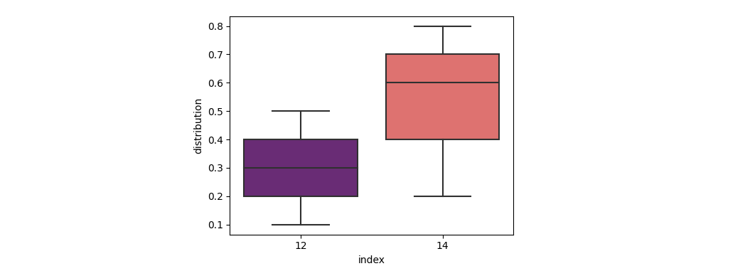
[12, [0.1, 0.2, 0.3, 0.4, 0.5]],
[14, [0.8, 0.7, 0.6, 0.4, 0.2]]
# .... and so on
]
df = pd.DataFrame(data, columns=['index', 'distribution'])如何构建方框图表,其中:
- 每个方框和晶须将显示上述
distribution列的分布(使用方框/晶须/离群值),对于每个索引 - ,每个方框和晶须将使用相同的
index(例如,如果index值相同,distribution将被合并)
g 210聚合分布。
回答 1
Stack Overflow用户
回答已采纳
发布于 2022-09-29 07:03:47
你可以使用熊猫的.explode()将讨厌的列表转换成一个长格式的数据格式。到目前为止,Seaborn是从dataframe创建matplotlib风格的盒图的最容易的摇摆。Seaborn将自动将属于同一“索引”的值分组。
import matplotlib.pyplot as plt
import pandas as pd
import seaborn as sns

data = [
    [12, [0.1, 0.2, 0.3, 0.4, 0.5]],
    [14, [0.8, 0.7, 0.6, 0.4, 0.2]]
    # .... and so on
]
df = pd.DataFrame(data, columns=['index', 'distribution'])
sns.boxplot(data=df.explode('distribution'), x='index', y='distribution', palette='magma')
页面原文内容由Stack Overflow提供。腾讯云小微IT领域专用引擎提供翻译支持
原文链接:
https://stackoverflow.com/questions/73891218
复制相关文章
相似问题
腾讯云开发者

Copyright © 2013 - 2026 Tencent Cloud. All Rights Reserved. 腾讯云 版权所有
深圳市腾讯计算机系统有限公司 ICP备案/许可证号:粤B2-20090059 ![]() 粤公网安备44030502008569号
粤公网安备44030502008569号
腾讯云计算(北京)有限责任公司 京ICP证150476号 | 京ICP备11018762号