
将“可达”转换为“ggplot”,这有可能吗?
目前,我已经在一些代码中将一个可达性存储为一个对象。我希望能够将所说的对象转换成一个ggg图,但是无论我做什么,我都会得到相同错误的变化。利用blastula的add_ggplot函数,我得到:
Error in UseMethod("grid.draw") :
  no applicable method for 'grid.draw' applied to an object of class "c('reactable', 'htmlwidget')"
使用ggplotify的as.ggplot函数,我得到:
Error in UseMethod("as.grob") :
  no applicable method for 'as.grob' applied to an object of class "c('reactable', 'htmlwidget')"
有没有人对如何达到预期的结果有建议?
编辑:在回答一个问题时,我可能应该最初回答:可达表是从一个非常运行的数据中派生出来的。
df <- structure(list(Date = c("2019-02-09", "2019-02-09", "2019-02-09",
"2019-02-09", "2019-02-09", "2019-02-09", "2020-02-09", "2020-02-09",
"2020-02-09", "2020-02-09", "2021-02-09", "2021-02-09", "2021-02-09",
"2021-02-09"), Type = c("HUF", "HAD", "WOK", "STR", "HUF", "HAD",
"WOK", "STR", "HUF", "HAD", "WOK", "STR", "HUF", "HAD"), Value = c(12L,
226394L, 27566L, 217098L, 208463L, 9320L, 156607L, 19790L, 24541L,
1074419L, 17250L, 12249L, 43651L, 45121L)), class = "data.frame", row.names = c(NA,
-14L))
EDIT2:这是可达的代码,很抱歉之前没有包括它:
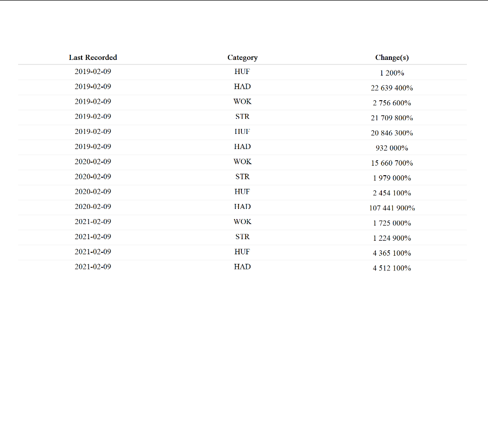
react_df <- reactable(df, highlight =  TRUE, compact = TRUE,pagination = FALSE, columns = list(Date = colDef(name = "Last Recorded", align = 'center'), Type = colDef(name = "Category", align = 'center'), Value = colDef(name = "Change(s)", align = 'center', cell = data_bars(df, background = "white", border_width = "2px", bar_height = 3, align_bars = "left", text_position = "outside-end", max_value = 1, number_fmt = scales::percent))))

react_df回答 2
Stack Overflow用户
发布于 2022-10-01 22:44:12
可达对象是html小部件,因此无法直接将其转换为ggplot对象。有一些方法可以实现它,比如将可达表保存为png,将png转换为光栅Grob,然后使用ggplotify:
library(grid)
library(png)
library(ggplotify)

save_reactable_test(react_df, "my_reactable.png")
img <- readPNG("my_reactable.png")
p <- as.ggplot(rasterGrob(img))现在,对象p在技术上是一个ggplot:
class(p)
#> [1] "gg"     "ggplot"
它看起来有点像原来的桌子:
p
然而,这实际上只是一个包装的图像,当涉及到调整大小、编辑、更改主题元素等时,它的行为将不像一个普通的ggplot。
实际上,只编写绘制要查找的表的ggplot代码并不困难。即使丢失了原始数据,也可以从可达对象中恢复数据,如下所示:
library(rvest)
library(jsonlite)

df <- read_html(as.character(react_df$x$tag)) %>%
  html_element("reactable") %>%
  html_attr("data") %>%
  parse_json() %>%
  lapply(unlist) %>%
  as.data.frame()
我们可以直接使用以下ggplot代码对您的表进行重新设计:
library(ggplot2)

ggplot(df, aes(y = rev(seq(nrow(df))))) +
  geom_text(aes(x = 1, label = Date), hjust = 0) +
  geom_text(aes(x = 2, label = Type), hjust = 0) +
  geom_segment(aes(x = 3, xend = 3 + Value / max(Value), yend = stat(y)),
               size = 2, color = "deepskyblue4") +
  geom_text(aes(x = 3, label = paste0(Value, " (",
                      scales::percent(Value / sum(Value), 0.1), ")")),
            hjust = 0, vjust = -0.8) +
  geom_hline(yintercept = seq(nrow(df)) - 0.5, size = 0.05) +
  geom_hline(yintercept = nrow(df) + 0.5) +
  annotate("text", label = colnames(df), x = 1:3,
             y = nrow(df) + 1, hjust = 0, fontface = 2) +
  theme_void()
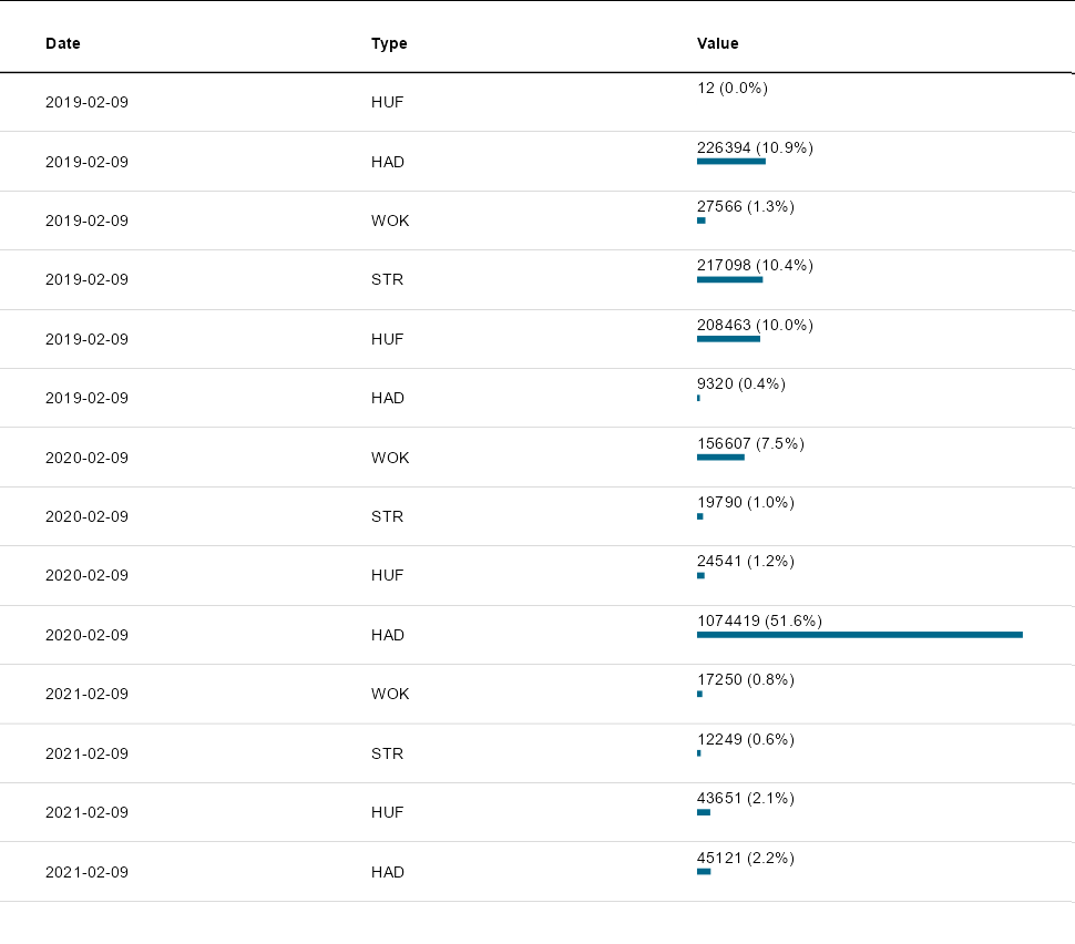
这是一个正确的ggplot,它看起来像原始的可达对象,完全可自定义,并且在调整大小时会像预期的那样运行,等等。
Stack Overflow用户
发布于 2022-09-26 17:16:24
如果没有对象或如何创建该对象的代码,我不确定这是否会对您的情况有所帮助。这是我对正在发生的事情最好的猜测。
如果您引用的是库reactable中的一个reactable表,则可以提取数据并创建如下所示的情节。
library(reactable)
library(tidyverse)
library(jsonlite)

df <- structure(list(
  Date = c("2019-02-09", "2019-02-09", "2019-02-09",
           "2019-02-09", "2019-02-09", "2019-02-09", "2020-02-09", "2020-02-09",
           "2020-02-09", "2020-02-09", "2021-02-09", "2021-02-09", "2021-02-09",
           "2021-02-09"),
  Type = c("HUF", "HAD", "WOK", "STR", "HUF", "HAD", "WOK", "STR", "HUF", "HAD",
           "WOK", "STR", "HUF", "HAD"),
  Value = c(12L, 226394L, 27566L, 217098L, 208463L, 9320L, 156607L, 19790L, 24541L,
            1074419L, 17250L, 12249L, 43651L, 45121L)),
  class = "data.frame", row.names = c(NA, -14L))

df1 <- df %>% reactable() # create reactable table (widget)

# extract the data from the widget
df2 <- fromJSON(df1$x$tag$attribs$data) %>% as.data.frame

all.equal(df, df2) # test if the widget and the original data frame are identical
# [1] TRUE

# make a plot
df2 %>% mutate(Date = as.Date(Date))  %>%
ggplot(aes(x = Date, y = Value, color = Type)) + geom_point()https://stackoverflow.com/questions/73829821
复制相似问题
腾讯云开发者

Copyright © 2013 - 2026 Tencent Cloud. All Rights Reserved. 腾讯云 版权所有
深圳市腾讯计算机系统有限公司 ICP备案/许可证号:粤B2-20090059 ![]() 粤公网安备44030502008569号
粤公网安备44030502008569号
腾讯云计算(北京)有限责任公司 京ICP证150476号 | 京ICP备11018762号