
如何将这些数据绘制成年复一年的动画地图?
如何将这些数据绘制成年复一年的动画地图?
提问于 2022-09-18 20:12:06
我得用这张数据做一张巧妙的地图
    country 2011    2012    2013    2014    2015    2016    Alpha-2 code    Alpha-3 code    Numeric code    ISO 3166-2
    0   Argentina   0   0   0   0   0   1   AR  ARG 32  ISO 3166-2:AR
    1   Australia   7   21  19  19  20  31  AU  AUS 36  ISO 3166-2:AU
    2   Austria 2   5   6   6   5   7   AT  AUT 40  ISO 3166-2:AT
    3   Bangladesh  0   0   0   0   0   1   BD  BGD 50  ISO 3166-2:BD
    4   Belarus 0   0   0   0   0   1   BY  BLR 112 ISO 3166-2:BY
    5   Belgium 2   7   7   7   7   7   BE  BEL 56  ISO 3166-2:BE
    6   Brazil  0   2   2   2   2   17  BR  BRA 76  ISO 3166-2:BR
    7   Canada  9   18  19  19  18  25  CA  CAN 124 ISO 3166-2:CA
    8   Chile   0   1   0   0   1   6   CL  CHL 152 ISO 3166-2:CL
    9   China   6   10  9   10  11  37  CN  CHN 156 ISO 3166-2:CN
    10  Colombia    0   0   1   1   1   2   CO  COL 170 ISO 3166-2:CO
我试过这样做,但我不知道在“动画帧”和“颜色”中放什么。谢谢
fig = px.choropleth(theiso, locations='Alpha-3 code', color=['2011','2012','2013','2014','2015','2016'],
                        hover_name="country",scope='world', animation_frame =['2011','2012','2013','2014','2015','2016'])

    fig.layout.updatemenus[0].buttons[0].args[1]["frame"]["duration"] = 2000

    fig.update_geos(visible=False, resolution=50, scope="world",
        showcountries=True, countrycolor="Black")

    fig.update_layout(margin={"r":0,"t":25,"l":0,"b":0},title="Numero di università totali per paese")
fig.show()回答 1
Stack Overflow用户
回答已采纳
发布于 2022-09-18 22:49:46
您希望首先使用df.melt将df从宽格式转换为长格式。
import plotly.express as px
import pandas as pd
theiso = theiso.melt(id_vars=['country','Alpha-3 code'],
value_vars=['2011','2012','2013','2014','2015','2016'],
var_name='Year', value_name='Numero di università')
# add `range_color` with a stable `min` (e.g. 0) and `max` (e.g. 40)
fig = px.choropleth(theiso, locations='Alpha-3 code', hover_name="country",
color='Numero di università', scope='world',
animation_frame ='Year', range_color=(0,40))
fig.layout.updatemenus[0].buttons[0].args[1]["frame"]["duration"] = 2000
fig.update_geos(visible=False, resolution=50, scope="world",
showcountries=True, countrycolor="Black")
fig.update_layout(margin={"r":0,"t":25,"l":0,"b":0},
title="Numero di università totali per paese")
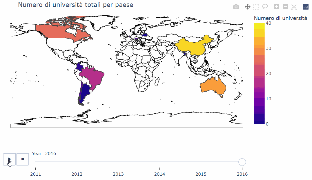
fig.show()结果:
页面原文内容由Stack Overflow提供。腾讯云小微IT领域专用引擎提供翻译支持
原文链接:
https://stackoverflow.com/questions/73766097
复制相关文章
相似问题
腾讯云开发者

Copyright © 2013 - 2026 Tencent Cloud. All Rights Reserved. 腾讯云 版权所有
深圳市腾讯计算机系统有限公司 ICP备案/许可证号:粤B2-20090059 ![]() 粤公网安备44030502008569号
粤公网安备44030502008569号
腾讯云计算(北京)有限责任公司 京ICP证150476号 | 京ICP备11018762号