
如何将框影环绕在一组灵活的项目上?
如何将框影环绕在一组灵活的项目上?
提问于 2022-09-16 12:13:18
我有一堆像药丸一样的东西里面有弯曲的元素。我想把整个“药丸”包装在一个盒子阴影中,但我正在与定义flex的blocky div作斗争。
我尝试过在单个inline-flex中使用div,但这打破了每个部分具有相同宽度的“药丸”的一致性。
在下面的代码中,我有两个我尝试过的框阴影示例:将其附加到flex容器和将其附加到各个flex项。
https://codepen.io/rewing/pen/oNdZNxb
HTML和CSS
.box-shadow-test-1 {
  -webkit-box-shadow: 0px 0px 6px 0px rgba(0,0,0,0.75);
  -moz-box-shadow: 0px 0px 6px 0px rgba(0,0,0,0.75);
  box-shadow: 0px 0px 6px 0px rgba(0,0,0,0.75);
  border-radius: 10px;
}

.box-shadow-test-2>div {
  -webkit-box-shadow: 0px 0px 6px 0px rgba(0,0,0,0.75);
  -moz-box-shadow: 0px 0px 6px 0px rgba(0,0,0,0.75);
  box-shadow: 0px 0px 6px 0px rgba(0,0,0,0.75);
}

.thing {
  display: flex;
  gap: 0;
  margin-bottom: 10px;
  font-size: 14px;
  cursor: default;
}
.thing > div {
  padding: 10px;
  border-top: 1px solid #666;
  border-bottom: 1px solid #666;
}
.thing .indicator {
  border-left: 1px solid #666;
  border-right: 1px solid #666;
}
.thing .left-indicator {
  border-top-left-radius: 10px;
  border-bottom-left-radius: 10px;
  padding-top: 18px;
  flex-basis: 13px;
}
.thing .left-indicator.state-1 {
  background-color: #bff2c6;
}
.thing .left-indicator.state-2 {
  background-color: #AAA;
}
.thing .left-indicator.state-3 {
  background-color: #bff2c6;
}
.thing .left-indicator.state-4 {
  background-color: #ff8989;
}
.thing .name {
  background-color: #FFFFFF;
  flex-basis: 195px;
}
.thing .change {
  background-color: #FFFFFF;
  flex-basis: 135px;
  padding-top: 18px;
}
.thing .right-indicator {
  border-top-right-radius: 10px;
  border-bottom-right-radius: 10px;
  padding-top: 18px;
}
.thing .right-indicator.state-1 {
  background-color: #bff2c6;
  cursor: pointer;
}
.thing .right-indicator.state-1:hover {
  background-color: #A6D9AD;
}
.thing .right-indicator.state-2 {
  background-color: #AAA;
}
.thing .right-indicator.state-3 {
  background-color: #fcf95c;
  cursor: pointer;
}
.thing .right-indicator.state-3:hover {
  background-color: #E3E043;
}
.thing .right-indicator.state-4 {
  background-color: #FFFFFF;
}<div class="things">
<div class="cluster">
<div class="thing box-shadow-test-1">
<div class="indicator left-indicator state-2"> </div>
<div class="name">Name 1</div>
<div class="change">Property 1</div>
<div class="indicator right-indicator state-2">state-2</div>
</div>
<div class="thing thing-2 box-shadow-test-2">
<div class="indicator left-indicator state-2"> </div>
<div class="name">Name 2</div>
<div class="change">Property 1</div>
<div class="indicator right-indicator state-2">state-2</div>
</div>
<div class="thing thing-3">
<div class="indicator left-indicator state-3"> </div>
<div class="name">Name 3</div>
<div class="change">Property 1</div>
<div class="indicator right-indicator state-3">state-3 longer</div>
</div>
<div class="thing thing-4">
<div class="indicator left-indicator state-4"> </div>
<div class="name">Name 4</div>
<div class="change">Property 1</div>
<div class="indicator right-indicator state-4">state-4 short</div>
</div>
</div>
</div>
编辑:
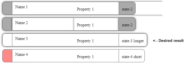
为了澄清,这个列表中的第三个盒子阴影药丸是我想要创建的。第一次尝试包装在blocky div周围,第二次尝试显示药丸本身内的框影,但是第三次药丸(photoshopped)药丸只在挠性容器的外部有框影。
回答 2
Stack Overflow用户
回答已采纳
发布于 2022-09-16 13:16:11
一种方法如下,守则中有解释性评论:
:root {
 --shadowColor: hsl(0deg 20% 20% / 0.7);
}

.thing {
  display: flex;
  align-content: center;
  gap: 0;
  margin-bottom: 10px;
  font-size: 14px;
  cursor: default;
}

.thing>div {
  padding: 10px;
  border-top: 1px solid #666;
  border-bottom: 1px solid #666;
}

.thing .indicator {
  border-left: 1px solid #666;
  border-right: 1px solid #666;
}

.thing .left-indicator {
  border-top-left-radius: 10px;
  border-bottom-left-radius: 10px;
  flex-basis: 13px;
}

.thing .left-indicator.state-3 {
  background-color: #bff2c6;
}

.thing .name {
  background-color: #FFFFFF;
  flex-basis: 195px;
}

.thing .change {
  background-color: #FFFFFF;
  flex-basis: 135px;
}

.thing .right-indicator {
  border-top-right-radius: 10px;
  border-bottom-right-radius: 10px;
}

.thing .right-indicator.state-3 {
  background-color: #fcf95c;
  cursor: pointer;
}

.thing .right-indicator.state-3:hover {
  background-color: #E3E043;
}

.withShadow {
  /* using the 'filter' property to apply a drop-shadow, using the
     drop-shadow() function:
      (first) 0:          the x-offset (positive numbers moves to the right,
                          negative to the left),
      (second) 0:         the y-offset (positive numbers move down, negative
                          numbers go up),
      0.5em:              the spread of the colour,
      var(--shadowColor): the colour of the shadow (here using a CSS property)
     */
  filter: drop-shadow(0 0 0.5em var(--shadowColor));
}<!-- for brevity I removed all but the one element you said you wanted to have the shadow
(and, similarly, removed the unnecessary CSS for the removed elements): -->
<div class="things">
<!-- I added a single class-name 'withShadow' to apply the CSS (because I was unsure of
the situations in which you wanted the shadow added; obviously you can add the
CSS declarations to another class if it makes more sense: -->
<div class="thing thing-3 withShadow">
<div class="indicator left-indicator state-3"> </div>
<div class="name">Name 3</div>
<div class="change">Property 1</div>
<div class="indicator right-indicator state-3">state-3 longer</div>
</div>
</div>
参考文献:
Stack Overflow用户
发布于 2022-09-16 13:22:21
尝试添加过滤器:下拉阴影(0 0 3 3px rgb(0 0/ 75%));在..thing 3类中
.box-shadow-test-1 {
  -webkit-box-shadow: 0px 0px 6px 0px rgba(0,0,0,0.75);
  -moz-box-shadow: 0px 0px 6px 0px rgba(0,0,0,0.75);
  box-shadow: 0px 0px 6px 0px rgba(0,0,0,0.75);
  border-radius: 10px;
}

.box-shadow-test-2>div {
  -webkit-box-shadow: 0px 0px 6px 0px rgba(0,0,0,0.75);
  -moz-box-shadow: 0px 0px 6px 0px rgba(0,0,0,0.75);
  box-shadow: 0px 0px 6px 0px rgba(0,0,0,0.75);
}

.thing {
  display: flex;
  gap: 0;
  margin-bottom: 10px;
  font-size: 14px;
  cursor: default;
}

.thing-3 {
  filter: drop-shadow(0 0 3px rgb(0 0 0 / 75%));
}

.thing > div {
  padding: 10px;
  border-top: 1px solid #666;
  border-bottom: 1px solid #666;
}
.thing .indicator {
  border-left: 1px solid #666;
  border-right: 1px solid #666;
}
.thing .left-indicator {
  border-top-left-radius: 10px;
  border-bottom-left-radius: 10px;
  padding-top: 18px;
  flex-basis: 13px;
}
.thing .left-indicator.state-1 {
  background-color: #bff2c6;
}
.thing .left-indicator.state-2 {
  background-color: #AAA;
}
.thing .left-indicator.state-3 {
  background-color: #bff2c6;
}
.thing .left-indicator.state-4 {
  background-color: #ff8989;
}
.thing .name {
  background-color: #FFFFFF;
  flex-basis: 195px;
}
.thing .change {
  background-color: #FFFFFF;
  flex-basis: 135px;
  padding-top: 18px;
}
.thing .right-indicator {
  border-top-right-radius: 10px;
  border-bottom-right-radius: 10px;
  padding-top: 18px;
}
.thing .right-indicator.state-1 {
  background-color: #bff2c6;
  cursor: pointer;
}
.thing .right-indicator.state-1:hover {
  background-color: #A6D9AD;
}
.thing .right-indicator.state-2 {
  background-color: #AAA;
}
.thing .right-indicator.state-3 {
  background-color: #fcf95c;
  cursor: pointer;
}
.thing .right-indicator.state-3:hover {
  background-color: #E3E043;
}
.thing .right-indicator.state-4 {
  background-color: #FFFFFF;
}<div class="things">
<div class="cluster">
<div class="thing box-shadow-test-1">
<div class="indicator left-indicator state-2"> </div>
<div class="name">Name 1</div>
<div class="change">Property 1</div>
<div class="indicator right-indicator state-2">state-2</div>
</div>
<div class="thing thing-2 box-shadow-test-2">
<div class="indicator left-indicator state-2"> </div>
<div class="name">Name 2</div>
<div class="change">Property 1</div>
<div class="indicator right-indicator state-2">state-2</div>
</div>
<div class="thing thing-3">
<div class="indicator left-indicator state-3"> </div>
<div class="name">Name 3</div>
<div class="change">Property 1</div>
<div class="indicator right-indicator state-3">state-3 longer</div>
</div>
<div class="thing thing-4">
<div class="indicator left-indicator state-4"> </div>
<div class="name">Name 4</div>
<div class="change">Property 1</div>
<div class="indicator right-indicator state-4">state-4 short</div>
</div>
</div>
</div>
页面原文内容由Stack Overflow提供。腾讯云小微IT领域专用引擎提供翻译支持
原文链接:
https://stackoverflow.com/questions/73744680
复制相关文章
相似问题
腾讯云开发者

Copyright © 2013 - 2026 Tencent Cloud. All Rights Reserved. 腾讯云 版权所有
深圳市腾讯计算机系统有限公司 ICP备案/许可证号:粤B2-20090059  粤公网安备44030502008569号
腾讯云计算(北京)有限责任公司 京ICP证150476号 | 京ICP备11018762号