
如何使用媒体查询进行动态布局?
如何使用媒体查询进行动态布局?
提问于 2022-09-13 01:52:50
我一直在试着做一些特定尺寸的布局。
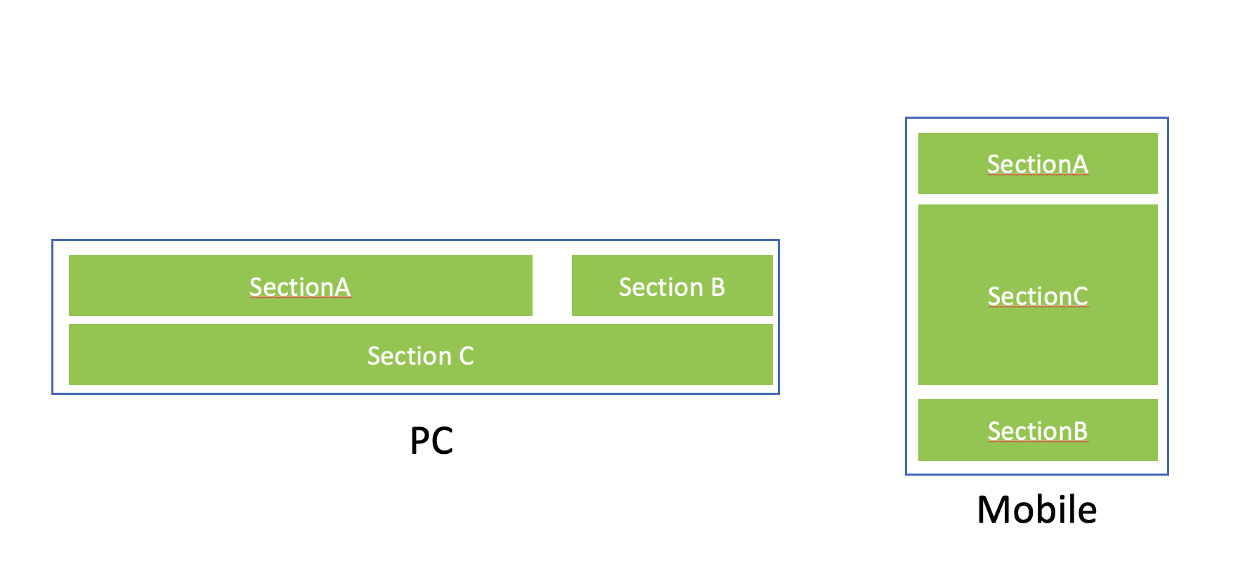
如上图所示,我试图创建两个布局,个人电脑和移动。
做一台电脑很容易。SectionA和SectionB是通过flex布局配置的,而SectionC则是在其下面配置的。
问题就在手机上。SectionA和SectionB在一个flex布局中绑定在一起,所以我想不出如何将SectionC放在A和B之间。
这是因为,在html结构中,sectionC已经存在于下面。是否可以只使用CSS配置而不使用Javascript?
.header {
  display: flex;
  flex-direction: row;
  justify-content: space-between;
  /*only for ilustration*/
  background-color: #d7d7d7;
}

.bottom {
  display: flex;
  flex-direction: row;
  /*only for ilustration*/
  background-color: #ffd5d5;
}

@media screen and (max-width: 760px) {
  .header {
    display: flex;
    flex-direction: column;
    justify-content: flex-start;
  }
  .bottom {
    flex-direction: column;
    border: none;
  }
}<div>
<div class="header">
<div>
SectionA
</div>
<div>
SectionB
</div>
</div>
<div class="bottom">
SectionC
</div>
</div>
回答 4
Stack Overflow用户
回答已采纳
发布于 2022-09-13 02:57:29
- 我刚刚对你的HTML做了一个修改。
- 所以我把所有的div包在
.header里面。 - 然后,为了首先给出50%的宽度来指导子程序,我刚刚添加了
.hlalf类,并将这个类CSS设置为flex:1 0 50%,这意味着使用50%的柔箱宽度。 - 现在,为了在响应中心实现底层div,我们使用了挠曲盒的
order特性。为此,我刚刚按照他们的顺序给所有的3div添加了类。我使用sm关键字只是为了理解为小屏幕。
    @media screen and (max-width: 560px) {
      .order-sm-1 {
        order: 1;
      }
      .order-sm-2 {
        order: 2;
      }
      .order-sm-3 {
        order: 3;
      }
    }
.header {
  display: flex;
  justify-content: space-between;
  flex-wrap: wrap;
}

.header>div {
  flex: 1;
}

.header>div.half {
  /*This css tells all the direct div of header class to take 50% of the space*/
  flex: 1 0 50%;
}

.bggreen {
  background: green;
}

.bgblue {
  background: blue;
}

.bottom {
  background-color: #ffd5d5;
}

@media screen and (max-width: 760px) {
  /*This will change flex-direction to column which is by default row*/
  .header {
    flex-direction: column;
  }
  .order-sm-1 {
    order: 1;
  }
  .order-sm-2 {
    order: 2;
  }
  .order-sm-3 {
    order: 3;
  }
}<div>
<div class="header">
<div class="bggreen half order-sm-1">
SectionA
</div>
<div class="bgblue half order-sm-3">
SectionB
</div>
<div class="bottom order-sm-2">
SectionC
</div>
</div>
Stack Overflow用户
发布于 2022-09-13 02:12:01
您可以将所有部分包装在一个flex容器中,并使用flex顺序属性。
Stack Overflow用户
发布于 2022-09-13 09:25:42
我在这个派对上迟到了,但在我看来,网格是一条路,因为你可以完全控制你放东西的地方。它比flexbox灵活得多,但它最初是一个陡峭的学习曲线,因为有很多选择。Kevin对网格有一个很好的入门视频,而这也是一个很好的、写得很清楚的css技巧资源。
.container {
  display: grid;
  grid-template-columns: 3fr 1fr;
  grid-template-areas: "a b" "c c";
  border: 2px solid #285DBB;
  row-gap: 0.25rem;
  column-gap: 2rem;
  padding: 0.35rem;
}

.container>div {
  background-color: #92D050;
  color: white;
  display: grid;
  place-content: center;
  padding: 0.75rem 2rem;
}

.zoneA {
  grid-area: a;
  text-decoration: underline wavy red;
}

.zoneB {
  grid-area: b;
}

.zoneC {
  grid-area: c;
}

.footer {
  margin-top: 1.5rem;
  font-size: 1.25rem;
  text-align: center;
}

.mobile {
  display: none;
}

.pc {
  display: block;
}

@media only screen and (max-width:760px) {
  .container {
    grid-template-columns: 1fr;
    grid-template-rows: 1fr 3fr 1fr;
    grid-template-areas: "a" "c" "b";
  }
  .mobile {
    display: block;
  }
  .pc {
    display: none;
  }
  .zoneB {
    text-decoration: underline wavy red;
  }
  .zoneC {
    text-decoration: underline wavy red;
  }
}<div class="container">
<div class="zoneA">
SectionA
</div>
<div class="zoneB">
SectionB
</div>
<div class="zoneC">
SectionC
</div>
</div>
<div class="pc footer">PC</div>
<div class="mobile footer">Mobile</div>
页面原文内容由Stack Overflow提供。腾讯云小微IT领域专用引擎提供翻译支持
原文链接:
https://stackoverflow.com/questions/73696787
复制相关文章
相似问题
腾讯云开发者

Copyright © 2013 - 2026 Tencent Cloud. All Rights Reserved. 腾讯云 版权所有
深圳市腾讯计算机系统有限公司 ICP备案/许可证号:粤B2-20090059  粤公网安备44030502008569号
腾讯云计算(北京)有限责任公司 京ICP证150476号 | 京ICP备11018762号