
多个地块只分成一个
我刚开始使用python,在搜索了几个小时后无法解决我的问题:
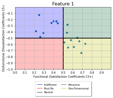
我为Kano分析调整了现有的Python脚本,但希望将所有“结果点”绘制成一个合并的图,而不是为每个特性生成一个。(我的目标是将所有特征绘制成一个图形,并列出像传说一样的特征名称)
下面是运行代码的数据:https://wetransfer.com/downloads/f1815b3660dca105b3364085d36a99e420220901195108/512a6d
非常感谢你的帮助!
# -*- coding: utf-8 -*-
"""
Spyder Editor

This is a temporary script file.
"""
#reading the Data-Export from Unipark
import pandas as pd
data = pd.read_excel (r'C:\Users\xxx\Nextcloud\03_Documents\xxx\data_kano.xlsx',header=0)

data.drop(index=0)
segment=list(range(0,len(data.columns)+1,2))

num=len(data.columns)/2
store=[]
for x in range(1,len(segment)):
    df=data.iloc[:,segment[x-1]:segment[x]].copy()
    store.append(df)

#creating the scoring to rate the answeres to categories
eval_matrix=pd.DataFrame({'#1':['Q','R','R','R','R'],'#2':['A','I','I','I','R'],
             '#3':['A','I','I','I','R'],'#4':['A','I','I','I','R'],
             '#5':['O','M','M','M','Q']})
eval_matrix.index=['#1','#2','#3','#4','#5']


#scoring to the different categories
result=pd.DataFrame()
for x in range(0,len(store)):
    Kano_score=[]
    for y in range(0,len(list(store[x].iloc[:,0]))):
        Kano_score.append(eval_matrix.loc[store[x].iloc[y,0],store[x].iloc[y,1]])
    pos='Feature '+str(x+1)+"-1"
    neg='Feature '+str(x+1)+"-2"
    col_name3='Feature '+str(x+1)+"-Result"
    result[pos]=store[x].iloc[:,0].copy()
    result[neg]=store[x].iloc[:,1].copy()
    result[col_name3]=Kano_score


import matplotlib.pyplot as plt
import numpy as np

# Create a function to calculate the satisfaction and dissatisfaction coefficients
def SI(A: int,O: int,M: int,I: int)->float:
    return float((A+O) / (A+O+M+I))

def DSI(A: int,O: int,M: int,I: int)->float:
    return float((O+M) / (A+O+M+I) * -1)


def showGraph(dsi: float, si:float,title:str,x: int, y: int, n:int)->str:
    ax=plt.axes()
    ax.scatter(si,dsi)


    ax.set(xlim=[0,1],ylim=[-1,0],xlabel='Functional (Satisfaction Coefficients CS+)',ylabel='Disfunctional (Dissatisfaction Coefficients CS-)',xticks=np.arange(0,1,0.1),yticks=np.arange(-1,0,0.1)) # set the ranges of x-axis y-axis
    ax.set_title(title,size=16)
    ax.grid(True)

    # Adjust the thickness of the two lines in the middle as a cross
    gridlines = ax.yaxis.get_gridlines()
    gridlines[5].set_color('k')
    gridlines[5].set_linewidth(2.5)
    gridlines = ax.xaxis.get_gridlines()
    gridlines[5].set_color('k')
    gridlines[5].set_linewidth(2.5)

    #colouring


    plt.fill([0.0,0.0,0.3,0.3],[-0.0,-0.5,-0.5,-0.0],alpha=0.25, color ="b")
    plt.fill([0.3,0.3,0.5,0.5],[-0.0,-0.5,-0.5,-0.0],alpha=0.25, color ="b")

    plt.fill([0.7,0.7,1.0,1.0],[-0.0,-0.5,-0.5,-0.0],alpha=0.25, color ="#036630")
    plt.fill([0.5,0.5,0.7,0.7],[-0.0,-0.5,-0.5,-0.0],alpha=0.25, color ="#036630")

    plt.fill([0.5,0.5,0.7,0.7],[-0.5,-1.0,-1.0,-0.5],alpha=0.25, color ="y")
    plt.fill([0.7,0.7,1.0,1.0],[-0.5,-1.0,-1.0,-0.5],alpha=0.25, color ="y")

    plt.fill([0.0,0.0,0.3,0.3],[-0.5,-1.0,-1.0,-0.5],alpha=0.25, color ="r")
    plt.fill([0.3,0.3,0.5,0.5],[-0.5,-1.0,-1.0,-0.5],alpha=0.25, color ="r")
    plt.savefig('./figures/'+title+'.jpg')

    #add a legend
    plt.plot(x, y, alpha=0.8, color ="b", label="Indifferent")
    plt.plot(x, y, alpha=0.8, color ="r", label="Must Be")
    plt.plot(x, y, alpha=0.8, color ="k", label="Neutral")
    plt.plot(x, y, alpha=0.8, color ="#036630", label="Attractive")
    plt.plot(x, y, alpha=0.8, color ="y", label="One-Dimensional")
    plt.legend(bbox_to_anchor =(0.225,-0.45,0.55, 0.5), loc='lower center', ncol=2, fontsize ="small", framealpha=1, shadow=True, borderpad=1)

    plt.show()


import collections
import os
os.makedirs('figures',exist_ok=True)
pos=list(range(2,len(result.columns),3))

count=collections.Counter(result.iloc[:,2])
df=pd.DataFrame.from_dict(count,orient='index')
df.columns=['Score']

si=SI(df.loc['A','Score'],df.loc['O','Score'],df.loc['M','Score'],df.loc['I','Score'])
dsi=DSI(df.loc['A','Score'],df.loc['O','Score'],df.loc['M','Score'],df.loc['I','Score'])
df['SI']=np.nan
df.iloc[0,1]=si
df['DSI']=np.nan
df.iloc[0,2]=dsi
df.to_excel('Kano_scoring_Ergebnisse.xlsx',sheet_name='Feature 1')
showGraph(dsi,si,'Feature 1',len(pos)/2,2,1)

with pd.ExcelWriter('Kano_scoring_Ergebnisse.xlsx', engine="openpyxl",mode='a') as writer:
    for x in range(1,len(pos)):
        count=collections.Counter(result.iloc[:,pos[x]])
        df=pd.DataFrame.from_dict(count,orient='index')
        df.columns=['Score']
        si=SI(df.loc['A','Score'],df.loc['O','Score'],df.loc['M','Score'],df.loc['I','Score'])
        dsi=DSI(df.loc['A','Score'],df.loc['O','Score'],df.loc['M','Score'],df.loc['I','Score'])
        df['SI']=np.nan
        df.iloc[0,1]=si
        df['DSI']=np.nan
        df.iloc[0,2]=dsi
        df.to_excel(writer,sheet_name='Feature '+str(x+1))
showGraph(dsi,si,'Feature '+str(x+1),len(pos)/2,2,x+1)回答 1
Stack Overflow用户
发布于 2022-09-02 08:46:03
在您的代码中,我做了一些小的调整,将dsi和si数据读入一个名为scatter_data的数据框架中。每次使用ShowGraph()时,都会将日期读取到dataframe。最后,相同的数据被传递给ShowGraph(),这只会创建一个图。希望这就是你要找的。
注意,我只显示了代码的最后一部分.休息就是你拥有它。同时,将代码保存在注释中,这样您就可以看到正在更改的内容。最后,我尝试对代码进行最小的更改,这样您就可以执行更有效率的代码,因为您对它了解得更多。
## From row 106 onwards...

#showGraph(dsi,si,'Feature 1',len(pos)/2,2,1) ##Don't plot
scatter_data = pd.DataFrame(columns = ['dsi', 'si']) ## Create empty dataframe
scatter_data = scatter_data.append({'dsi':dsi, 'si':si}, ignore_index=True) ##Append feature 1 to dataframe

with pd.ExcelWriter('Kano_scoring_Ergebnisse.xlsx', engine="openpyxl",mode='a') as writer:
    for x in range(1,len(pos)):
        count=collections.Counter(result.iloc[:,pos[x]])
        df=pd.DataFrame.from_dict(count,orient='index')
        df.columns=['Score']
        si=SI(df.loc['A','Score'],df.loc['O','Score'],df.loc['M','Score'],df.loc['I','Score'])
        dsi=DSI(df.loc['A','Score'],df.loc['O','Score'],df.loc['M','Score'],df.loc['I','Score'])
        df['SI']=np.nan
        df.iloc[0,1]=si
        df['DSI']=np.nan
        df.iloc[0,2]=dsi
        df.to_excel(writer,sheet_name='Feature '+str(x+1))
#        showGraph(dsi,si,'Feature '+str(x+1),len(pos)/2,2,x+1) ## Dont plot, read into df instead
        scatter_data = scatter_data.append({'dsi':dsi, 'si':si}, ignore_index=True)

##Finally plot once (note this is outside the with loop
showGraph(scatter_data.dsi,scatter_data.si,'All Feature',len(pos)/2,2,1)
图
编辑
根据您的新请求,我将为每个点添加文本Feature N。下面的代码应该添加到ShowGraphs()中,它有一个使用ax.annotate()的for循环。有关此问题的更多信息是可用的这里,我使用了-0.05和+0.02作为偏移量,以便文本出现在每一点之上。你可以调整这个以适应你的需要。如果需要每个点位于不同的位置,则需要手动设置每个功能的标签点。
##Added lines near row 51 (inside ShowGraphs)
    ax.grid(True)  ##Existing line

    # Add labels for each point
    for idx in range(len(dsi)):
        ax.annotate("Feature " + str(idx), (si[idx]-0.05, dsi[idx]+0.02))

    ##Existing lines
    # Adjust the thickness of the two lines in the middle as a cross
    gridlines = ax.yaxis.get_gridlines()
REQ-2
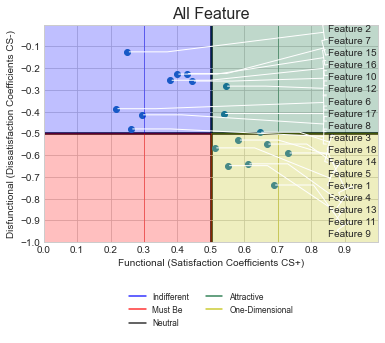
根据您的评论,您希望将所有标签对齐到右边,而不存在任何标签重叠。要做到这一点,请使用代码中显示的代码行。
改变是什么:我已经将textcoords替换为axes fraction,这样就可以很容易地对齐所有标签。然后,mytext设为x=0.85,y设为,最小的dsi值点在底部,其次是它的上方,直到我们到达最大的dsi值点,也就是顶部。要做到这一点,所有的dsi点数都是从最低到最高的,然后这个值用于文本的y-coorindate。
在ShowGraphs()函数中,用以下代码替换用于注释的FOR循环.
from scipy.stats import rankdata  ## This at the top
    ##This inside showgraphs... included the tab
    rank = rankdata(dsi, method='ordinal')
    # Add labels for each point
    for idx in range(len(dsi)):
        #ax.annotate("Feature " + str(idx), (si[idx]-0.05, dsi[idx]+0.02))
        ax.annotate("Feature " + str(idx+1), (si[idx], dsi[idx]),xycoords = 'data', textcoords=('axes fraction'),
                    xytext=(0.85,rank[idx]/len(dsi)-0.02), ha='left', va='center',
                    arrowprops=dict(arrowstyle="]-, widthA=0.75, lengthA=0.3",
                                    connectionstyle="arc,angleA=-90,angleB=0,armA=0,armB=40,rad=0"))
图
https://stackoverflow.com/questions/73570661
复制相似问题
腾讯云开发者

Copyright © 2013 - 2026 Tencent Cloud. All Rights Reserved. 腾讯云 版权所有
深圳市腾讯计算机系统有限公司 ICP备案/许可证号:粤B2-20090059 ![]() 粤公网安备44030502008569号
粤公网安备44030502008569号
腾讯云计算(北京)有限责任公司 京ICP证150476号 | 京ICP备11018762号