
实际上:如何使用自定义调色板
实际上:如何使用自定义调色板
提问于 2022-08-26 22:15:47
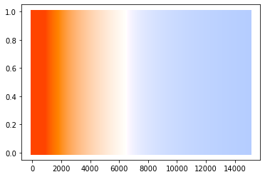
我做了一个调色板,颜色与温度相关(用开尔文测量)。我在这里找到的将温度转换为rgb的代码:https://gist.github.com/petrklus/b1f427accdf7438606a6
palette
- Capture
- 在colorList
中显示颜色
- r,g,b
step_size = 10
colorList=[]
# from 0 K to 15 K, convert K to rgb, plot and capture
for i in range(0, 15000, step_size):
    color = list(map(lambda div: div, convert_K_to_RGB(i)))
    colorList.append(color)
    plt.plot((i, i), (0, 1), linewidth=step_size/2.0, linestyle="-", color=color)
如何使用此调色板而不是标准调色板?
我试过的是:
- 做一个小弟弟
dC = {'pallete':colorList}- 制作一只熊猫
dCpd = pd.DataFrame(dC)- 从熊猫栏
中提取RGB
xRed = [dCpd['pallete'][i][0] for i in range(len(dCpd['pallete']))]
xGreen = [dCpd['pallete'][i][1] for i in range(len(dCpd['pallete']))]
xBlue = [dCpd['pallete'][i][2] for i in range(len(dCpd['pallete']))]- 做出最后的dic以巧妙地传递给
xRGB = {'Red':xRed, 'Green':xGreen, 'Blue':xBlue}- 实际上分散了三维
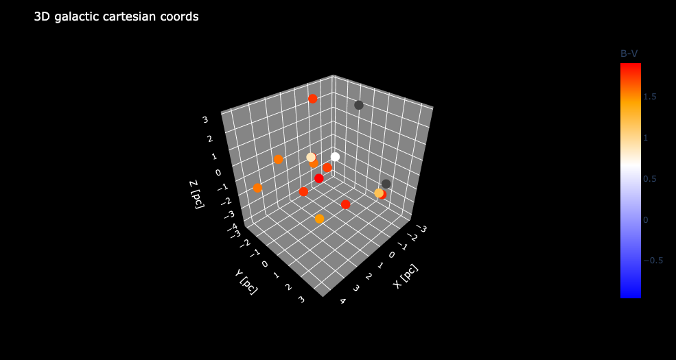
fig = px.scatter_3d(datap,x = x, y = y, z = z, color=datap['B-V'],
                    color_continuous_scale= xRGB,
                    color_continuous_midpoint=0)
fig.show()数据,是熊猫df,我正在尝试应用调色板。我正在绘制恒星的位置,我想要它们的颜色来表示温度。逻辑是:星B-V颜色索引列(datap[B-V]) ->计算温度->从温度计算RGB ->应用该颜色
我所犯的错误:
Invalid value of type 'builtins.dict' received for the 'colorscale' property of make_figure用标准调色板绘制一个示例,该调色板巧妙地工作,但不表示我正在尝试实现的色温相关性:
fig = px.scatter_3d(datap,x = x, y = y, z = z, color=datap['B-V'],
                     color_continuous_scale=px.colors.diverging.Spectral_r,
                     color_continuous_midpoint= 0,
                     hover_data=(['Name','magV']))
fig.show()
,我希望B调色板作为第一个png中的示例。
回答 1
Stack Overflow用户
发布于 2022-08-27 16:14:43
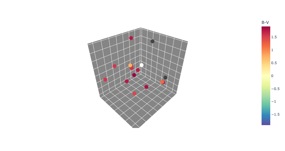
这是我所能得到的最好的代表:
找到调色板的蓝端和红端
redEnd = f"rgb{tuple(dCpd['pallete'][0])}"
blueEnd = f"rgb{tuple(dCpd['pallete'].values[-1])}"
检查:
print(f"'{redEnd}'")
print(f"'{blueEnd}'")
印刷:
'rgb(1.0, 0.2663545845364998, 0.0)'
'rgb(0.7100281129287552, 0.8043951737139605, 1.0)'
以巧妙的方式将这些值传递给连续的颜色表示:
fig = px.scatter_3d(datap,x = x, y = y, z = z, color=datap['B-V'],

                       color_continuous_scale= [[0,blueEnd],
                                                [0.566,'white'],
                                                [0.833,'orange'],
                                                [1,redEnd]],
                       color_continuous_midpoint=0.4759,
                        hover_data=(['Name','magV','Temperature']))
结果:忽略白色恒星(即我们的太阳,为了便于识别)和2颗深灰色恒星(没有B和温度计算的数据)。
页面原文内容由Stack Overflow提供。腾讯云小微IT领域专用引擎提供翻译支持
原文链接:
https://stackoverflow.com/questions/73506933
复制相关文章
相似问题
腾讯云开发者

Copyright © 2013 - 2026 Tencent Cloud. All Rights Reserved. 腾讯云 版权所有
深圳市腾讯计算机系统有限公司 ICP备案/许可证号:粤B2-20090059 ![]() 粤公网安备44030502008569号
粤公网安备44030502008569号
腾讯云计算(北京)有限责任公司 京ICP证150476号 | 京ICP备11018762号