
在同一行中添加多张卡片
在同一行中添加多张卡片
提问于 2022-08-19 11:22:17
我有这个电影应用程序在Spring,我想显示5电影卡在同一排。这就是我现在拥有的:
<div class="my-4 card-columns">
<div class="card" th:each="movie : ${listMovies}">
<a th:href="@{/movie/{id}(id=${movie.id})}">
<img class="card-img-top"
th:src="${movie.photosImagePath}"/>
</a>
<div class="card-body">
<h5 class="card-title" th:text="${movie.movieTitle}"></h5>
<p class="card-text" th:text="${movie.movieGenre}"></p>
</div>
</div>
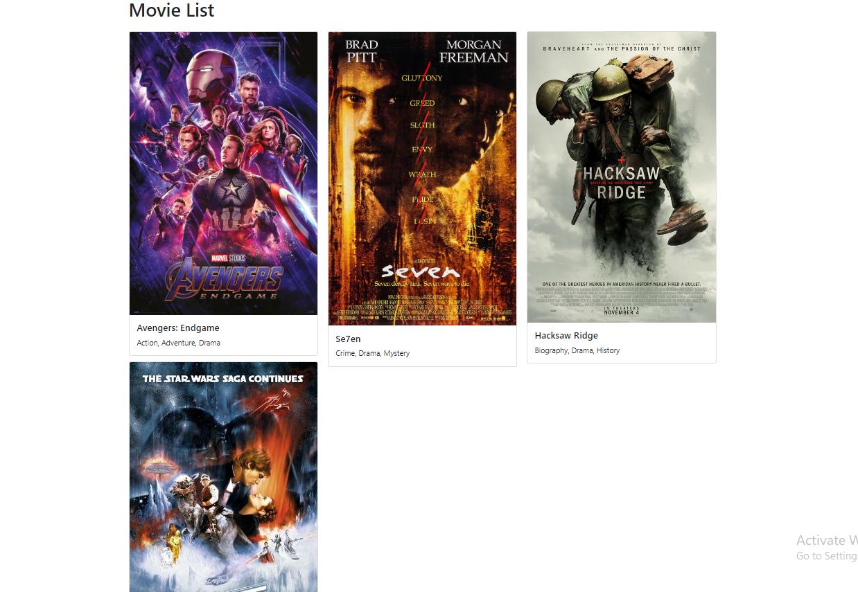
</div>这是它在本地主机上的样子:8080
回答 1
Stack Overflow用户
发布于 2022-08-19 11:51:33
以下CSS代码应该工作得很好:
.card-container{
            display: flex;
            gap: 10px; /*This feature may not work for all browsers*/
            width: 100vw; /*this is 100% percent of the screen viewable width*/
        }
        .card{
            flex-grow: 1;
        }
只需确保相应地命名类以匹配css中的类!
页面原文内容由Stack Overflow提供。腾讯云小微IT领域专用引擎提供翻译支持
原文链接:
https://stackoverflow.com/questions/73416017
复制相关文章
相似问题
腾讯云开发者

Copyright © 2013 - 2026 Tencent Cloud. All Rights Reserved. 腾讯云 版权所有
深圳市腾讯计算机系统有限公司 ICP备案/许可证号:粤B2-20090059  粤公网安备44030502008569号
腾讯云计算(北京)有限责任公司 京ICP证150476号 | 京ICP备11018762号