
在R中的facet网格中向每个图中添加特定于数据的文本。
在R中的facet网格中向每个图中添加特定于数据的文本。
提问于 2022-08-14 02:57:21
我有一个直方图,我想根据三个不同的因素对其进行分类。然后,我想在每个方面的右上角添加两行文本。文本依赖于数据,并且对于数据的每个子集都是不同的。
这里我使用Kaggle心脏病发作分析数据。我下载并解压缩数据,然后在heart.csv中读取。我将数据分为3个因素(性别,slp,exng),并在每个子集中得到最大和最小年龄。然后,我用因子来绘制年龄图。我要地块右上角的最大和最低年龄。但是,我只能知道如何在一个图中完成这个任务(不需要平面网格步骤)。
下面是代码:
# Load data
heart <- read.csv(file = 'C:/FilePath/heart.csv')


# Split data into subsets based on our three factors
hrt_grps <- heart %>%
  group_split(sex,slp,exng)

# Get the max and min within each subset (and some other stats as well)
hrt_grps_smry <- tibble::tibble()
colnames(hrt_grps_smry) <- c("sex","slp","exng", "max_d", "min_d",
                              "mean_d","t.p-val","t.conf.L","t.conf.U")


# Iterate through every element in the hrt_grps group-split and populate the rows of hrt_grps_smry df
for(i in 1:length(hrt_grps)){
  t.tst <- t.test(x = hrt_grps[[i]]$age,
                  alternative = "two.sided")

  hrt_grps_smry[i,"sex"]       <- hrt_grps[[i]]$sex[1]
  hrt_grps_smry[i,"slp"]       <- hrt_grps[[i]]$slp[1]
  hrt_grps_smry[i,"exng"]      <- hrt_grps[[i]]$exng[1]
  hrt_grps_smry[i,"max_d"]     <- max(hrt_grps[[i]]$age)
  hrt_grps_smry[i,"min_d"]     <- min(hrt_grps[[i]]$age)
  hrt_grps_smry[i,"mean_d"]    <- mean(hrt_grps[[i]]$age)
  hrt_grps_smry[i,"t.p-val"]   <- t.tst$p.value
  hrt_grps_smry[i,"t.conf.L"]  <- t.tst$conf.int[[1]]
  hrt_grps_smry[i,"t.conf.U"]  <- t.tst$conf.int[[2]]

}

# Plot single histogram with max and min in top right-hand corner (successful):
heart %>%
  # This line is because in my real data it is very important that I control the order of the facets
  mutate(across(slp,factor, levels = c(2,0,1))) %>%
  ggplot(aes(x=age)) +
  geom_histogram(bins = 35) +
 # facet_grid(sex ~ slp ~ exng) +
  geom_text(
    data = hrt_grps_smry,
    aes(x=5, y = median(density(heart$age)$y)),
    label = max(hrt_grps_smry$max_d), vjust = -35, hjust = -40,
    size = 4, angle = 0, colour = "gray10") +
  geom_text(
    data = hrt_grps_smry,
    aes(x=5, y = median(density(heart$age)$y)),
    label = min(hrt_grps_smry$min_d), vjust = -32, hjust = -40,
    size = 4, angle = 0, colour = "gray10") +
  ylab("Count")

# Plot facet-grid histogram of ages with the max and min in the top right-hand corner
heart %>%
  mutate(across(slp,factor, levels = c(2,0,1))) %>%
  ggplot(aes(x=age)) +
  geom_histogram(bins = 35) +
  facet_grid(sex ~ slp ~ exng) +
  geom_text(
    data = hrt_grps_smry,
    aes(x=5, y = median(density(heart$age)$y)),
    label = hrt_grps_smry$max_d[1], vjust = -4.1, hjust = -18,
    size = 4, angle = 0, colour = "gray10") +
  geom_text(
    data = hrt_grps_smry,
    aes(x=5, y = median(density(heart$age)$y)),
    label = hrt_grps_smry$min_d[1], vjust = -2.8, hjust = -18,
    size = 4, angle = 0, colour = "gray10") +
  ylab("Count")
我只知道如何获取第一个子集的最大值和最小值。我还没有搞清楚如何迭代子集,并将所有的图保持在同一个方面的网格ggplot对象中。
回答 1
Stack Overflow用户
回答已采纳
发布于 2022-08-14 06:34:11
据我所知,最简单的方法是在原始数据集中添加这些min_d和max_d变量,然后在geom_text中使用它们。
library(tidyverse)
# Load data
heart <- read.csv(file = 'test/heart.csv')
# calculate group wise max and min age and also create a group id variable
# which will be used later to do merging
min_max_df <- heart %>%
group_by(sex, slp, exng) %>%
summarise(
id = cur_group_id(),
max_d = max(age),
min_d = min(age),
.groups = "drop"
)
# merge the group wise min and max age with the main data by group id
heart <- heart %>%
group_by(sex, slp, exng) %>%
mutate(
id = cur_group_id()
) %>%
ungroup() %>%
left_join(
min_max_df %>% select(id, max_d, min_d),
by = "id"
)
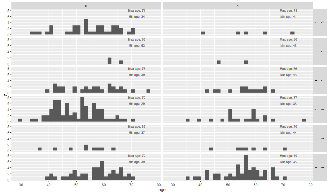
heart %>%
mutate(across(slp,factor, levels = c(2,0,1))) %>%
ggplot(aes(x=age)) +
geom_histogram(bins = 35) +
geom_text(aes(x = 72, y = 8, label = paste0("Max age: ", max_d)),
size = 3, color = colorspace::lighten("black", amount = 0.5)) +
geom_text(aes(x = 72, y = 6, label = paste0("Min age: ", min_d)),
size = 3, color = colorspace::lighten("black", amount = 0.5)) +
facet_grid(sex ~ slp ~ exng)
页面原文内容由Stack Overflow提供。腾讯云小微IT领域专用引擎提供翻译支持
原文链接:
https://stackoverflow.com/questions/73348864
复制相关文章
相似问题
腾讯云开发者

Copyright © 2013 - 2026 Tencent Cloud. All Rights Reserved. 腾讯云 版权所有
深圳市腾讯计算机系统有限公司 ICP备案/许可证号:粤B2-20090059 ![]() 粤公网安备44030502008569号
粤公网安备44030502008569号
腾讯云计算(北京)有限责任公司 京ICP证150476号 | 京ICP备11018762号