
更改条形图中的文本
我想知道如何在条形图中更改文本以表示百分比,而不是数字。我看了一下这个巧妙的库,看来我唯一能做到的方法就是使用plolty.graph_objects。有什么办法可以避免使用plotly.graph_objects吗?
编辑:我的目标是让y轴保留值,但是图表中的文本显示百分比。本质上,我想定制图表中的文本。
下面是我试图将数据放入图中的数据,它将转换为dataframe (df):
Use-Cases 2018 2019 2020 2021
0 Consumer 50 251 2123 210
1 Education 541 52 32 23
2 Government 689 444 441 456
df=pd.read_excel('Book1.xlsx')
df=df.transpose()
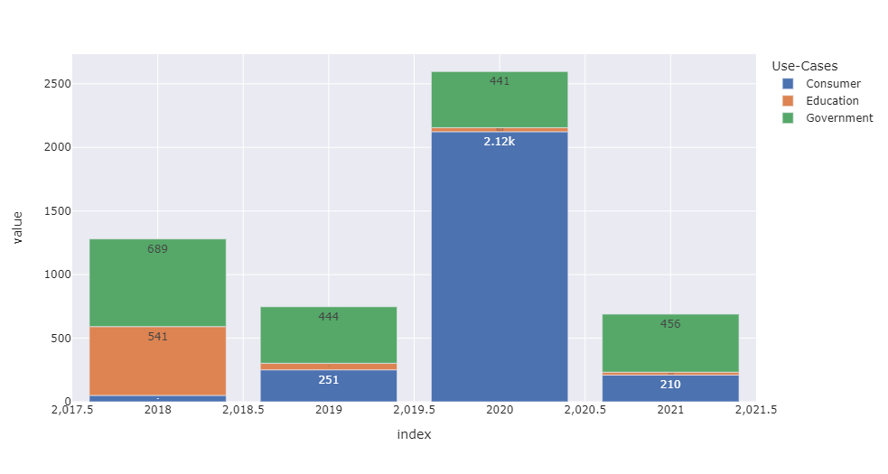
fig=px.bar(df,template='seaborn',text_auto='.3s')
fig.show()
回答 2
Stack Overflow用户
发布于 2022-08-10 22:29:58
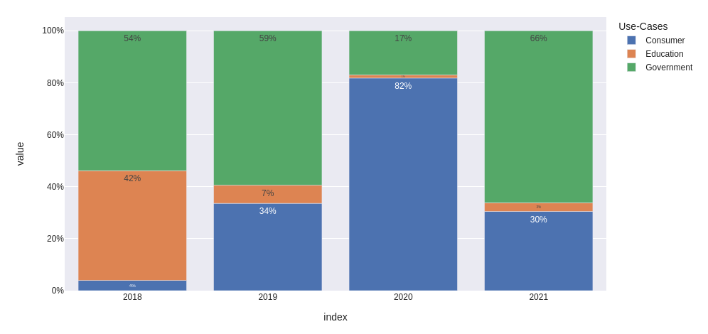
我会转换数据,然后将文本和Y标签格式化为.0%。另外,我会将x轴类型更改为分类,以避免表示中间值。
from io import StringIO
import pandas as pd
import plotly.express as px

data='''
    Use-Cases   2018    2019    2020    2021
0   Consumer    50      251     2123    210
1   Education   541     52      32      23
2   Government  689     444     441     456
'''

df = pd.read_csv(StringIO(data), sep='\s+').set_index('Use-Cases')

fig = px.bar(
    (df / df.sum()).T,
    template='seaborn',
    text_auto='.0%',
)

fig.update_layout(
    xaxis={
        'type': 'category',
        'showgrid': False,
    },
    yaxis={
        'tickformat': '.0%'
    }
)

fig.show()
更新:如何为每个栏单独修改文本
让我们使用与上面相同的数据框架df,并准备一个百分比表(我们将使用它单独更新每个栏的文本):
percentage = (df / df.sum()).applymap(lambda x: f'{x:.0%}')创建要绘制的图形:
fig = px.bar(
    df.T,
    template='seaborn',
    barmode='group',
    title='Value and Percentage over years'
)

fig.update_xaxes(
    type='category',
    showgrid=False,
)使用跟踪对每个用例进行迭代,并对它们应用单独的text值:
fig.for_each_trace(
    lambda trace: trace.update(text=percentage.loc[trace.name])
)

fig.update_traces(
    textposition='outside'
    texttemplate='%{text}'
    # use '%{y}<br>%{text}' to show values and percentage together
)下面是我的输出,包括悬停数据和texttemplate='%{y}<br>%{text}'
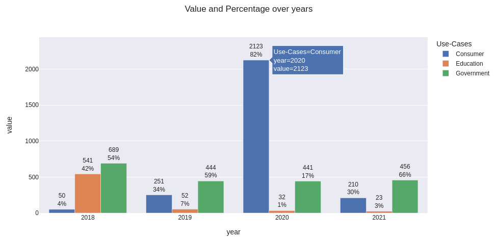
获得相同情节的完整代码
(注释barmode='group'以获得相对表示)
from io import StringIO
import pandas as pd
import plotly.express as px

data='''
    Use-Cases   2018    2019    2020    2021
0   Consumer    50      251     2123    210
1   Education   541     52      32      23
2   Government  689     444     441     456
'''

df = pd.read_csv(StringIO(data), sep='\s+').set_index('Use-Cases').rename_axis(columns='year')

fig = px.bar(
    df.T,
    template='seaborn',
    barmode='group',
    title='Value and Percentage over years'
)

fig.update_xaxes(
    type='category',
    showgrid=False,
)

fig.update_yaxes(
    range=[0, 1.15*df.values.max()]
)

percentage = (df / df.sum()).applymap(lambda x: f'{x:.0%}')
fig.for_each_trace(lambda trace: trace.update(text=percentage.loc[trace.name]))

fig.update_traces(
    texttemplate='%{y}<br>%{text}',   # use '%{text}' to show only percentage
    textposition='outside'
)

fig.show()Stack Overflow用户
发布于 2022-08-12 09:59:55
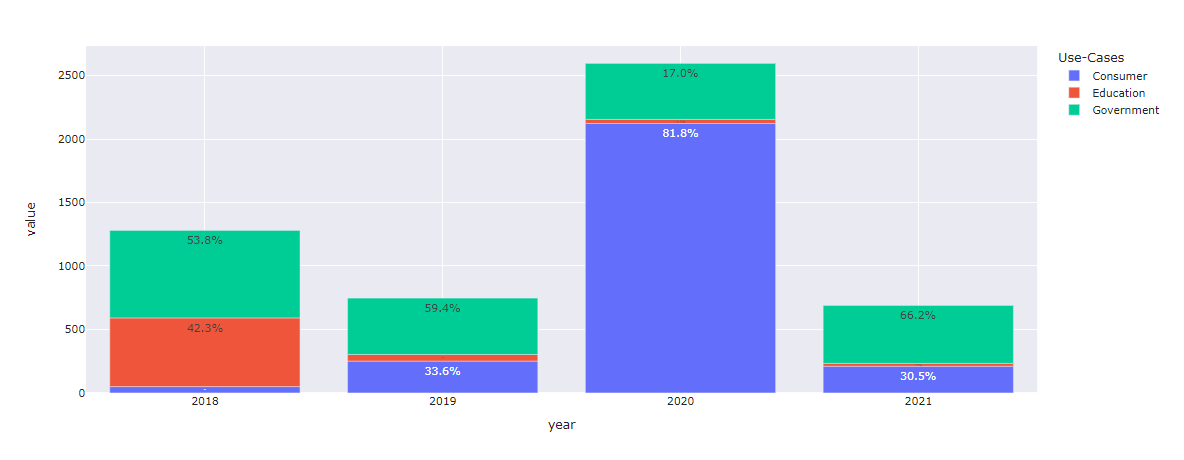
实际上,当数据格式是长格式时,表达式通常更容易。然后,您可以使用text kwarg来指定每个栏上的文本。
from io import StringIO
import pandas as pd
import plotly.express as px

data='''
    Use-Cases   2018    2019    2020    2021
0   Consumer    50      251     2123    210
1   Education   541     52      32      23
2   Government  689     444     441     456
'''

df = pd.read_csv(StringIO(data), sep='\s+')

# Go from a wide to long dataframe using melt
df = pd.melt(df, id_vars=[ 'Use-Cases'], value_vars=['2018', '2019', '2020', '2021'])
df = df.rename(columns={ 'variable': 'year'})

# get totals for each year so the percent calculation can be done
aggregated_df = df[[ 'value', 'year']].groupby(['year']).agg(['sum']).reset_index()
aggregated_df.columns = ['year', 'value_sum']
df = pd.merge(df, aggregated_df, on=['year'], how='left')

# Caclulate percents and format the column
df['percent'] = (df['value']/df['value_sum']*100).round(1).astype(str) + "%"
df
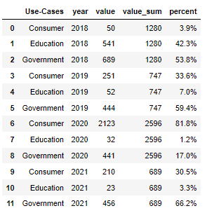
fig = px.bar(
    df,
    x = 'year',
    y = 'value',
    color = 'Use-Cases',
    text = 'percent',
    barmode = 'relative',
                    )
fig.update_layout(template='seaborn')
https://stackoverflow.com/questions/73312960
复制相似问题
腾讯云开发者

Copyright © 2013 - 2026 Tencent Cloud. All Rights Reserved. 腾讯云 版权所有
深圳市腾讯计算机系统有限公司 ICP备案/许可证号:粤B2-20090059 ![]() 粤公网安备44030502008569号
粤公网安备44030502008569号
腾讯云计算(北京)有限责任公司 京ICP证150476号 | 京ICP备11018762号