
ggplot + maptools + ggmap:颜色梯度?
ggplot + maptools + ggmap:颜色梯度?
提问于 2022-08-10 14:36:53
我有以下数据框架:
pacman::p_load(maptools, ggplot2, raster, ggmap)

df <- tribble( ~ country,   ~ maternity_leave,
               "Argentina",               390,
               "Bahamas",                 390,
               "Barbados",                360,
               "Belize",                  420,
               "Bolivia",                 390,
               "Brazil",                  510,
               "Chile",                   540,
               "Colombia",                540,
               "Costa Rica",              510,
               "Dominican Republic",      420,
               "Ecuador",                 360,
               "El Salvador",             480,
               "Guatemala",               360,
               "Guyana",                  390,
               "Haiti",                   360,
               "Honduras",                240,
               "Jamaica",                 240,
               "Mexico",                  360,
               "Nicaragua",               360,
               "Panama",                  420,
               "Paraguay",                540,
               "Peru",                    420,
               "Suriname",                480,
               "Trinidad and Tobago",     420,
               "Venezuela",               780)

countries <- maternity_leave %>%
  pull(country)

map <- borders("world", regions = countries, fill = "grey70", colour = "black")

ggplot() +
  map +
  xlab("Longitude (decimals)") +
  ylab("Latitude (decimals)") +
  theme(panel.border = element_blank(),
        panel.grid.major = element_line(colour = "grey80"),
        panel.grid.minor = element_blank())
但是我想使用变量maternity_leave作为颜色梯度的基,我不知道怎么做。我试图更改map函数以及scale_colour_gradient2和sacale_fill_gradient2,但没有成功。
我很感激你的帮助!
回答 1
Stack Overflow用户
发布于 2022-08-10 15:05:22
我用tmap来获取世界数据。对我来说,它工作得更快更清晰。
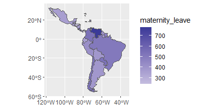
我将您的df data.frame与tmap中提供的World信息一起加入,使其只包含在data.frame中的国家,但添加了maternity_leave列。然后,您可以使用这个列作为geom_sf中的填充。除非您想要指定不同的配色方案,否则并不真正需要scale_fill_函数。
library(ggplot2)
library(tmap)
library(dplyr)

data("World")
map_data <- World %>%
  inner_join(df, by = c("name" = "country"))

ggplot(map_data) +
  geom_sf(aes(fill = maternity_leave)) +
  scale_fill_gradient2() # not really needed but gives different colors.
页面原文内容由Stack Overflow提供。腾讯云小微IT领域专用引擎提供翻译支持
原文链接:
https://stackoverflow.com/questions/73308226
复制相关文章
相似问题
腾讯云开发者

Copyright © 2013 - 2026 Tencent Cloud. All Rights Reserved. 腾讯云 版权所有
深圳市腾讯计算机系统有限公司 ICP备案/许可证号:粤B2-20090059 ![]() 粤公网安备44030502008569号
粤公网安备44030502008569号
腾讯云计算(北京)有限责任公司 京ICP证150476号 | 京ICP备11018762号