
Css渐变实现2色虚线边框
Css渐变实现2色虚线边框
提问于 2022-08-10 10:55:56
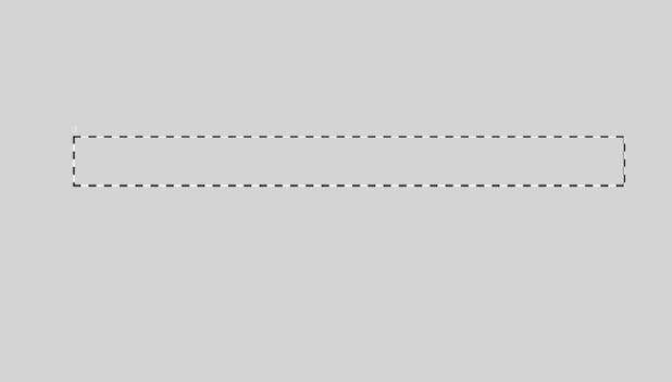
任何想法如何在css中使用渐变来实现自定义边框,看上去就像下面的图像
回答 3
Stack Overflow用户
回答已采纳
发布于 2022-08-10 11:34:11
在实心边框上添加虚线边框。
body {
  background: #ccc;
}
div {
   width: 200px;
   height: 50px;
   border: 2px solid #fff;
   position: relative;
}
div::after {
    content: "";
    position: absolute;
    width: 100%;
    height: 100%;
    border: 2px dashed black;
    margin: -2px;
}<div></div>
Stack Overflow用户
发布于 2022-08-10 11:09:10
梯度与掩码相结合可以做到这一点:
.box {
  width: 300px;
  height: 200px;
  position: relative;
}
.box:before {
  content:"";
  position: absolute;
  inset:0;
  padding: 4px; /* the border thickness */
  background:
   repeating-conic-gradient(pink 0 25%,blue 0 50%) /* update the colors here */
   0 0/30px 20px round; /* update the size here (30px = width, 20px = height) */
  -webkit-mask:
    linear-gradient(#000 0 0) content-box,
    linear-gradient(#000 0 0);
  -webkit-mask-composite: xor;
          mask-composite: exclude;
}<div class="box"></div>
Stack Overflow用户
发布于 2022-08-10 11:10:28
您能在div中放置div吗?如:https://jsfiddle.net/sdfpe5w9/
<div class="outer">
    <div class="inner"></div>
</div>body {
background: #999;
}
.outer {
background: white;
border: 2px dashed #000;
display: inline-block;
}
.inner {
width: 200px;
height: 100px;
background: #999;
}页面原文内容由Stack Overflow提供。腾讯云小微IT领域专用引擎提供翻译支持
原文链接:
https://stackoverflow.com/questions/73305041
复制相关文章
相似问题
腾讯云开发者

Copyright © 2013 - 2026 Tencent Cloud. All Rights Reserved. 腾讯云 版权所有
深圳市腾讯计算机系统有限公司 ICP备案/许可证号:粤B2-20090059  粤公网安备44030502008569号
腾讯云计算(北京)有限责任公司 京ICP证150476号 | 京ICP备11018762号