
是否有一个R函数来创建一个图表,在y轴上显示多个变量,在x轴上显示多个变量?
是否有一个R函数来创建一个图表,在y轴上显示多个变量,在x轴上显示多个变量?
提问于 2022-08-08 12:22:34
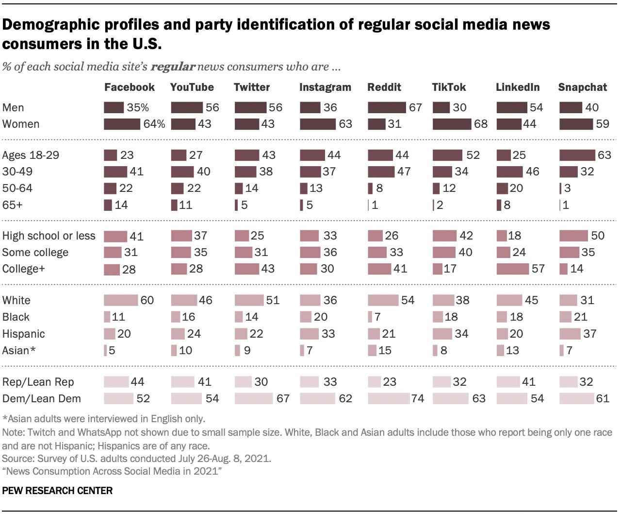
我试图创建一个类似于Kevin创建的图表(见下文)。
我在R图库上找不到接近这张图的任何东西。所以,我只想问你们有没有办法。这意味着x轴上有多个变量(如社交媒体平台),y轴上有多个变量及其表达式。据我所知,您只能使用ggplt()创建图形,在一个轴上显示多个变量,但不能同时在两个轴上显示多个变量。
你能看到一个创造类似情节的机会吗?或者你可能有一个例子?
我在想也许可以用这个:https://r-graph-gallery.com/web-horizontal-barplot-with-labels-the-economist.html
最好的,格蒂
回答 1
Stack Overflow用户
回答已采纳
发布于 2022-08-08 13:08:13
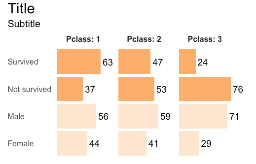
下面是使用titanic数据集复制类似内容的尝试:
library(tidyverse)
library(titanic)

#Prepare the data set
titanic_train %>%
  select(Survived, Pclass, Sex) %>%
  mutate(Survived = ifelse(Survived == 1, "Survived", "Not survived"),
         Sex = ifelse(Sex == "male", "Male", "Female")) %>%
  pivot_longer(-Pclass) %>%
  group_by(Pclass, name, value) %>%
  summarise(count = n()) %>%
  mutate(perc = count/sum(count)) %>%
  ungroup() %>%

# The plot
  ggplot(aes(x = value, y = perc * 100, fill = name, label = round(perc*100, 0))) +
  geom_bar(stat = "identity") +
  geom_text(hjust = -.2, size = 5) +
  labs(title = "Title", subtitle = "Subtitle") +
  coord_flip(clip = "off") +
  facet_grid(~ Pclass, labeller = label_both) +
  theme_minimal() +
  scale_fill_brewer(palette = 7, guide = "none") +
  theme(axis.title.y = element_blank(),
        axis.title.x = element_blank(),
        axis.text.x = element_blank(),
        axis.text.y = element_text(hjust = 0, size = 12),
        panel.grid = element_blank(),
        plot.title = element_text(size = 22),
        plot.subtitle = element_text(size = 15),
        strip.text = element_text(face = "bold", size = 12),
        plot.title.position = "plot")
页面原文内容由Stack Overflow提供。腾讯云小微IT领域专用引擎提供翻译支持
原文链接:
https://stackoverflow.com/questions/73277818
复制相关文章
相似问题
腾讯云开发者

Copyright © 2013 - 2026 Tencent Cloud. All Rights Reserved. 腾讯云 版权所有
深圳市腾讯计算机系统有限公司 ICP备案/许可证号:粤B2-20090059  粤公网安备44030502008569号
腾讯云计算(北京)有限责任公司 京ICP证150476号 | 京ICP备11018762号