
在R中显示问题排序答案
在R中显示问题排序答案
提问于 2022-08-04 19:23:31
我有以下变量,这是一个排名问题的结果。在这个问题上,参与者得到了列出的7种动机,并对它们进行了排序。在这里,值1表示参与者将动机放在第1位置,而值7表示他将动机放在最后位置。排名是通过这些变量上的数字(数字1到7)表示的:
'data.frame':   25 obs. of  8 variables:
 $ id                       : num  8 9 10 11 12 13 14 15 16 17 ...
 $ motivation_quantity      : num  NA 3 1 NA 3 NA NA NA 1 NA ...
 $ motivation_quality       : num  NA 1 6 NA 3 NA NA NA 3 NA ...
 $ motivation_timesaving    : num  NA 6 4 NA 2 NA NA NA 5 NA ...
 $ motivation_contribution  : num  NA 4 2 NA 1 NA NA NA 2 NA ...
 $ motivation_alternativelms: num  NA 5 3 NA 6 NA NA NA 7 NA ...
 $ motivation_inspiration   : num  NA 2 7 NA 4 NA NA NA 4 NA ...
 $ motivation_budget        : num  NA 7 5 NA 7 NA NA NA 6 NA ...
我现在要做的是计算和可视化排名问题的结果(即可视化结果的动机)。因为我已经很长时间没有和R一起工作了,所以我不知道如何最好地做到这一点。
我可以想象的一种方法是首先计算出前三名的答案(这是最常在"1“、"2”和"3“的位置上对参与者进行排名的动机。如果有人能帮忙做这件事,甚至展示更好的方法来分析和可视化我的数据,我会非常感激的。
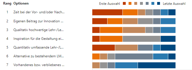
我最初在microsoft中有一个可视化,但是这个在一夜之间就被一个bug破坏了。看起来是这样的:
回答 1
Stack Overflow用户
发布于 2022-08-19 11:53:00
这些变量由RStudio定义为数值变量(在统计术语中它指的是连续变量)。其目标是将它们转换为分类变量(在RStudio中称为因素)。
我们开始工作吧:
library(dplyr)
library(tidyr)

# lets us first convert the id column into integers so we can apply mutate_if on the other numeric factors and convert all of them into factors (categorical variables), we shall name your dataframe (df)

df$id <- as.integer(df$id)


# and now let's apply mutate_if to convert all the other variables (numeric) into factors (categorical variables).

df <- df %>% mutate_if(is.numeric,factor,
                     levels = 1:7)

# I guess in your case that would be all, but if you wanted the content of the dataframe to be position_1, position_2 ...position_7, we just add labels like this :

df <- df %>% mutate_if(is.numeric,factor,
                     levels = 1:7,
                     labels = paste(rep("position",7),1:7,sep="_"))


# For the visualisation now, we need to use the function gather in order to convert the df dataframe into a two column dataframe (and keeping the id column), we shall name this new dataframe df1

df1 <- df %>% gather(key=Questions, value=Answers, motivation_quantity:motivation_budget,-id  )


# the df1 dataframe now includes three columns : the id column - the Questions columns - the Answers column.
# we can now apply the ggplot function on the new dataframe for the visualisation

# first the colours

colours <- c("firebrick4","firebrick3", "firebrick1", "gray70", "blue", "blue3" ,"darkblue")


# ATTENTION since there are NAs in your dataframe, either you can recode them as zeros or delete them (for the visualisation) using the subset function within the ggplot function as follows :

ggplot(subset(df1,!is.na(Answers)))+
  aes(x=Questions,fill=Answers)+
  geom_bar()+
  coord_flip()+
  scale_fill_manual(values = colours) +
  ylab("position_levels")

# of course you can enter many modifications into the visualisation but in total I think that's what you need.页面原文内容由Stack Overflow提供。腾讯云小微IT领域专用引擎提供翻译支持
原文链接:
https://stackoverflow.com/questions/73241290
复制相关文章
相似问题
腾讯云开发者

Copyright © 2013 - 2026 Tencent Cloud. All Rights Reserved. 腾讯云 版权所有
深圳市腾讯计算机系统有限公司 ICP备案/许可证号:粤B2-20090059 ![]() 粤公网安备44030502008569号
粤公网安备44030502008569号
腾讯云计算(北京)有限责任公司 京ICP证150476号 | 京ICP备11018762号