
Echarts4r的barplot值为0以外。
Echarts4r的barplot值为0以外。
提问于 2022-07-08 12:28:13
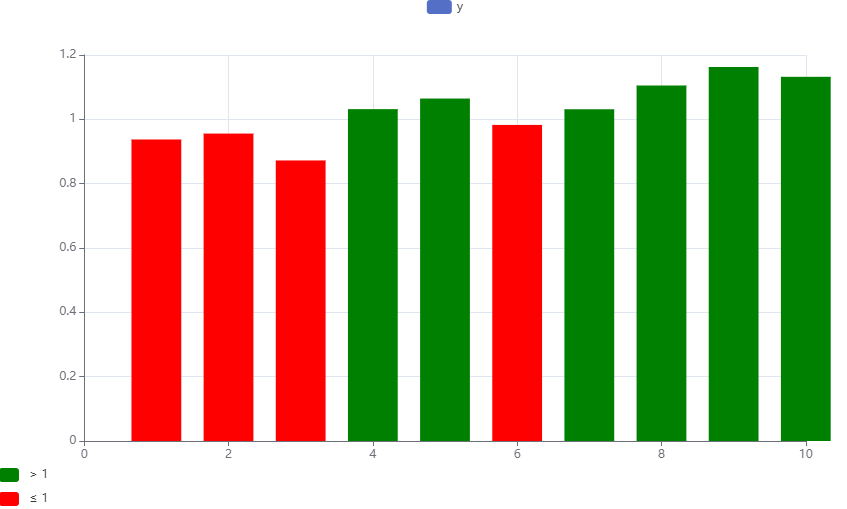
我想使用echarts4r来绘制一个条形图,其中一个截止点上方的值是绿色的,下面是红色的,而条形图是从这个值开始的。如果截止值为0,我们可以使用提供的答案( here ),对于其他值(如下面的示例中的1),这样做的效果并不好,因为条形图总是从零开始。有什么方法可以让酒吧从其他值开始吗?
见下文MWE:
library(echarts4r)
set.seed(1)
df <- data.frame(
  x = 1:10,
  y = 1 + cumsum(rnorm(10, 0, 0.1))
)
df %>%
  e_charts(x) %>%
  e_bar(y) %>%
  e_visual_map(
    type = "piecewise",
    pieces = list(
      list(
        gt = 1,
        color = "green"
      ),
      list(
        lte = 1,
        color = "red"
      )
    )
  )
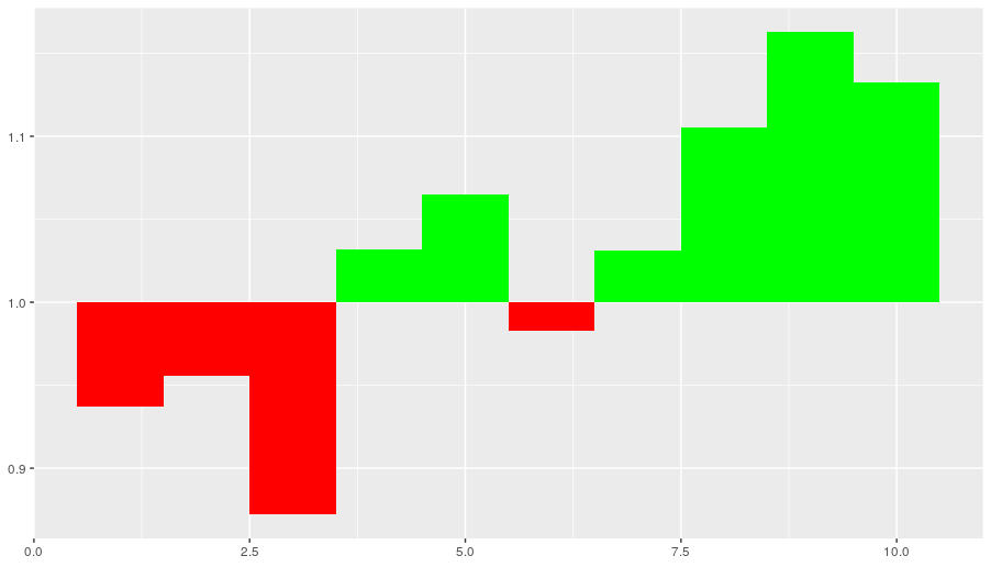
使用ggplot2,我会这样做
library(ggplot2)
CUTOFF <- 1
df$color <- ifelse(df$y > CUTOFF, "green", "red")
ggplot(df, aes(xmin = x - 0.5, xmax = x + 0.5,
               ymin = CUTOFF, ymax = y, fill = I(color))) +
  geom_rect()
回答 3
Stack Overflow用户
回答已采纳
发布于 2022-07-08 13:44:20
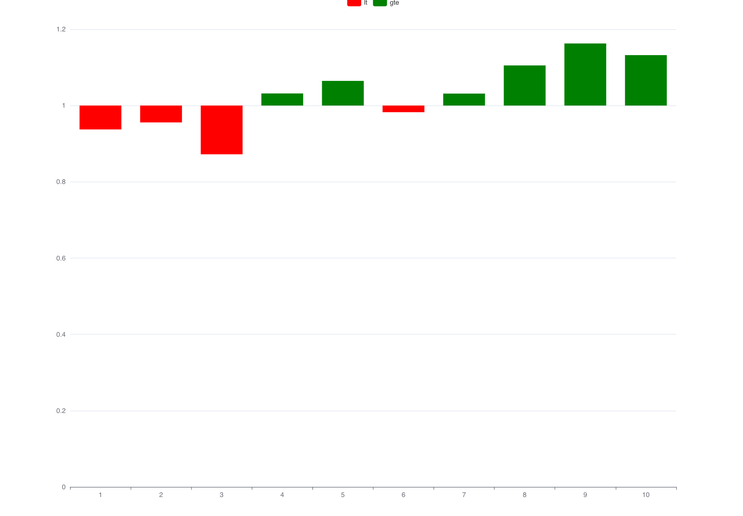
要达到您想要的结果,一个选项是使用一些辅助列来使用堆叠条形图。基本上,我使用一个透明的底部栏,在上面我添加了两个条子,反映了下面和上面的截断值。
注意:我必须将x列转换为一个因子,因为否则我得到的x轴范围高达20。
library(echarts4r)
library(dplyr)

set.seed(1)

df <- data.frame(
  x = 1:10,
  y = 1 + cumsum(rnorm(10, 0, 0.1))
)

df |>
  mutate(x = factor(x),
         bottom = ifelse(y < 1, y, 1),
         lt = ifelse(y < 1, 1 - y, 0),
         gte = ifelse(y < 1, 0, y - 1)) |>
  e_charts(x) |>
  e_bar(bottom, stack = "x", itemStyle = list(color = "transparent", barBorderColor  = "transparent"), legend = FALSE) |>
  e_bar(lt, stack = "x") |>
  e_bar(gte, stack = "x") |>
  e_color(c("red", "green"))
Stack Overflow用户
发布于 2022-07-12 09:22:33
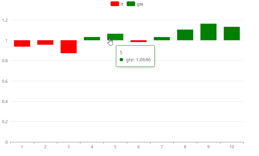
作为@stefans完美工作解决方案的补充,我添加了以下JS代码,以使工具提示也能工作。
也就是说,不可见的底部条没有工具提示,而对lt和gte值进行了调整以显示正确的值:
# ... construct df as shown above

tip <- htmlwidgets::JS("
function(params, ticket, callback) {
        var fmt = new Intl.NumberFormat('en', {\"style\":\"decimal\",\"minimumFractionDigits\":4,\"maximumFractionDigits\":4,\"currency\":\"USD\"});
        var idx = 0;
        if (params.name == params.value[0]) {
            idx = 1;
        }
        if (params.seriesName == \"bottom\") return '';

        var v = params.value[idx];
        if (params.seriesName == \"lt\") {
          v = 1 - v;
        } else {
          v = v * 1 + 1;
        }
        return params.value[0] + '<br>' +
               params.marker + ' ' +
               params.seriesName + ': ' + fmt.format(parseFloat(v));
    }
")
custom_e_tooltip <- structure(tip, class = c("JS_EVAL", "item_formatter"))


df |>
  mutate(x = factor(x),
         bottom = ifelse(y < 1, y, 1),
         lt = ifelse(y < 1, 1 - y, 0),
         gte = ifelse(y < 1, 0, y - 1)) |>
  e_charts(x) |>
  e_bar(bottom, stack = "x", itemStyle = list(color = "transparent", barBorderColor  = "transparent"), legend = FALSE) |>
  e_bar(lt, stack = "x") |>
  e_bar(gte, stack = "x") |>
  e_tooltip(formatter = custom_e_tooltip) |>  #< This is new here!
  e_color(c("red", "green"))
Stack Overflow用户
发布于 2022-07-12 12:48:41
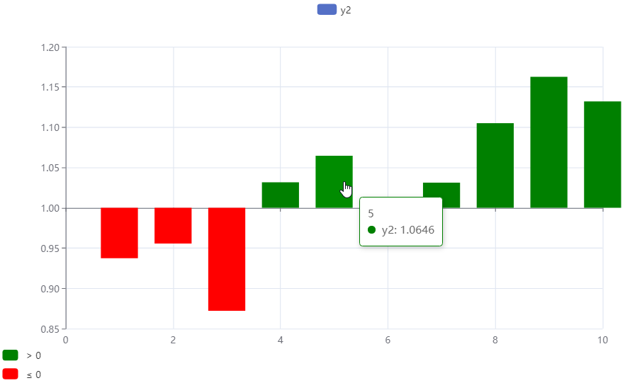
另一种解决方案是通过偏移量移动值,然后将y轴和工具提示中的值相加。这个解决方案允许y轴也不从0开始(例如,如果偏离1的偏差很小,那么显示0可能没有多大意义)。
library(echarts4r)
library(dplyr)

## Create custom axis/tooltip formatter
tip <- htmlwidgets::JS("
function(value, index) {
  var fmt = new Intl.NumberFormat('en', {\"style\":\"decimal\",\"minimumFractionDigits\":2,\"maximumFractionDigits\":2,\"currency\":\"USD\"});
  return fmt.format(value + 1);
}")
custom_axis_formatter <- structure(tip, class = c("JS_EVAL", "item_formatter"))


tip2 <- htmlwidgets::JS("
function(params, ticket, callback) {
        var fmt = new Intl.NumberFormat('en', {\"style\":\"decimal\",\"minimumFractionDigits\":4,\"maximumFractionDigits\":4,\"currency\":\"USD\"});
        return params.value[0] + '<br>' +
               params.marker + ' ' +
               params.seriesName + ': ' + fmt.format(parseFloat(params.value[1] + 1));
    }
")
custom_e_tooltip <- structure(tip2, class = c("JS_EVAL", "item_formatter"))

## Create the dataset
set.seed(1)
df <- data.frame(
  x = 1:10,
  y = 1 + cumsum(rnorm(10, 0, 0.1))
)

# offset everything by 1
df$y2 <- df$y - 1

df |>
  e_charts(x) |>
  e_bar(y2) |>
  e_tooltip() |>
  e_y_axis(formatter = custom_axis_formatter) |>
  e_tooltip(formatter = custom_e_tooltip) |>
  e_visual_map(
    type = "piecewise",
    pieces = list(list(gt = 0, color = "green"),
                  list(lte = 0, color = "red"))
  )
页面原文内容由Stack Overflow提供。腾讯云小微IT领域专用引擎提供翻译支持
原文链接:
https://stackoverflow.com/questions/72911432
复制相关文章
相似问题
腾讯云开发者

Copyright © 2013 - 2026 Tencent Cloud. All Rights Reserved. 腾讯云 版权所有
深圳市腾讯计算机系统有限公司 ICP备案/许可证号:粤B2-20090059 ![]() 粤公网安备44030502008569号
粤公网安备44030502008569号
腾讯云计算(北京)有限责任公司 京ICP证150476号 | 京ICP备11018762号