
使用dplyr/ ggplot创建频率表和图表直方图
使用dplyr/ ggplot创建频率表和图表直方图
提问于 2022-07-05 15:36:34
我是新的管道和dplyr在R和需要一些帮助。请注意-我有一个解决这个问题使用剪切功能。
我想用dplyr解决这个问题。我希望使用dplyr来创建一个频率表(不想存储这个频率表),并使用ggplot绘制数据。
问题:我有两个传感器的数据-参考数据和传感器数据(这是我正在评估的传感器)。传感器数据是分类数据(1或2或3)。我试图为不同的参考值绘制传感器状态直方图。例如:当参考值为1-5时,我希望看到传感器1状态(1、2或3)的频率分布。同样,对于6-10个参考数据和95-100个参考值,我想要传感器状态的频率分布。请参阅下面的样本数据。感谢你的帮助。
dput(sample1)
structure(list(test_data = c(1.2, 0.2, 0.6, 1.6, 1, 1, 0.4,
0.4, 0.8, 0.8, 0.4, 0.2, 15.8, 59.2, 55.4, 54.8, 54.6, 54.2,
49, 53, 47.2, 44, 40.2, 39, 34.2, 35.8, 33.4, 30.6, 29.4, 29.2,
27.6, 24.8, 24, 22, 21.2, 20.6, 18.6, 18, 17, 17.2, 14.8, 15.2,
13.2, 13.4, 12, 11.8, 11, 10.8, 10, 9.2, 8.8, 8.8, 8.4, 7.8,
7.6, 6.6, 6.4, 6.2, 6, 5.8, 5.4, 5, 4.8, 4.4, 4.2, 4, 3.8, 3.6,
3.6, 3.6, 3, 2.8, 3, 2.8, 2.6, 2.4, 2.4, 2.2, 2, 2.2, 2.2, 1.8,
1.8, 1.6, 1.8, 1.8, 2.2, 71.2, 75.8, 74.6, 74.6, 74.2, 67.2,
66.2, 60.6, 60.6, 54.8, 53.6, 48.4, 45.2), status = c(1,
1, 1, 1, 1, 1, 1, 1, 1, 1, 1, 1, 1, 1, 3, 3, 3, 3, 3, 3, 3, 3,
3, 3, 3, 3, 3, 3, 3, 3, 3, 3, 3, 2, 2, 2, 2, 2, 2, 2, 2, 2, 2,
2, 2, 2, 2, 1, 1, 1, 1, 1, 1, 1, 1, 1, 1, 1, 1, 1, 1, 1, 1, 1,
1, 1, 1, 1, 1, 1, 1, 1, 1, 1, 1, 1, 1, 1, 1, 1, 1, 1, 1, 1, 1,
1, 1, 1, 3, 3, 3, 3, 3, 3, 3, 3, 3, 3, 3, 3)), row.names = 113:212, class = "data.frame")回答 2
Stack Overflow用户
发布于 2022-07-05 16:13:06
library(dplyr)
library(ggplot2)
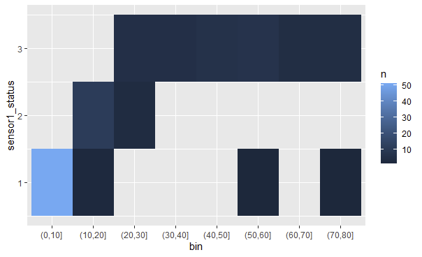
dat %>%
mutate(bin = cut(dusttrak_conc, breaks=seq(0,100,by=10))) %>%
count(bin, sensor1_status) %>%
ggplot(aes(bin, sensor1_status)) +
geom_tile(aes(fill = n))
Stack Overflow用户
发布于 2022-07-07 12:44:08
这里没有必要使用dplyr:
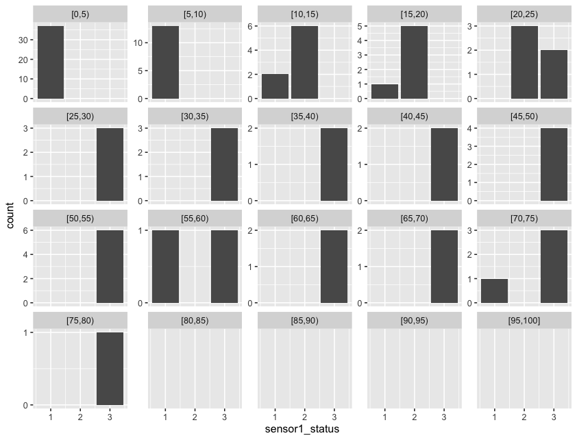
library('ggplot2')

# create ggplot; specify data frame and x-axis variable
ggplot(sample1, aes(x = sensor1_status)) +

  # geom_bar() counts the number of cases at each x position
  geom_bar(stat = "count") +

  # facet_wrap() creates a square-ish grid of multiple panels
  # - facets defines the "grouping" per panel; cut creates the bins
  # - scales chooses to keep all x/y-axes the same or not
  # - drop chooses if empty groups should be dropped
  facet_wrap(facets = vars(reference_bin = cut(dusttrak_conc, seq(0,100,5), right = F, include.lowest = T)),
             scales = "free_y",
             drop = F) +

  # format y axis: desire ± 4 ticks; round() + unique() to prevent fractions on the ticks
  # I used (the new base R) piping because you were interested in it :)
  scale_y_continuous(breaks=\(x) pretty(x, n = 4) |> round() |> unique() )
页面原文内容由Stack Overflow提供。腾讯云小微IT领域专用引擎提供翻译支持
原文链接:
https://stackoverflow.com/questions/72872090
复制相关文章
相似问题
腾讯云开发者

Copyright © 2013 - 2026 Tencent Cloud. All Rights Reserved. 腾讯云 版权所有
深圳市腾讯计算机系统有限公司 ICP备案/许可证号:粤B2-20090059 ![]() 粤公网安备44030502008569号
粤公网安备44030502008569号
腾讯云计算(北京)有限责任公司 京ICP证150476号 | 京ICP备11018762号