
ggmap图例未显示
ggmap图例未显示
提问于 2022-07-01 20:39:52
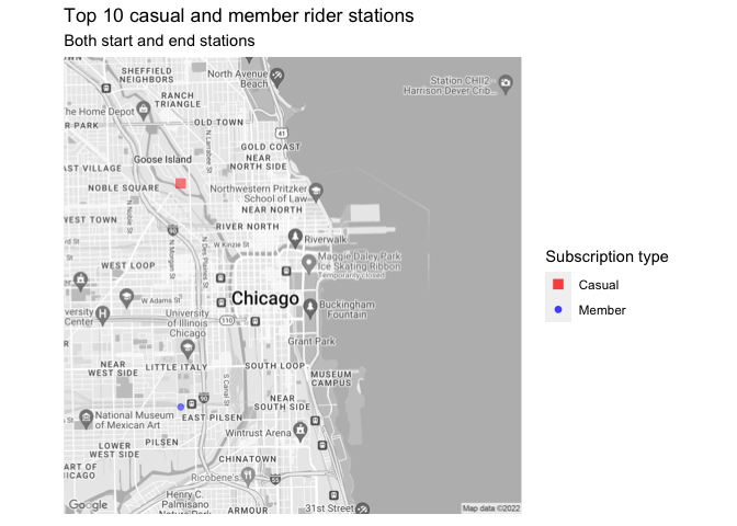
我有两个数据记录,两个记录前10个站的骑手去了。一个是休闲骑手,另一个是会员骑手。这两种数据都包含“工作站”、“freq”、“纬度”、“经度”列。我可以用ggmap来绘制图表,从两个数据中显示站的位置,但不能显示传奇。R条如下所示:
library(ggplot2)
library(rstudioapi)
library(ggmap)

map_location <- c (lon =  -87.623177, lat = 41.881832)

chicago_map_zoom <- get_map (location = map_location,
                        maptype = 'roadmap',
                        color='bw',
                        source='google',
                        zoom=13,
)

chicago_plot <- ggmap(chicago_map_zoom) +
  geom_point (data = casual_top_station,
              aes (x = longitude,
                   y = latitude),
              color = "red",
              shape = 15,
              alpha = 0.5,
              size = 3) +
  geom_point (data = member_top_station,
              aes (x = longitude,
                   y = latitude),
              color = "blue",
              shape = 16,
              alpha = 0.5,
              size = 2) +
  scale_color_identity (name = "Subscription type",
                        breaks = c("red","blue"),
                        labels = c("Casual","Member"),
                        guide = "legend") +
  theme (axis.ticks = element_blank(),
         axis.text = element_blank(),
         axis.title = element_blank()) +
  labs (title = "Top 10 casual and member rider stations",
subtitle = "Both start and end stations")结果图:地图
回答 1
Stack Overflow用户
回答已采纳
发布于 2022-07-02 08:20:23
而不是使用scale_color_identity。为了设置颜色、形状和大小的值,我建议首先将id列设置为data.frames,然后将其映射到aes内部的美学上。然后,通过scale_xxx_manual系列函数设置所需的颜色、形状和大小。
用一些假数据来表示要点:
library(ggplot2)
library(ggmap)
casual_top_station <- data.frame(
longitude = -87.65,
latitude = 41.9
)
member_top_station <- data.frame(
longitude = -87.65,
latitude = 41.86
)
casual_top_station$id <- "Casual"
member_top_station$id <- "Member"
legend_title <- "Subscription type"
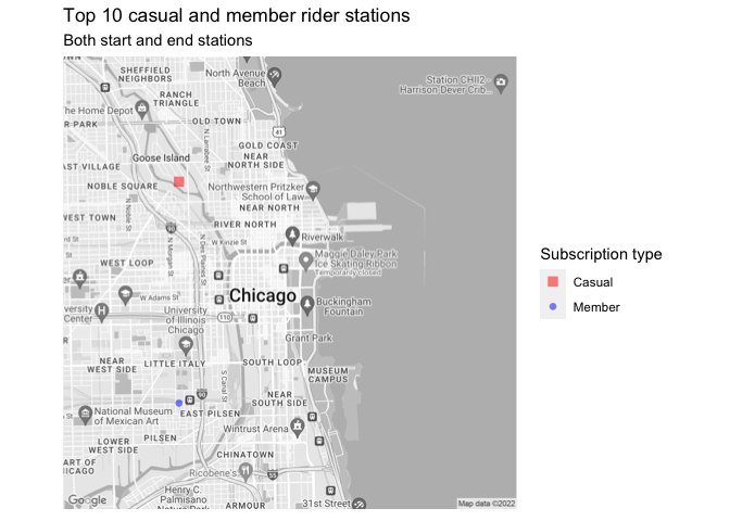
base <- ggmap(chicago_map_zoom) +
scale_color_manual(values = c(Casual = "red", Member = "blue")) +
scale_shape_manual(values = c(Casual = 15, Member = 16)) +
scale_size_manual(values = c(Casual = 3, Member = 2)) +
theme(
axis.ticks = element_blank(),
axis.text = element_blank(),
axis.title = element_blank()
) +
labs(
title = "Top 10 casual and member rider stations",
subtitle = "Both start and end stations",
color = legend_title, shape = legend_title, size = legend_title
)
base +
geom_point(
data = casual_top_station,
aes(
x = longitude,
y = latitude,
color = id, shape = id, size = id
),
alpha = 0.5
) +
geom_point(
data = member_top_station,
aes(
x = longitude,
y = latitude,
color = id, shape = id, size = id
),
alpha = 0.5
)
此外,为了进一步简化代码,我建议使用例如dplyr::bind_rows按行绑定两个数据框架,这将允许仅通过一个geom_point添加点。
top_station <- dplyr::bind_rows(casual_top_station, member_top_station)

base +
  geom_point(
    data = top_station,
    aes(
      x = longitude,
      y = latitude,
      color = id, shape = id, size = id
    ), alpha = .5)
页面原文内容由Stack Overflow提供。腾讯云小微IT领域专用引擎提供翻译支持
原文链接:
https://stackoverflow.com/questions/72834431
复制相关文章
相似问题
腾讯云开发者

Copyright © 2013 - 2026 Tencent Cloud. All Rights Reserved. 腾讯云 版权所有
深圳市腾讯计算机系统有限公司 ICP备案/许可证号:粤B2-20090059 ![]() 粤公网安备44030502008569号
粤公网安备44030502008569号
腾讯云计算(北京)有限责任公司 京ICP证150476号 | 京ICP备11018762号