
Boostra5.2向右下拉式菜单
Boostra5.2向右下拉式菜单
提问于 2022-06-27 21:48:32
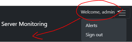
我已经为这个问题挣扎了3天,尝试了所有的事情,但无法修复--我使用的是Bootstra5.2,我有一个带有下拉菜单的Navbar,我想把它放在最右边,我成功地做到了,但是我打破了其他东西,比如边栏和导航条切换器,如图像所示,我希望下拉菜单在品牌名称下,而屏幕是小的,在桌面上正确的。
帮帮忙,谢谢
<!doctype html>
<html lang="en">
    <head>
    <link href="https://cdn.jsdelivr.net/npm/bootstrap@5.2.0-beta1/dist/css/bootstrap.min.css"          rel="stylesheet" integrity="sha384-0evHe/X+R7YkIZDRvuzKMRqM+OrBnVFBL6DOitfPri4tjfHxaWutUpFmBp4vmVor" crossorigin="anonymous">
  <script src="https://cdn.jsdelivr.net/npm/bootstrap@5.2.0-beta1/dist/js/bootstrap.bundle.min.js"  integrity="sha384-pprn3073KE6tl6bjs2QrFaJGz5/SUsLqktiwsUTF55Jfv3qYSDhgCecCxMW52nD2" crossorigin="anonymous"></script>
    </head>
    <body>
    <style>
    .sidebar {
position: fixed;
top: 0;
/* rtl:raw:
right: 0;
*/
bottom: 0;
/* rtl:remove */
left: 0;
z-index: 100; /* Behind the navbar */
padding: 48px 0 0; /* Height of navbar */
box-shadow: inset -1px 0 0 rgba(0, 0, 0, .1);
}

@media (max-width: 767.98px) {
.sidebar {
    top: 5rem;
}
}

.sidebar-sticky {
position: relative;
top: 0;
height: calc(100vh - 48px);
padding-top: .5rem;
overflow-x: hidden;
overflow-y: auto; /* Scrollable contents if viewport is shorter than content. */
}

.sidebar .nav-link {
font-weight: 500;
color: #333;
}

.sidebar .nav-link .feather {
margin-right: 4px;
color: #727272;
}

.sidebar .nav-link.active {
color: #2470dc;
}

.sidebar .nav-link:hover .feather,
.sidebar .nav-link.active .feather {
color: inherit;
}

.sidebar-heading {
font-size: .75rem;
}

/*
* Navbar
*/

.navbar-brand {
padding-top: .75rem;
padding-bottom: .75rem;
box-shadow: inset 0 0 0 rgba(0, 0, 0, .25);
}

.navbar .navbar-toggler {
top: .25rem;
right: 1rem;
}
    </style>
      <nav class="navbar navbar-expand-lg navbar-dark sticky-top bg-dark flex-md-nowrap p-0 shadow">
        <div class="container-fluid">
            <a class="navbar-brand" href="{{ url_for('dashboard') }}">
                <img src="../static/images/Logo_Square.png" width="30" height="30">
                Server Monitoring
            </a>
            <div class="d-flex order-sm-1 ms-auto pe-2">
                <ul class="navbar-nav flex-row">
                    <li class="nav-item mx-2">
                        <a href="#" data-bs-toggle="dropdown" class="nav-link dropdown-toggle" id="iconToggle">
                            Welcome, {{ session['username'] }}
                        </a>
                        <ul class="dropdown-menu dropdown-menu-end dropdown-menu-dark" aria-labelledby="navbarDropdownMenuLink2">
                            <li><a class="dropdown-item" href="{{ url_for('alerts') }}">Alerts</a></li>
                            <li><a class="dropdown-item" href="{{ url_for('logout') }}">Sign out</a></li>
                        </ul>
                    </li>
                </ul>
            </div>
            <button class="navbar-toggler position-absolute d-md-none collapsed" type="button" data-bs-toggle="collapse" data-bs-target="#sidebarMenu" aria-controls="sidebarMenu" aria-expanded="false" aria-label="Toggle navigation">
                <span class="navbar-toggler-icon"></span>
            </button>
        </div>
      </nav>

      <div class="container-fluid">
        <div class="row">
            <nav id="sidebarMenu" class="col-md-3 col-lg-2 d-md-block bg-light sidebar collapse">
                <div class="position-sticky pt-3">
                    <ul class="nav flex-column">
                    <li class="nav-item">
                        <a class="{{ 'nav-link active' if active_page == 'dashboard' else 'nav-link' }}" href="{{ url_for('dashboard') }}">
                            <svg xmlns="http://www.w3.org/2000/svg" width="20" height="20" fill="currentColor" class="bi bi-speedometer" viewBox="0 0 16 16">
                                <path d="M8 2a.5.5 0 0 1 .5.5V4a.5.5 0 0 1-1 0V2.5A.5.5 0 0 1 8 2zM3.732 3.732a.5.5 0 0 1 .707 0l.915.914a.5.5 0 1 1-.708.708l-.914-.915a.5.5 0 0 1 0-.707zM2 8a.5.5 0 0 1 .5-.5h1.586a.5.5 0 0 1 0 1H2.5A.5.5 0 0 1 2 8zm9.5 0a.5.5 0 0 1 .5-.5h1.5a.5.5 0 0 1 0 1H12a.5.5 0 0 1-.5-.5zm.754-4.246a.389.389 0 0 0-.527-.02L7.547 7.31A.91.91 0 1 0 8.85 8.569l3.434-4.297a.389.389 0 0 0-.029-.518z"/>
                                <path fill-rule="evenodd" d="M6.664 15.889A8 8 0 1 1 9.336.11a8 8 0 0 1-2.672 15.78zm-4.665-4.283A11.945 11.945 0 0 1 8 10c2.186 0 4.236.585 6.001 1.606a7 7 0 1 0-12.002 0z"/>
                            </svg>
                        <span class="ml-2"> <strong>Dashboard</strong> </span>
                        </a>
                    </li>
                    <li class="nav-item">
                        <a class="{{ 'nav-link active' if active_page == 'alerts' else 'nav-link' }}" href="{{ url_for('alerts') }}">
                            <svg xmlns="http://www.w3.org/2000/svg" width="20" height="20" fill="currentColor" class="bi bi-bell-fill" viewBox="0 0 16 16">
                                <path d="M8 16a2 2 0 0 0 2-2H6a2 2 0 0 0 2 2zm.995-14.901a1 1 0 1 0-1.99 0A5.002 5.002 0 0 0 3 6c0 1.098-.5 6-2 7h14c-1.5-1-2-5.902-2-7 0-2.42-1.72-4.44-4.005-4.901z"/>
                            </svg>
                        <span class="ml-2"> <strong>Alerts</strong> </span>
                        </a>
                    </li>
                    <li class="nav-item">
                        <a class="{{ 'nav-link active' if active_page == 'charts' else 'nav-link' }}" href="{{ url_for('charts') }}">
                            <svg xmlns="http://www.w3.org/2000/svg" width="20" height="20" fill="currentColor" class="bi bi-bar-chart-line-fill" viewBox="0 0 16 16">
                                <path d="M11 2a1 1 0 0 1 1-1h2a1 1 0 0 1 1 1v12h.5a.5.5 0 0 1 0 1H.5a.5.5 0 0 1 0-1H1v-3a1 1 0 0 1 1-1h2a1 1 0 0 1 1 1v3h1V7a1 1 0 0 1 1-1h2a1 1 0 0 1 1 1v7h1V2z"/>
                            </svg>
                            <span class="ml-2"> <strong>Charts</strong> </span>
                        </a>
                    </li>
                    <li class="nav-item">
                        <a class="{{ 'nav-link active' if active_page == 'data' else 'nav-link' }}" href="{{ url_for('data') }}">
                            <svg xmlns="http://www.w3.org/2000/svg" width="20" height="20" fill="currentColor" class="bi bi-table" viewBox="0 0 16 16">
                                <path d="M0 2a2 2 0 0 1 2-2h12a2 2 0 0 1 2 2v12a2 2 0 0 1-2 2H2a2 2 0 0 1-2-2V2zm15 2h-4v3h4V4zm0 4h-4v3h4V8zm0 4h-4v3h3a1 1 0 0 0 1-1v-2zm-5 3v-3H6v3h4zm-5 0v-3H1v2a1 1 0 0 0 1 1h3zm-4-4h4V8H1v3zm0-4h4V4H1v3zm5-3v3h4V4H6zm4 4H6v3h4V8z"/>
                            </svg>
                            <span class="ml-2"> <strong>Data</strong> </span>
                        </a>
                    </li>

                    </ul>
                </div>
            </nav>
        </div>
      </div>
  </body>
</html>
回答 1
Stack Overflow用户
发布于 2022-06-27 22:58:25
我将position:absolute添加到在红色圆圈中标记的元素中。
@media (max-width: 768px) {
  ul.navbar-nav.flex-row {
    position: absolute;
    left: 0;
    top: 60px;
  }
}<!doctype html>
<html lang="en">
<head>
<link href="https://cdn.jsdelivr.net/npm/bootstrap@5.2.0-beta1/dist/css/bootstrap.min.css" rel="stylesheet" integrity="sha384-0evHe/X+R7YkIZDRvuzKMRqM+OrBnVFBL6DOitfPri4tjfHxaWutUpFmBp4vmVor" crossorigin="anonymous">
<script src="https://cdn.jsdelivr.net/npm/bootstrap@5.2.0-beta1/dist/js/bootstrap.bundle.min.js" integrity="sha384-pprn3073KE6tl6bjs2QrFaJGz5/SUsLqktiwsUTF55Jfv3qYSDhgCecCxMW52nD2" crossorigin="anonymous"></script>
</head>
<body>
<style>
.sidebar {
position: fixed;
top: 0;
/* rtl:raw:
right: 0;
*/
bottom: 0;
/* rtl:remove */
left: 0;
z-index: 100;
/* Behind the navbar */
padding: 48px 0 0;
/* Height of navbar */
box-shadow: inset -1px 0 0 rgba(0, 0, 0, .1);
}
@media (max-width: 767.98px) {
.sidebar {
top: 5rem;
}
}
.sidebar-sticky {
position: relative;
top: 0;
height: calc(100vh - 48px);
padding-top: .5rem;
overflow-x: hidden;
overflow-y: auto;
/* Scrollable contents if viewport is shorter than content. */
}
.sidebar .nav-link {
font-weight: 500;
color: #333;
}
.sidebar .nav-link .feather {
margin-right: 4px;
color: #727272;
}
.sidebar .nav-link.active {
color: #2470dc;
}
.sidebar .nav-link:hover .feather,
.sidebar .nav-link.active .feather {
color: inherit;
}
.sidebar-heading {
font-size: .75rem;
}
/*
* Navbar
*/
.navbar-brand {
padding-top: .75rem;
padding-bottom: .75rem;
box-shadow: inset 0 0 0 rgba(0, 0, 0, .25);
}
.navbar .navbar-toggler {
top: .25rem;
right: 1rem;
}
</style>
<nav class="navbar navbar-expand-lg navbar-dark sticky-top bg-dark flex-md-nowrap p-0 shadow">
<div class="container-fluid">
<a class="navbar-brand" href="{{ url_for('dashboard') }}">
<img src="../static/images/Logo_Square.png" width="30" height="30"> Server Monitoring
</a>
<div class="d-flex order-sm-1 ms-auto pe-2">
<ul class="navbar-nav flex-row">
<li class="nav-item mx-2">
<a href="#" data-bs-toggle="dropdown" class="nav-link dropdown-toggle" id="iconToggle">
Welcome, {{ session['username'] }}
</a>
<ul class="dropdown-menu dropdown-menu-end dropdown-menu-dark" aria-labelledby="navbarDropdownMenuLink2">
<li><a class="dropdown-item" href="{{ url_for('alerts') }}">Alerts</a></li>
<li><a class="dropdown-item" href="{{ url_for('logout') }}">Sign out</a></li>
</ul>
</li>
</ul>
</div>
<button class="navbar-toggler position-absolute d-md-none collapsed" type="button" data-bs-toggle="collapse" data-bs-target="#sidebarMenu" aria-controls="sidebarMenu" aria-expanded="false" aria-label="Toggle navigation">
<span class="navbar-toggler-icon"></span>
</button>
</div>
</nav>
<div class="container-fluid">
<div class="row">
<nav id="sidebarMenu" class="col-md-3 col-lg-2 d-md-block bg-light sidebar collapse">
<div class="position-sticky pt-3">
<ul class="nav flex-column">
<li class="nav-item">
<a class="{{ 'nav-link active' if active_page == 'dashboard' else 'nav-link' }}" href="{{ url_for('dashboard') }}">
<svg xmlns="http://www.w3.org/2000/svg" width="20" height="20" fill="currentColor" class="bi bi-speedometer" viewBox="0 0 16 16">
<path d="M8 2a.5.5 0 0 1 .5.5V4a.5.5 0 0 1-1 0V2.5A.5.5 0 0 1 8 2zM3.732 3.732a.5.5 0 0 1 .707 0l.915.914a.5.5 0 1 1-.708.708l-.914-.915a.5.5 0 0 1 0-.707zM2 8a.5.5 0 0 1 .5-.5h1.586a.5.5 0 0 1 0 1H2.5A.5.5 0 0 1 2 8zm9.5 0a.5.5 0 0 1 .5-.5h1.5a.5.5 0 0 1 0 1H12a.5.5 0 0 1-.5-.5zm.754-4.246a.389.389 0 0 0-.527-.02L7.547 7.31A.91.91 0 1 0 8.85 8.569l3.434-4.297a.389.389 0 0 0-.029-.518z"/>
<path fill-rule="evenodd" d="M6.664 15.889A8 8 0 1 1 9.336.11a8 8 0 0 1-2.672 15.78zm-4.665-4.283A11.945 11.945 0 0 1 8 10c2.186 0 4.236.585 6.001 1.606a7 7 0 1 0-12.002 0z"/>
</svg>
<span class="ml-2"> <strong>Dashboard</strong> </span>
</a>
</li>
<li class="nav-item">
<a class="{{ 'nav-link active' if active_page == 'alerts' else 'nav-link' }}" href="{{ url_for('alerts') }}">
<svg xmlns="http://www.w3.org/2000/svg" width="20" height="20" fill="currentColor" class="bi bi-bell-fill" viewBox="0 0 16 16">
<path d="M8 16a2 2 0 0 0 2-2H6a2 2 0 0 0 2 2zm.995-14.901a1 1 0 1 0-1.99 0A5.002 5.002 0 0 0 3 6c0 1.098-.5 6-2 7h14c-1.5-1-2-5.902-2-7 0-2.42-1.72-4.44-4.005-4.901z"/>
</svg>
<span class="ml-2"> <strong>Alerts</strong> </span>
</a>
</li>
<li class="nav-item">
<a class="{{ 'nav-link active' if active_page == 'charts' else 'nav-link' }}" href="{{ url_for('charts') }}">
<svg xmlns="http://www.w3.org/2000/svg" width="20" height="20" fill="currentColor" class="bi bi-bar-chart-line-fill" viewBox="0 0 16 16">
<path d="M11 2a1 1 0 0 1 1-1h2a1 1 0 0 1 1 1v12h.5a.5.5 0 0 1 0 1H.5a.5.5 0 0 1 0-1H1v-3a1 1 0 0 1 1-1h2a1 1 0 0 1 1 1v3h1V7a1 1 0 0 1 1-1h2a1 1 0 0 1 1 1v7h1V2z"/>
</svg>
<span class="ml-2"> <strong>Charts</strong> </span>
</a>
</li>
<li class="nav-item">
<a class="{{ 'nav-link active' if active_page == 'data' else 'nav-link' }}" href="{{ url_for('data') }}">
<svg xmlns="http://www.w3.org/2000/svg" width="20" height="20" fill="currentColor" class="bi bi-table" viewBox="0 0 16 16">
<path d="M0 2a2 2 0 0 1 2-2h12a2 2 0 0 1 2 2v12a2 2 0 0 1-2 2H2a2 2 0 0 1-2-2V2zm15 2h-4v3h4V4zm0 4h-4v3h4V8zm0 4h-4v3h3a1 1 0 0 0 1-1v-2zm-5 3v-3H6v3h4zm-5 0v-3H1v2a1 1 0 0 0 1 1h3zm-4-4h4V8H1v3zm0-4h4V4H1v3zm5-3v3h4V4H6zm4 4H6v3h4V8z"/>
</svg>
<span class="ml-2"> <strong>Data</strong> </span>
</a>
</li>
</ul>
</div>
</nav>
</div>
</div>
</body>
</html>
页面原文内容由Stack Overflow提供。腾讯云小微IT领域专用引擎提供翻译支持
原文链接:
https://stackoverflow.com/questions/72778637
复制相关文章
相似问题
腾讯云开发者

Copyright © 2013 - 2026 Tencent Cloud. All Rights Reserved. 腾讯云 版权所有
深圳市腾讯计算机系统有限公司 ICP备案/许可证号:粤B2-20090059  粤公网安备44030502008569号
腾讯云计算(北京)有限责任公司 京ICP证150476号 | 京ICP备11018762号