
Matplotlib.axes.Axes.bar条件格式
Matplotlib.axes.Axes.bar条件格式
提问于 2022-06-23 14:02:57
我在matplotlib中有一个垂直的条形图,并且希望条形图的颜色根据数组中的值而变化。我知道在plot.scatter()中,这可以用cmap='‘来完成。但是,我似乎无法在plot.bar()中找到相同的功能。有什么建议吗?
是有争议的数字。
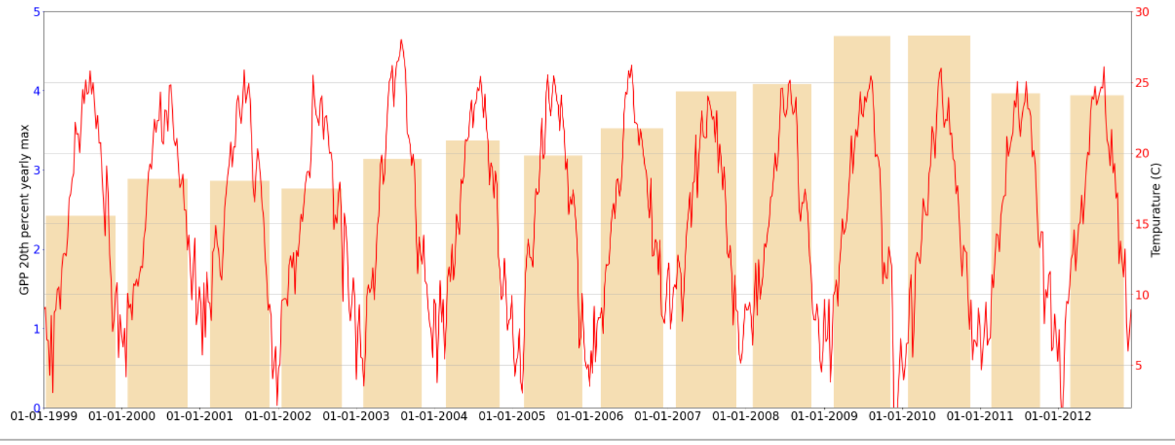
fig, season = plt.subplots()

# show the phenology season

season.set_ylabel('GPP 20th percent yearly max')
season.tick_params('y', colors = 'blue', labelsize =24)

season.bar(x = pheno['SRO_SoS'], height= pheno['SRO_20th'], width =
           pheno['SRO_DateDelta'], zorder=1, color = 'wheat', align =
'edge')

season.set_ylim(0,5)
temp = season.twinx()

temp.plot(df_w.index, df_w['TA_F'],color = 'red', label = 'Tempurature',
linewidth = 2)

# set x-label
temp.set_xlabel('Date')
temp.tick_params('x', labelsize =24)

 # set primary y label
temp.set_ylabel('Tempurature (C)')
temp.tick_params('y', colors = 'red', labelsize =24)

# set x-axis limits as the min and max of the series
temp.set_xlim(date2num([df_w.index.min(), df_w.index.max()]))
temp.xaxis.set_major_formatter(mdates.DateFormatter('%d-%m-%Y'))
temp.xaxis.set_major_locator(mdates.YearLocator(1, month=1, day=1))

temp.set_ylim(2,30)

temp.grid(True)

plt.show()回答 1
Stack Overflow用户
发布于 2022-06-23 15:15:46
您可以为season.bar()中的颜色参数提供一个数组。那应该管用。
如果你想给出离散的颜色,下面是一个例子。
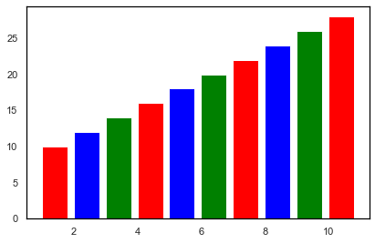
fig, season = plt.subplots()
clist = ['red', 'blue', 'green']
season.bar(x = range(1, 11), height= range(10, 30, 2), width = 0.8, zorder=1, color = clist, align = 'edge')
离散色.输出图
对于使用cmap连续颜色,下面是另一个示例。
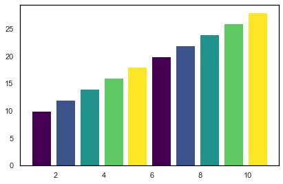
fig, season = plt.subplots()
my_cmap = plt.get_cmap("viridis")
colorrange = [0,0.25,0.5,0.75,1.0] #Range should be in range of 0 to 1
season.bar(x = range(1, 11), height= range(10, 30, 2), width = 0.8, zorder=1, color=my_cmap(colorrange), align = 'edge')
连续色.输出图
页面原文内容由Stack Overflow提供。腾讯云小微IT领域专用引擎提供翻译支持
原文链接:
https://stackoverflow.com/questions/72731523
复制相关文章
相似问题
腾讯云开发者

Copyright © 2013 - 2026 Tencent Cloud. All Rights Reserved. 腾讯云 版权所有
深圳市腾讯计算机系统有限公司 ICP备案/许可证号:粤B2-20090059 ![]() 粤公网安备44030502008569号
粤公网安备44030502008569号
腾讯云计算(北京)有限责任公司 京ICP证150476号 | 京ICP备11018762号