
重新格式化数据和创建热图
在这里倒车。
我想在R中创建一个如下所示的热图(对我在PowerPoint中的简陋手工绘图表示歉意):
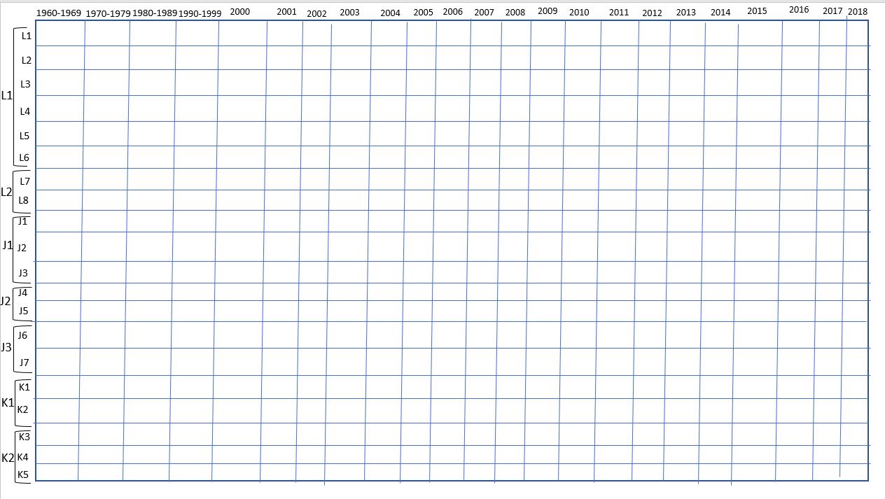
-Where列是年:60年代、70年代、80年代、90年代,然后是2000年以后的每一年;
-Rows是鲸鱼(鲸鱼在我的数据中是在"id“之下,见下文)
-Whales按家族血统分组(下面标记为"matriline“)
-The盒以典型的热图方式进行阴影,每年计算鲸鱼的黑暗colors=greater次数(通常为1-5次)。
-And理想的情况下,母质以数字顺序下降,例如,L1,L2,L3等。在每个母质中,鲸鱼ID以数字顺序下降- L1,L2,L3等(鲸鱼ID有时可以与母质相同)。
我想我的数据需要有母鲸ID的列,1960年代,1970年代,1980年代,1990年代,2000年(然后每年之后),每一行都是鲸鱼ID,每个方框值是鲸鱼在那个十年/年中发生的次数。
我的数据目前看起来如下(为了简洁起见,将数据缩短为10行):
    > dput(id)
    structure(list(date = structure(c(8243, 8243, 8243, 8248, 8947,
    8947, 8947, 12271, 12271, 12271), class = "Date"), year = c(1992L,
    1992L, 1992L, 1992L, 1994L, 1994L, 1994L, 2003L, 2003L, 2003L),
    event.id = c(8L, 8L, 8L, 10L, 11L, 11L, 11L, 14L, 14L, 15L),
    id = structure(c(51L,55L, 59L, 46L, 51L, 55L, 59L, 51L, 59L, 57L),
    .Label = c("J11", "J16", "J17", "J2", "J22", "J26", "J27", "J30", "J31", "J35"),
    class = "factor"), matriline = structure(c(20L, 20L, 20L, 11L, 20L, 20L, 20L, 20L,
    20L, 15L), .Label = c("J2","J4", "J7", "J9", "K11", "K18", "K4", "K8",
    "L12", "L2"), class = "factor"), pod = structure(c(3L, 3L, 3L, 3L, 3L, 3L, 3L, 3L,
    3L, 3L), .Label = c("J", "K", "L"), class = "factor")), row.names = c(NA,
    -136L), class = c("tbl_df", "tbl", "data.frame"))
有人能帮我把我的数据转换成一种可行的格式吗?
提前谢谢你!
编辑新代码:
socialmap<- id %>%
mutate(x = case_when(year < 1960 ~ "Pre-1960",
year %in% 1960:1969 ~ "1960-1969",
year %in% 1970:1979 ~ "1970-1979",
year %in% 1980:1989 ~ "1980-1989",
year %in% 1990:1999 ~ "1990-1999",
TRUE ~ year)) %>%
mutate(y = paste(matr, id)) %>%
group_by(x, y, .drop = FALSE) %>%
summarize(count = n()) %>%
arrange(y) %>%
tidyr::separate(y, into = c("ym", "yid"), sep = " ", remove = FALSE)
socialmap$count=as.integer(socialmap$count) #don't want decimals in
#count scale - but this didnt seem to fix it
socialmap$x <- factor(socialmap$x, levels = c("Pre-1960", "1960-
1969", "1970-1979", "1980-1989", "1990-1999", 2000:2020)) #data go up
to 2020
ggplot(data = socialmap, aes(x, yid, fill = count)) +
geom_tile() +
scale_fill_gradient(low = "blue", high = "red") +
scale_x_discrete(position = "top") +
scale_y_discrete(limits=rev) +
labs(x = NULL, y = NULL) +
facet_wrap( ~ ym, strip.position = "left", dir = "v") +
theme(panel.spacing = unit(0, "lines"),
strip.background = element_blank(),
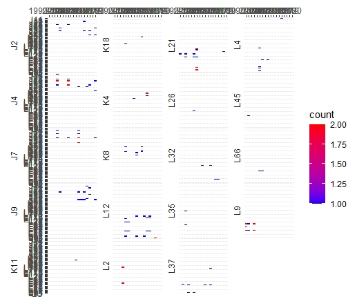
strip.placement = "outside")新图表:
回答 1
Stack Overflow用户
发布于 2022-06-14 12:51:55
看起来您的示例数据是dplyr格式的,所以我将向您展示如何在dplyr中这样做。我创建了更多的示例数据,因此结果更有趣--查看下面的数据代码块。一般过程是首先创建一个基于年份、matriline和id的分组变量,然后根据每个组汇总计数。然后使用ggplot2::geom_tile()映射。
要具有分层的y轴,您可以首先分离您的in (即链中的最后一步):
library(dplyr)
library(tidyr)
library(ggplot2)

hm <- dat %>%
  mutate(x = case_when(year < 1960 ~ "Pre-1960",
                       year %in% 1960:1969 ~ "1960-1969",
                       year %in% 1970:1979 ~ "1970-1979",
                       year %in% 1980:1989 ~ "1980-1989",
                       year %in% 1990:1999 ~ "1990-1999",
                       TRUE ~ year)) %>%
  mutate(y = paste(matriline, id)) %>%
  group_by(x, y, .drop  = FALSE) %>%
  summarize(count = n()) %>%
  arrange(y) %>%
  tidyr::separate(y, into = c("ym", "yid"), sep = " ", remove = FALSE)

hm
   x         y       ym    yid   count
   <fct>     <chr>   <chr> <chr> <int>
 1 1960-1969 J02 J02 J02   J02       3
 2 1970-1979 J02 J02 J02   J02       4
 3 1980-1989 J02 J02 J02   J02       7
 4 1990-1999 J02 J02 J02   J02       1
 5 2006      J02 J02 J02   J02       2
 6 2007      J02 J02 J02   J02       2
 7 2009      J02 J02 J02   J02       2
 8 2014      J02 J02 J02   J02       1
 9 1960-1969 J02 J11 J02   J11       3
10 1970-1979 J02 J11 J02   J11       5
# ... with 485 more rows
然后强迫你的情节包含所有年份,强迫你的x轴去考虑你想要的所有层次:
hm$x <- factor(hm$x, levels = c("Pre-1960", "1960-1969", "1970-1979", "1980-1989", "1990-1999", 2000:2020))并按母系使用面对组ids进行绘图:
ggplot(data = hm, aes(x, yid, fill = count)) +
  geom_tile() +
  scale_fill_gradient(low = "white", high = "red") +
  scale_x_discrete(position = "top", drop = FALSE) +
  scale_y_discrete(limits=rev) +
  labs(x = NULL, y = NULL) +
  facet_wrap( ~ ym, strip.position = "left", dir = "v", ncol = 1) +
  theme(panel.spacing = unit(0.2, "lines"),
        strip.background = element_blank(),
        strip.placement = "outside",
        axis.text.x = element_text(angle = 45, hjust = -0.02))
数据:
ids <- c("J11", "J16", "J17", "J02", "J22", "J26", "J27", "J30")
matrilines <- c("J02","J04", "K11", "L20", "P90", "K100", "R22")

dat <- data.frame(year = as.character(sample(1960:2018, 1000, replace = TRUE)),
                  id = sample(ids, 1000, replace = TRUE),
matriline = sample(matrilines, 1000, replace = TRUE))https://stackoverflow.com/questions/72609294
复制相似问题
腾讯云开发者

Copyright © 2013 - 2026 Tencent Cloud. All Rights Reserved. 腾讯云 版权所有
深圳市腾讯计算机系统有限公司 ICP备案/许可证号:粤B2-20090059 ![]() 粤公网安备44030502008569号
粤公网安备44030502008569号
腾讯云计算(北京)有限责任公司 京ICP证150476号 | 京ICP备11018762号