
如何在R中实现高图表比较选项的价值
如何在R中实现高图表比较选项的价值
提问于 2022-06-07 19:50:00
我有这个密码
serie <- data.frame(date=c("2022-01-01","2022-01-02","2022-01-03"),serie2=c(1,2,5), serie3=c(4,6,7))
serie$date <- as.Date(serie$date)
serie <- tk_xts(serie,data_var = serie$date)

highchart(type = "stock") %>%
  hc_title(text = "Comparison") %>%
  hc_add_series(serie$serie2,
                name = "serie 2",
                color = "green", compare = 'percent', compareBase=100) %>%
  hc_add_series(serie$serie3, name = "serie 3", color= "white",compare = 'percent', compareBase=100)%>%
  hc_add_theme(hc_theme_db())%>%
  hc_navigator(enabled = FALSE) %>%
  hc_scrollbar(enabled = FALSE) %>%
  hc_legend(enabled = TRUE) %>%
  hc_exporting(enabled = TRUE) %>%
  hc_xAxis(
    labels = list(
      style = list(
        color = "white"
      )
    )
  ) %>%
  hc_yAxis(
    labels = list(format = '{value}%',
                  style = list(
                    color = "white"
                  )
    )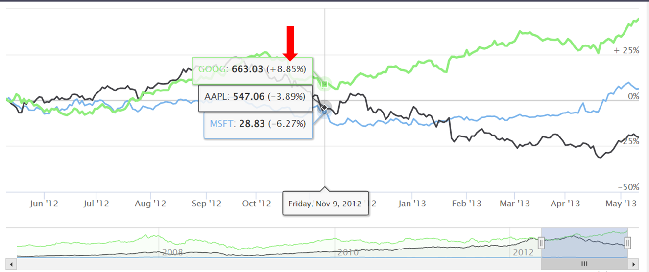
)我要把这个值写在R-高图上。我看到了这个https://www.highcharts.com/demo/stock/compare,但是我不理解代码,因为它和R有点不同。
回答 1
Stack Overflow用户
回答已采纳
发布于 2022-06-08 02:22:08
很难确定你想要什么。我认为您希望修改工具提示,因此它们与如何在此图中记录它们相匹配。如果是的话,您可以使用
hc_tooltip(pointFormat = paste0('<span style="color:{series.color}">{series.name}',
                                '</span>: <b>{point.y}</b> ({point.change}%)<br/>'),
           valueDecimals = 2,
           split = T)
你的y轴没有标签,但是你有格式化它的代码.如果您希望您的y轴格式类似于此图,则可以使用
hc_yAxis(formatter = "function(){
           return (this.value > 0 ? ' + ' : '') + this.value + '%';
           }")
如果还有别的事请告诉我。
页面原文内容由Stack Overflow提供。腾讯云小微IT领域专用引擎提供翻译支持
原文链接:
https://stackoverflow.com/questions/72536827
复制相关文章
相似问题
腾讯云开发者

Copyright © 2013 - 2026 Tencent Cloud. All Rights Reserved. 腾讯云 版权所有
深圳市腾讯计算机系统有限公司 ICP备案/许可证号:粤B2-20090059 ![]() 粤公网安备44030502008569号
粤公网安备44030502008569号
腾讯云计算(北京)有限责任公司 京ICP证150476号 | 京ICP备11018762号