
quantileNormal与labelExpr在高原地区的应用
quantileNormal与labelExpr在高原地区的应用
提问于 2022-06-06 21:17:13
我有一个数据集df,其中包含一个计算出来的频率曲线,看起来像
    aep flow    variance    n-day
0   0.001   64480.8 0.01190750  01-day
1   0.002   56995.7 0.00925476  01-day
2   0.005   47984.8 0.00633636  01-day
3   0.01    41772.4 0.00456081  01-day
4   0.02    36024.0 0.00314372  01-day
5   0.05    29043.5 0.00179256  01-day
6   0.1 24145.0 0.00113570  01-day
7   0.2 19466.1 0.00075381  01-day
8   0.5 13215.4 0.00055517  01-day
9   0.8 9261.1  0.00054307  01-day
10  0.9 7785.4  0.00066750  01-day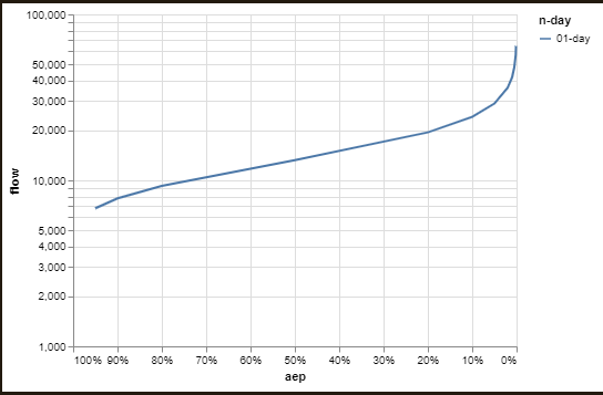
11 0.95 6787.7 0.00094589 01-day当df.aep是年超概率时,df.flow被观测到。我感兴趣的是做一个洪水频度图,它通常有一个对数标度的y轴,而x轴标度是一个反向的法线轴。
对于此图表规范:
alt.Chart(df).transform_calculate(
    normal = 'quantileNormal(datum.aep)').mark_line().encode(
    x = alt.X('aep:Q', axis = alt.Axis(format = '%'), scale = alt.Scale( reverse=True)),
    y = alt.Y('flow:Q', scale = alt.Scale(type='log')),
    color = 'n-day')
我得到了一个情节,看起来是:
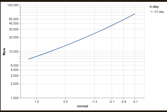
最终,我更感兴趣的是一个看上去使用转换quantileNormal的绘图。
alt.Chart(df).transform_calculate(
normal = 'quantileNormal(datum.aep)').mark_line().encode(
x = alt.X('normal:Q', scale = alt.Scale( reverse=True)),
y = alt.Y('flow:Q', scale = alt.Scale(type='log')),
color = 'n-day')
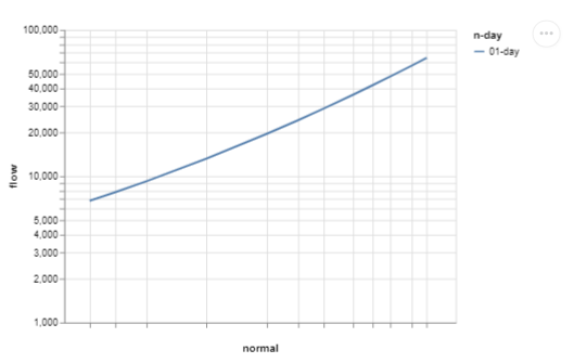
但是现在我需要的是由quantileNormal(datum.aep)提供的缩放,它是z分数,带有来自df.aep的标签。
- 是否有一种方法来指定这种类型的规模在牛市,同时仍然使用
df.aep作为绘图的y-值?
因此,我想我可以设置一个labelExpr来映射到标签中,使用:
from altair_transform import extract_data

aa = extract_data(a)
aa.normal = aa.normal.round(3)

bb = aa[['normal']]
bb.index = list('abcdefghijkl')
bb = pd.Series(index = bb.index, data = bb.values.flatten())

cc = aa[['aep']]
cc.index = list('abcdefghijkl')
cc = pd.Series(index = cc.index, data = cc.values.flatten())

s = ''
for norm, aep in zip(bb.iteritems(), cc.iteritems()):
    s += f"datum.normal == {norm[1]} ? '{aep[1]:.3f}' :  "
s += 'null'其中s的计算值为:
"datum.normal == -3.09 ? '0.001' : datum.normal == -2.878 ? '0.002' : datum.normal == -2.576 ? '0.005' : datum.normal == -2.326 ? '0.010' : datum.normal == -2.054 ? '0.020' : datum.normal == -1.645 ? '0.050' : datum.normal == -1.282 ? '0.100' : datum.normal == -0.842 ? '0.200' : datum.normal == 0.0 ? '0.500' : datum.normal == 0.842 ? '0.800' : datum.normal == 1.282 ? '0.900' : datum.normal == 1.645 ? '0.950' : null"然后,如果我将图表规范更改为:
a = alt.Chart(aa).mark_line().encode(
    x = alt.X('normal:Q',
    axis = alt.Axis(
        values = [bb.a, bb.b, bb.c, bb.d, bb.e, bb.f, bb.g, bb.h, bb.i, bb.j, bb.k, bb.l],
        labelExpr=s
        ),
        scale = alt.Scale( reverse=True)),
    y = alt.Y('flow:Q', scale = alt.Scale(type='log')),
color = 'n-day')我得到了一个带有空标签的图表。labelExpr可以这样使用吗?
回答 1
Stack Overflow用户
回答已采纳
发布于 2022-06-07 01:13:39
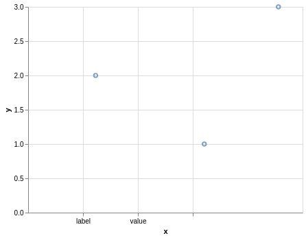
我认为您需要使用datum.label或datum.value而不是datum.normal来与标签的值进行比较:
import altair as alt
import pandas as pd

alt.Chart(pd.DataFrame({'x': [3.21, 1.23, 4.56], 'y': [1, 2, 3]})).mark_point().encode(
    x=alt.X(
        'x',
        axis=alt.Axis(
            values=[1, 2, 3],
            labelExpr='datum.label == 1 ? "label" : datum.value == 2 ? "value" : datum.x == 3 ? "x": null')),
    y='y'
)
页面原文内容由Stack Overflow提供。腾讯云小微IT领域专用引擎提供翻译支持
原文链接:
https://stackoverflow.com/questions/72523559
复制相关文章
相似问题
腾讯云开发者

Copyright © 2013 - 2026 Tencent Cloud. All Rights Reserved. 腾讯云 版权所有
深圳市腾讯计算机系统有限公司 ICP备案/许可证号:粤B2-20090059 ![]() 粤公网安备44030502008569号
粤公网安备44030502008569号
腾讯云计算(北京)有限责任公司 京ICP证150476号 | 京ICP备11018762号