
如何在神经图中使神经边缘更加动态?
如何在神经图中使神经边缘更加动态?
提问于 2022-05-19 20:01:04
我有代表英国城市间交通的数据。
- :如果这两个城市之间有一条公交线路= 1,否则=0
- ave.pas:平均乘客人数
。
图书馆(巧妙地)图书馆(图形)图书馆(Tidyverse)图书馆(Tidygraph)库(Igraph)库(EdgebundleR)
   df2 <- data.frame (City1  = c("London", "London", "London", "London" ,"Liverpool","Liverpool","Liverpool" , "Manchester", "Manchester", "Bristol"),
                          City2 = c("Liverpool", "Manchester", "Bristol","Derby", "Manchester", "Bristol","Derby","Bristol","Derby","Derby"),
                          Transit = c(1,0,1,1,1,1,1,1,0,1),
                          ave.pas = c(10,0,11,24,40,45,12,34,0,29))
df:
City1 City2 Transit ave.pas
1 London Liverpool 1 10
2 London Manchester 0 0
3 London Bristol 1 11
4 London Derby 1 24
5 Liverpool Manchester 1 40
6 Liverpool Bristol 1 45
7 Liverpool Derby 1 12
8 Manchester Bristol 1 34
9 Manchester Derby 0 0
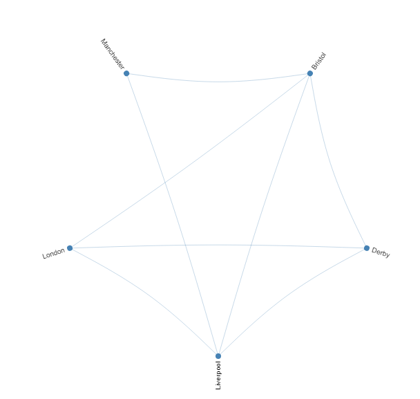
10 Bristol Derby 1 29现在我绘制了一个循环网络:
df <- subset(df2, Transit== 1, select = c("City1","City2"))
edgebundle(graph.data.frame(df),directed=F,tension=0.1,fontsize = 10)
我的目标是根据数据集中“ave.pas”变量中相应的值来设置边缘的大小或颜色强度。
(必须使用edgebundle()函数绘制绘图)
回答 1
Stack Overflow用户
发布于 2022-05-19 20:46:51
连通图中边的强度似乎是连接顶点的边数的函数。我们可以使边缘的数量等于乘客的数量,但问题是,在绘制了几条线之后,强度就不再增加了。因此,它可以很好地显示1和3边之间的差异,但10和30之间的差别要小得多。作为一种折衷,我们可以使边数与乘客数量近似成正比。其中一种方法是从邻接矩阵创建图形:
cities <- unique(c(df2$City1, df$City2))

m <- matrix(0, nrow = length(cities), ncol = length(cities),
            dimnames = list(cities, cities))

for(i in seq(nrow(df2))) m[df2[i, 1], df2[i, 2]] <- df2[i, 4]

m <- m/min(m[m > 0])

edgebundle(graph_from_adjacency_matrix(m))

页面原文内容由Stack Overflow提供。腾讯云小微IT领域专用引擎提供翻译支持
原文链接:
https://stackoverflow.com/questions/72310452
复制相关文章
相似问题
腾讯云开发者

Copyright © 2013 - 2026 Tencent Cloud. All Rights Reserved. 腾讯云 版权所有
深圳市腾讯计算机系统有限公司 ICP备案/许可证号:粤B2-20090059 ![]() 粤公网安备44030502008569号
粤公网安备44030502008569号
腾讯云计算(北京)有限责任公司 京ICP证150476号 | 京ICP备11018762号