
柱状图
柱状图
提问于 2022-05-14 20:25:21
我正在尝试将下图复制到我的数据集(df)中。
dyBarChart <- function(dygraph) {
  dyPlotter(dygraph = dygraph,
            name = "BarChart",
            path = system.file("plotters/barchart.js",
                               package = "dygraphs"))
}

dygraph(mdeaths) %>%
  dyRangeSelector() %>%
dyBarChart()上面是在mdeaths上应用条形图的例子。
我的数据集df如下所示
df1 <- structure(list(Year = c(2021, 2022, 2020, 2021, 2022, 2020, 2021,
2020, 2021, 2020, 2021, 2020, 2021, 2020, 2021, 2020, 2021, 2020,
2021, 2020, 2021, 2020, 2021, 2020, 2021), mon_day = c("January",
"January", "February", "February", "February", "March", "March",
"April", "April", "May", "May", "June", "June", "July", "July",
"August", "August", "September", "September", "October", "October",
"November", "November", "December", "December"), `R` = c(-427,
-389, 18, -357, -230, -383, -259, -1233, -232, -875, -190, -489,
-299, -448, -577, -662, -762, -552, -621, -488, -409, -290, -76,
-155, -10)), row.names = c(NA, -25L), groups = structure(list(
Year = c(2020, 2021, 2022), .rows = structure(list(c(3L,
6L, 8L, 10L, 12L, 14L, 16L, 18L, 20L, 22L, 24L), c(1L, 4L,
7L, 9L, 11L, 13L, 15L, 17L, 19L, 21L, 23L, 25L), c(2L, 5L
)), ptype = integer(0), class = c("vctrs_list_of", "vctrs_vctr",
"list"))), row.names = c(NA, -3L), class = c("tbl_df", "tbl",
"data.frame"), .drop = TRUE), class = c("grouped_df", "tbl_df",
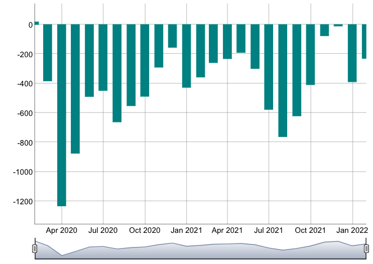
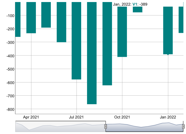
"tbl", "data.frame"))所以我需要用动态图来绘制上述数据集的条形图。我知道我们必须将df转换成时间序列,但不知道如何转换。有人能帮忙吗?
回答 1
Stack Overflow用户
回答已采纳
发布于 2022-05-15 03:52:31
我不知道函数的目的是什么,也不能从你的问题中看出这个图应该是什么样子。如果这不是你想要的,你能澄清你的问题吗?
我使用了库dygraphs、xts和lubridate。
在查看了您的数据结构之后,我创建了一个日期字段。然后我创建了一个时间序列对象。我用R作为值,它似乎是唯一合适的。
# create date and convert to date type
df1$dt = paste0(df1$Year, "-", df1$mon_day, "-", 01) %>%
  ymd()

str(df1) # validate; looks right

#convert data to xts object
df2 <- xts(x = df1$R, order.by = df1$dt)

# make it pretty
dygraph(df2) %>% dyRangeSelector() %>% dyBarChart()
页面原文内容由Stack Overflow提供。腾讯云小微IT领域专用引擎提供翻译支持
原文链接:
https://stackoverflow.com/questions/72243625
复制相关文章
相似问题
腾讯云开发者

Copyright © 2013 - 2026 Tencent Cloud. All Rights Reserved. 腾讯云 版权所有
深圳市腾讯计算机系统有限公司 ICP备案/许可证号:粤B2-20090059 ![]() 粤公网安备44030502008569号
粤公网安备44030502008569号
腾讯云计算(北京)有限责任公司 京ICP证150476号 | 京ICP备11018762号