
将X的色调转换为色调与模式(X给定色调)的图形?
将X的色调转换为色调与模式(X给定色调)的图形?
提问于 2022-05-12 22:44:54
我有一个带有颜色变量的Seaborn演示:
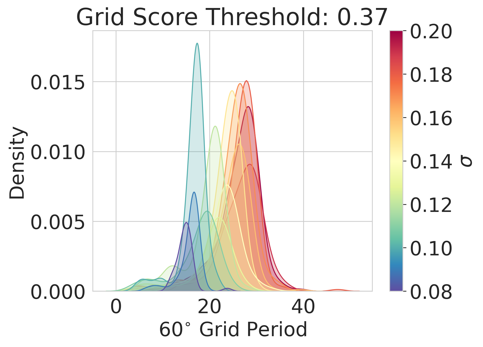
对于每个色调变量,我希望提取密度估计的模式,然后将每个色调变量与其模式进行划分,如下所示:
我该怎么做?
回答 1
Stack Overflow用户
回答已采纳
发布于 2022-05-12 23:32:57
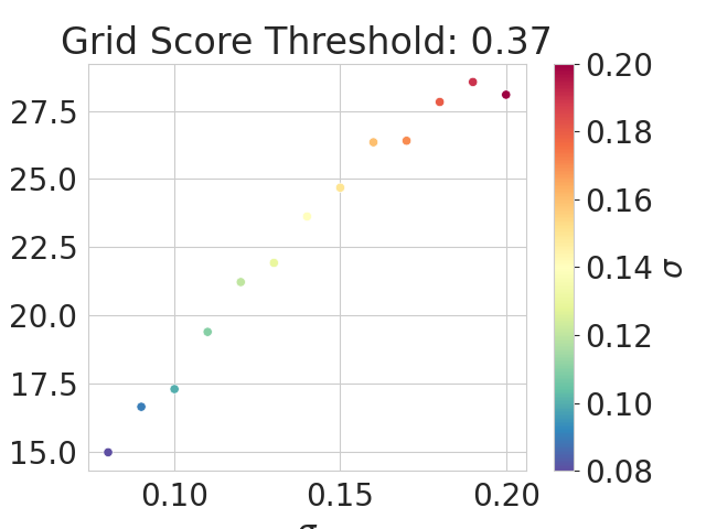
您可以使用scipy.stats.gaussian_kde创建密度估计函数。然后在x值数组上调用该函数来计算其最大值。
import matplotlib.pyplot as plt
import seaborn as sns
import pandas as pd
import numpy as np

df = pd.DataFrame({'x': np.random.normal(0.001, 1, 1300).cumsum() + 30,
                   'hue': np.repeat(np.arange(0.08, 0.20001, 0.01), 100).round(2)})
g = sns.displot(df, x='x', hue='hue', palette='turbo', kind='kde', fill=True, height=6, aspect=1.5)
plt.show()

from scipy.stats import gaussian_kde
from matplotlib.cm import ScalarMappable

fig, ax = plt.subplots(figsize=(10, 6))
hues = df['hue'].unique()
num_hues = len(hues)
colors = sns.color_palette('turbo', num_hues)
xmin, xmax = df['x'].min(), df['x'].max()
xs = np.linspace(xmin, xmax, 500)
for hue, color in zip(hues, colors):
     data = df[df['hue'] == hue]['x'].values
     kde = gaussian_kde(data)
     mode_index = np.argmax(kde(xs))
     mode_x = xs[mode_index]
     sns.scatterplot(x=[hue], y=[mode_x], color=color, s=50, ax=ax)
cmap = sns.color_palette('turbo', as_cmap=True)
norm = plt.Normalize(hues.min(), hues.max())
plt.colorbar(ScalarMappable(cmap=cmap, norm=norm), ax=ax, ticks=hues)
plt.show()
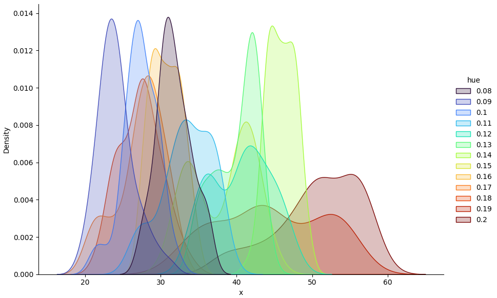
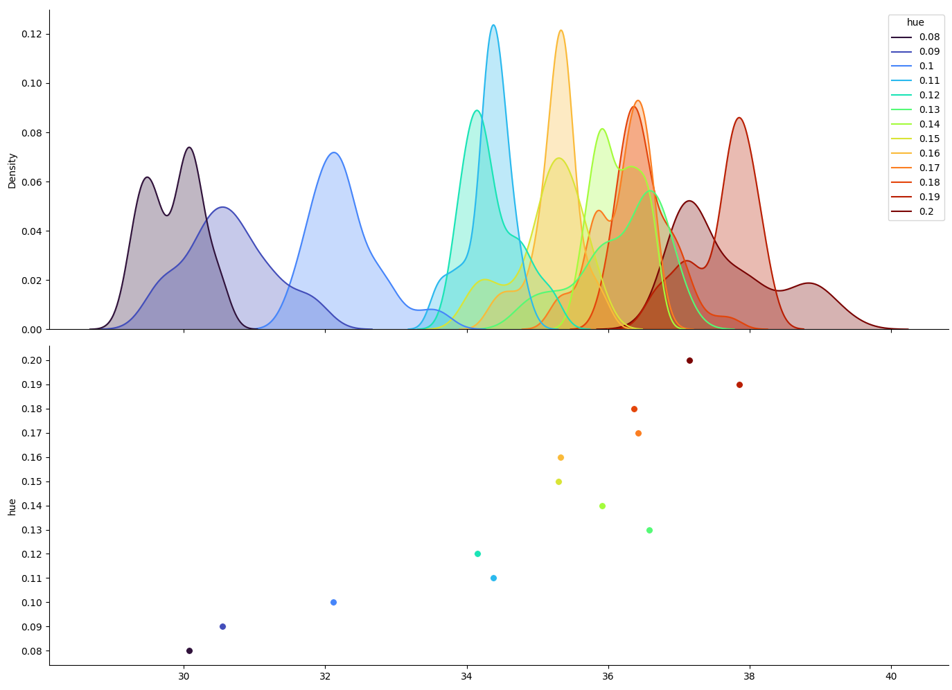
这是另一种方法,提取kde曲线。它使用kde图的图例来得到曲线和色调值之间的对应关系。sns.kdeplot是sns.displot(kind='kde')使用的轴级函数.fill=False为曲线创建了线条而不是填充的多边形,这些曲线的值更容易提取。(ax1.fill_between可以在第二次通过时填充曲线)。第二幅图的x轴和y轴被转换成对齐两个图的x轴。
import matplotlib.pyplot as plt
import seaborn as sns
import pandas as pd
import numpy as np
df = pd.DataFrame({'x': np.random.normal(0.007, 0.1, 1300).cumsum() + 30,
'hue': np.repeat(np.arange(0.08, 0.20001, 0.01), 100).round(2)})
fig, (ax1, ax2) = plt.subplots(nrows=2, figsize=(12, 10), sharex=True)
sns.kdeplot(data=df, x='x', hue='hue', palette='turbo', fill=False, ax=ax1)
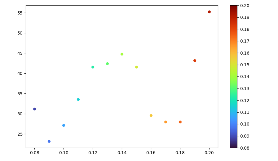
hues = [float(txt.get_text()) for txt in ax1.legend_.get_texts()]
ax2.set_yticks(hues)
ax2.set_ylabel('hue')
for hue, line in zip(hues, ax1.lines[::-1]):
color = line.get_color()
x = line.get_xdata()
y = line.get_ydata()
ax1.fill_between(x, y, color=color, alpha=0.3)
mode_ind = np.argmax(y)
mode_x = x[mode_ind]
sns.scatterplot(x=[mode_x], y=hue, color=color, s=50, ax=ax2)
sns.despine()
plt.tight_layout()
plt.show()
页面原文内容由Stack Overflow提供。腾讯云小微IT领域专用引擎提供翻译支持
原文链接:
https://stackoverflow.com/questions/72222795
复制相关文章
相似问题
腾讯云开发者

Copyright © 2013 - 2026 Tencent Cloud. All Rights Reserved. 腾讯云 版权所有
深圳市腾讯计算机系统有限公司 ICP备案/许可证号:粤B2-20090059 ![]() 粤公网安备44030502008569号
粤公网安备44030502008569号
腾讯云计算(北京)有限责任公司 京ICP证150476号 | 京ICP备11018762号