
删除默认图例,但添加自定义图例tidyverse?
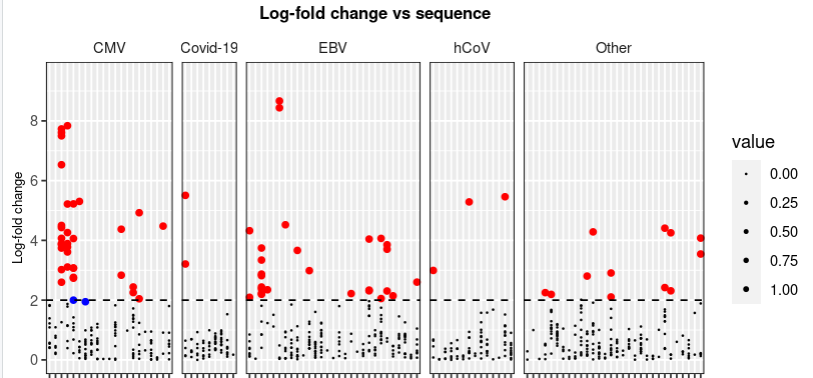
我真的希望你有时间帮忙。所以,我尝试做一个我想要删除默认图例的图,因为它没有任何意义,因为它是基于0-1的大小(我试着使用legend.position = "none“,它起作用了),但是我想根据我的图解添加一个新的图例,这样我就有了三个选项:小点(log折叠< 2),蓝点(p < 0.001和log折叠< 2),红点(p < 0.001和log折叠> 2)。但我不能删除默认的图例,仍然添加一个新的传说?!
提前谢谢!
下面是我绘制图表的代码。
maximum_y <- my_data_clean_aug %>%
  pull(log_fold_change) %>%
  max() %>%
  round() + 0.5

#Determining the numbers of sequences per virus strain (Origin) and setting a threshold.
threshold <- my_data_clean_aug %>%
  count(Origin) %>%
  filter(n > 50) %>%
  count() %>%
  pull()

#Pooling all groups of vira with less than 50 hits into HHV or Others
my_data_clean_aug_pooling <- my_data_clean_aug %>%
  mutate(Origin = as.factor(Origin)) %>%
  mutate(newID = fct_lump(Origin, threshold)) %>%
  mutate(value = case_when(log_fold_change <= 2 ~ 0,
                           0.001 < p & log_fold_change >= 2 ~ 0,
                           0.001 >= p & log_fold_change >= 2 ~ 1))

pointsofinterest <- my_data_clean_aug_pooling %>%
  filter(0.001 >= p & log_fold_change >= 2)

pointswithpsig <- my_data_clean_aug_pooling %>%
  filter(0.001 >= p & log_fold_change < 2)

my_data_clean_aug_pooling %>%
  ggplot(aes(x = Peptide,
             y = log_fold_change)) +
  facet_grid(.~newID,
             scales = "free_x",
             space = "free") +
  geom_point(aes_string(size = "value")) +
  geom_point(data = pointsofinterest,
             color = "red") +
  geom_point(data = pointswithpsig,
             color = "blue") +
  geom_hline(yintercept = 2,
             linetype = "dashed") +
  scale_y_continuous(limits = c(0,
                                maximum_y),
                     breaks = seq(0,
                                  maximum_y,
                                  2)) +
  theme(plot.title = element_text(size = 10,
                                  hjust = 0.5,
                                  face = "bold"),
        axis.text.x = element_text(size = 5,
                                   angle = 90,
                                   vjust = 0.5,
                                   hjust = 1),
        strip.background = element_rect(fill = "white"),
        panel.border = element_rect(colour = "black",
                                    fill = NA),
        axis.title.x = element_text(size = 8),
        axis.title.y = element_text(size = 8),
        plot.background = element_rect(fill = "transparent",
                                       color = NA)) +
  labs(x = "ID",
       y = "Log-fold change",
       title = "Log-fold change vs sequence") +
  scale_size(range = c(0.1,
1))dput(head(my_data_clean_aug_pooling, 30))
structure(list(sample = c("BC372", "BC372", "BC372",
"BC372", "BC372", "BC372", "BC372", "BC372", "BC372", "BC372",
"BC372", "BC372", "BC372", "BC372", "BC372", "BC372", "BC372",
"BC372", "BC372", "BC372", "BC372", "BC372", "BC372", "BC372",
"BC372", "BC372", "BC372", "BC372", "BC372", "BC372"), log_fold_change = c(0.878480955476892,
0.0254158993036971, 0.169690374849339, 1.29365346670481, 0.950207146498172,
0.121582483746693, 0.29591552217522, 0.0493694708020405, 0.253196235065184,
0.511413610788978, 0.92777679529061, 0.633288220541381, 0.852617925189971,
0.245947820840199, 0.284143920808481, 0.54421651055215, 0.998865269852439,
0.468714806763581, 0.704136952532169, 0.334881411284732, 1.09989649348867,
0.44520995356178, 0.559300342753859, 0.198650181166743, 0.947415942094208,
0.0365273151532468, 0.129416762542994, 3.85327690599736, 0.912242173799338,
0.980016944958404), p = c(0.455815003793973, 0.9710277325421,
0.929138758106761, 0.106508575848957, 0.325186030411862, 0.933801784951691,
0.929138758106761, 0.96549305958931, 0.929138758106761, 0.776892782297412,
0.325186030411862, 0.635666815285353, 0.382558882746048, 0.929138758106761,
0.929138758106761, 0.722931599232632, 0.325186030411862, 0.815874297477519,
0.529382980477629, 0.929138758106761, 0.238130758200615, 0.827129935665299,
0.711217028978768, 0.929138758106761, 0.325186030411862, 0.96549305958931,
0.933280410383701, 2.15547277536054e-13, 0.349668295725122, 0.325186030411862
), HLA = c("A0201", "A0201", "A0201", "A0201", "A0201", "A0201",
"A0201", "A0201", "A0201", "A0201", "A0201", "A0201", "A0201",
"A0201", "A0201", "A0201", "A0201", "A0301", "A0301", "A0301",
"A2402", "A2402", "A2402", "A2402", "B0702", "B0702", "B0702",
"B0801", "B0801", "B0801"), Origin = structure(c(5L, 1L, 5L,
9L, 19L, 5L, 7L, 18L, 1L, 3L, 5L, 14L, 14L, 9L, 5L, 3L, 5L, 5L,
5L, 3L, 3L, 2L, 14L, 5L, 3L, 15L, 5L, 5L, 3L, 3L), .Label = c("B19",
"BKPyV", "CMV", "Covid-19", "EBV", "FLU-A", "HAdV-C", "hCoV",
"HHV-1", "HHV-2", "HHV-6B", "HIV-1", "HMPV", "HPV", "JCPyV",
"NWV", "unknown", "VACV", "VZV"), class = "factor"), Peptide = c("v16",
"a47", "a49", "a50", "a51", "a52", "a53", "a55", "a57", "a58",
"a59", "a60", "a61", "a64", "a65", "a66", "a67", "v18", "v25",
"a68", "a74", "a77", "a80", "a81", "v14", "a87", "a89", "v17",
"v22", "a90"), newID = structure(c(3L, 5L, 3L, 5L,
5L, 3L, 5L, 5L, 5L, 1L, 3L, 5L, 5L, 5L, 3L, 1L, 3L, 3L, 3L, 1L,
1L, 5L, 5L, 3L, 1L, 5L, 3L, 3L, 1L, 1L), .Label = c("CMV", "Covid-19",
"EBV", "hCoV", "Other"), class = "factor"), value = c(0, 0, 0,
0, 0, 0, 0, 0, 0, 0, 0, 0, 0, 0, 0, 0, 0, 0, 0, 0, 0, 0, 0, 0,
0, 0, 0, 1, 0, 0)), row.names = c(NA, -30L), class = c("tbl_df",
"tbl", "data.frame"))回答 2
Stack Overflow用户
发布于 2022-05-08 11:59:18
这里有个办法。
与其将数据过滤为3个不同的数据集,不如创建一个新列,其值对应于几个条件。我已经调用了新变量Colour,但是任何有意义的名称都可以。值是用case_when语句分配的,缺省值是"black"。然后,用手动的比例给出颜色。
要删除value图例,它现在使用参数guide。
为了使问题代码更清晰,我还定义了一个自定义theme。
theme_LasseVoss <- function(){
  theme_minimal() %+replace%
    theme(
      plot.title = element_text(size = 10,
                                hjust = 0.5,
                                face = "bold"),
      axis.text.x = element_text(size = 5,
                                 angle = 90,
                                 vjust = 0.5,
                                 hjust = 1),
      strip.background = element_rect(fill = "white"),
      panel.border = element_rect(colour = "black",
                                  fill = NA),
      axis.title.x = element_text(size = 8),
      axis.title.y = element_text(size = 8),
      plot.background = element_rect(fill = "transparent",
                                     color = NA)
    )
}

maximum_y <- ceiling(max(my_data_clean_aug_pooling$log_fold_change))

my_data_clean_aug_pooling %>%
  mutate(Colour = case_when(
    0.001 >= p & log_fold_change >= 2 ~ "interest",
    0.001 >= p & log_fold_change < 2 ~ "psig",
    TRUE ~ "other"
  )) %>%
  ggplot(aes(x = Peptide, y = log_fold_change)) +
  geom_point(aes(size = value, colour = Colour)) +
  geom_hline(yintercept = 2, linetype = "dashed") +
  #
  scale_color_manual(
    name = "Colour",
    values = c(other = "black", interest = "red", psig = "blue")
  ) +
  scale_size(
    range = c(0.1, 1),
    guide = "none"
  ) +
  scale_y_continuous(
    limits = c(0, maximum_y),
    breaks = seq(0, maximum_y, 2)
  ) +
  #
  labs(x = "ID", y = "Log-fold change",
       title = "Log-fold change vs sequence") +
  facet_grid(.~newID, scales = "free_x", space = "free") +
theme_LasseVoss()Stack Overflow用户
发布于 2022-05-08 13:39:36
通常,如果避免单独绘制数据子集,则更容易使图例正常工作,因此获取绘图的一种方法是添加一个额外的列,指示它的类型。请注意,示例数据不包括和重要点。然后,您可以将代码更改为:
my_data_clean_aug_pooling <- my_data_clean_aug_pooling %>%
  mutate(group = factor(ifelse(0.001 >= p, ifelse(log_fold_change >= 2, "Interesting", "Significant"), "Boring"),
                           levels=c("Boring", "Interesting", "Significant")))

levels(my_data_clean_aug_pooling$group)
#[1] "Boring"      "Interesting" "Significant"


my_data_clean_aug_pooling %>%
  ggplot(aes(x = Peptide,
             y = log_fold_change, colour=group, size=group)
         ) +
  facet_grid(.~newID,
             scales = "free_x",
             space = "free") +
  geom_point() +
  geom_hline(yintercept = 2,
             linetype = "dashed") +
  scale_y_continuous(limits = c(0,
                                maximum_y),
                     breaks = seq(0,
                                  maximum_y,
                                  2)) +
  theme(plot.title = element_text(size = 10,
                                  hjust = 0.5,
                                  face = "bold"),
        axis.text.x = element_text(size = 5,
                                   angle = 90,
                                   vjust = 0.5,
                                   hjust = 1),
        strip.background = element_rect(fill = "white"),
        panel.border = element_rect(colour = "black",
                                    fill = NA),
        axis.title.x = element_text(size = 8),
        axis.title.y = element_text(size = 8),
        plot.background = element_rect(fill = "transparent",
                                       color = NA)) +
  labs(x = "ID",
       y = "Log-fold change",
       title = "Log-fold change vs sequence") +
  scale_colour_manual(values=c("Boring"="black","Interesting"="red","Significant"="blue")) +
  scale_size_manual(values=c("Boring"=0.1, "Interesting"=5, "Significant"=5))
这意味着:
(我可能没有为黑点选择最好的名字!)
https://stackoverflow.com/questions/72159429
复制相似问题
腾讯云开发者

Copyright © 2013 - 2026 Tencent Cloud. All Rights Reserved. 腾讯云 版权所有
深圳市腾讯计算机系统有限公司 ICP备案/许可证号:粤B2-20090059 ![]() 粤公网安备44030502008569号
粤公网安备44030502008569号
腾讯云计算(北京)有限责任公司 京ICP证150476号 | 京ICP备11018762号