
选择R高倍颜色为每个钻下水平图在Rshiny
选择R高倍颜色为每个钻下水平图在Rshiny
提问于 2022-05-01 20:15:39
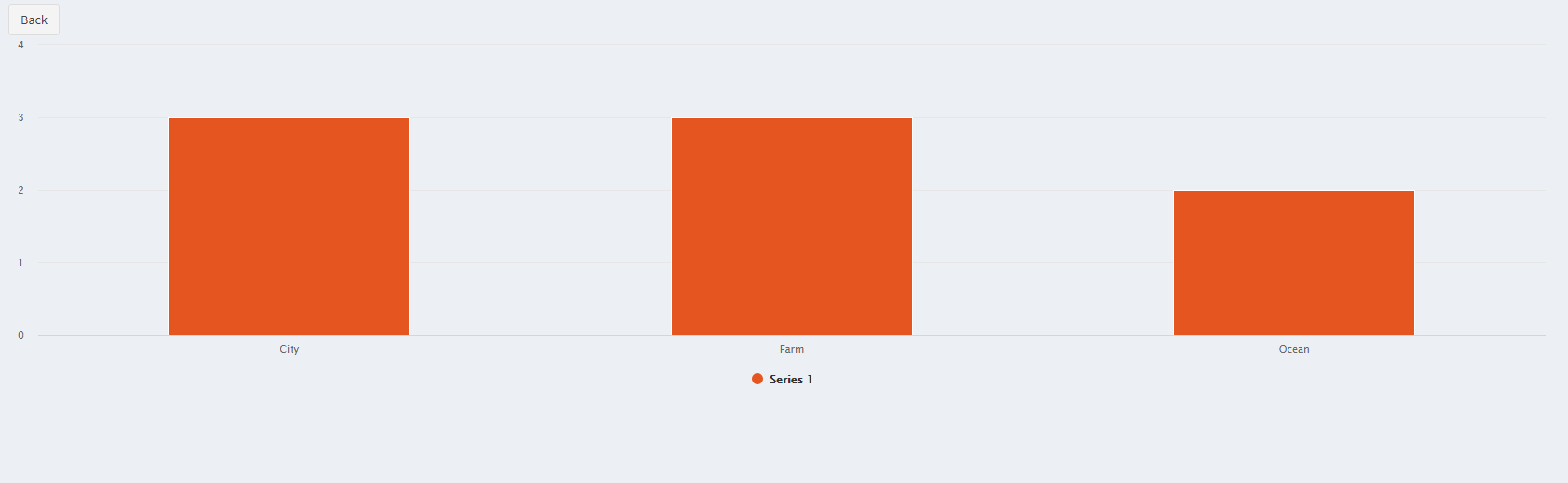
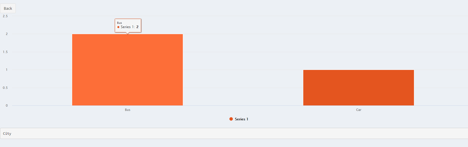
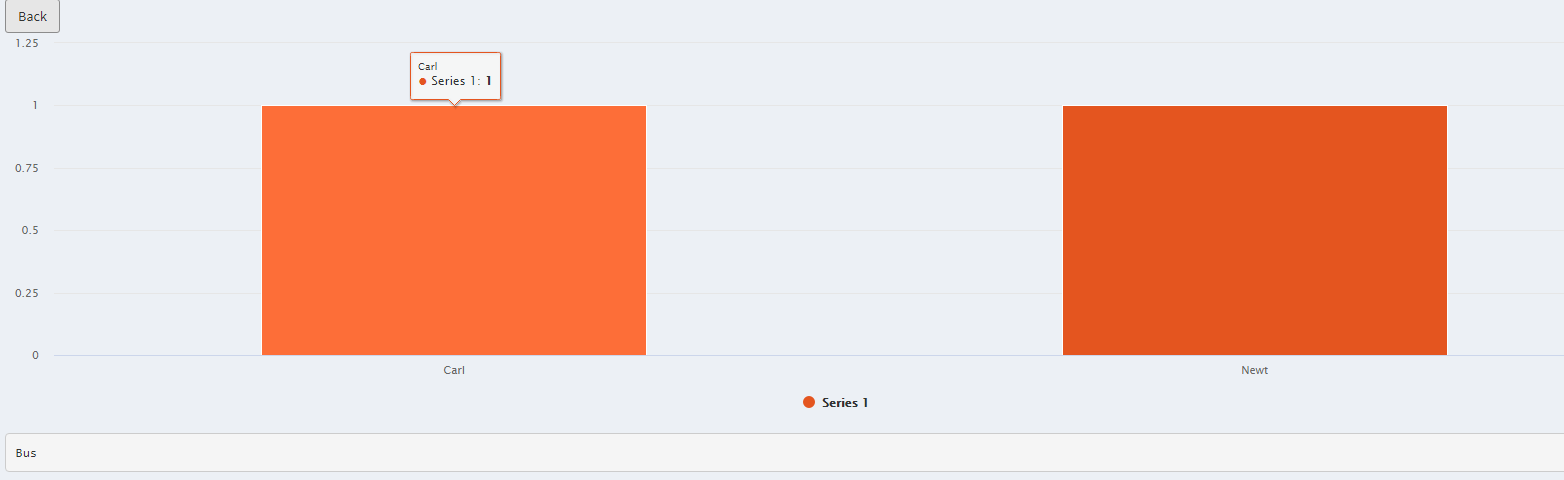
我正在创建一个类似于这个question中的解决方案的向下钻取,但是我有6个向下钻取的级别,而最初的问题有3个级别。是否有一种方法来指定每个向下钻层的颜色?例如,使用所引用的问题,我将能够指定一级城市,农场和海洋,二级公共汽车和汽车,三级卡尔和纽特等的颜色(如下图所示)。这个是可能的吗?
钻下1级
选择一级“城市”,导致2级公共汽车和汽车
选择二级“公共汽车”,导致卡尔和纽特等。
我试过的是:
......
highchart() %>%
      hc_xAxis(type = "category") %>%
      hc_add_series(tibbled, "column", hcaes(x = name, y = y), color = "#E4551F", "#4572A7",
"#AA4643", "#89A54E", "#80699B", "#3D96AE") %>%
      hc_plotOptions(column = list(stacking = "normal", events = list(click = pointClickFunction)))
这不起作用,它只是使用了第一个十六进制代码。当然,必须有一种方式说“对于类别城市使用颜色"#4572A7”等“?请帮帮忙
回答 1
Stack Overflow用户
回答已采纳
发布于 2022-05-02 04:29:13
有几种不同的方法可以做到这一点。您没有提供一个可重复的问题,所以我使用了数据gapminder。
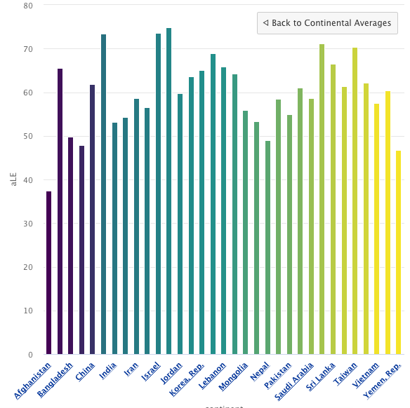
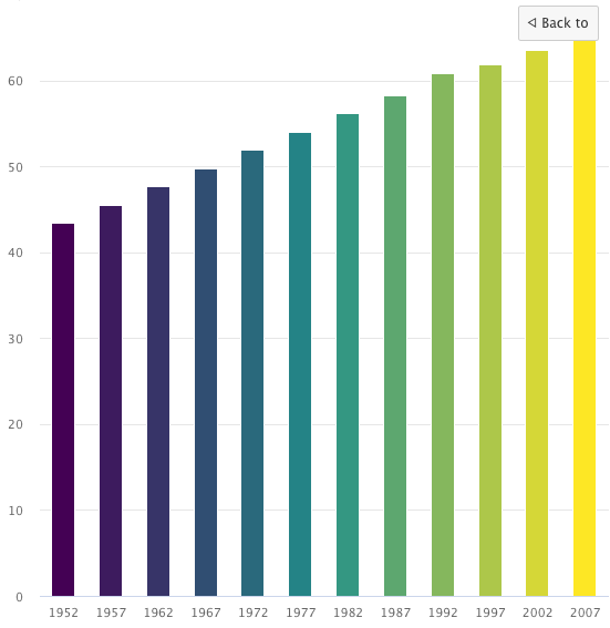
最高水平是按大陆分列的平均预期寿命。第二个层次是按国家分列的平均数。第三个层次是按国家分列的预期寿命。
我使用highcharter函数colorize创建颜色向量。我就是这样把它放在一起的:
数据
library(tidyverse)
library(highcharter)
data(gapminder, package = "gapminder")

avLE = gapminder %>%
  group_by(continent) %>%
  mutate(aLE = mean(lifeExp)) %>% # average by continent
  ungroup() %>% group_by(country) %>%
  mutate(caLE = mean(lifeExp)) %>% # average by year
  ungroup() %>% arrange(desc(aLE)) %>% # order by life expectancy for continents
  mutate_if(is.numeric, round, 2)  # round to 2 decimals
summary(avLE) # check it; makes sense

gapCol = avLE %>%  # set the continets in the validated avLE as ordered
  group_by(continent) %>%
  mutate(color = colorize(continent),
         continent = ordered(continent,
                             levels = unique(avLE$continent)))
summary(gapCol) # check it; makes sense
钻地
# make the deepest level dropdown
gapDD2 = avLE %>%
  arrange(year) %>%
  group_nest(continent, country, caLE) %>% # keep these variables!
  mutate(id = country,
         type = "column",
         data = map(data, mutate, name = year, y = lifeExp,
                    color = colorize(year)), # set the color (easier with #)
         data = map(data, list_parse))

gapDD1 = avLE %>%
  arrange(country) %>%  # arrange by country, set as ordered, then find colors
  mutate(country = ordered(country, levels = unique(country))) %>%
  mutate(color = ordered(colorize(country),     # colors/countries align
                         levels = unique(colorize(country)))) %>%
  group_nest(continent) %>%
  mutate(id = continent,
         type = "column",
         data = map(data, mutate, name = country, y = caLE,
                    color = color,  # set the color (a few more steps than with #s)
                    drilldown = country),
         data = map(data, list_parse))
图表
# take a look:
hchart(gapCol, "column", name = "Continental Averages",
       hcaes(x = continent, color = continent, y = aLE,
             name = "continent", drilldown = "continent")) %>%
  hc_drilldown(allowPointsDrillDown = T,
               series = c(list_parse(gapDD1), list_parse(gapDD2)))
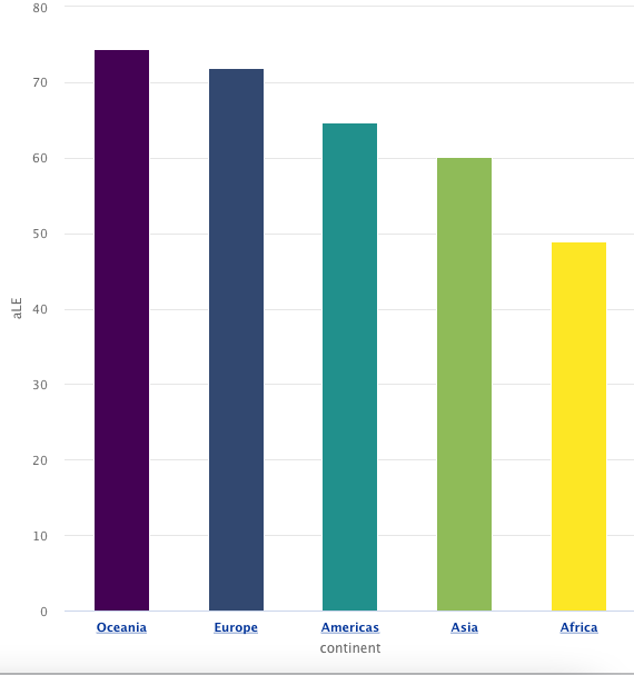
闪闪发亮
我提供了一个非常简单的示例,说明如何在一个闪亮的应用程序中呈现此图。在本例中,除了调用hchart之外,所有代码都是在设置ui之前调用的。
ui <- fluidPage(
  fluidRow(highchartOutput("myHC"))
)
server <- function(input, output, session){
  output$myHC <- renderHighchart({
    hchart(gapCol, "column", name = "Continental Averages",
           hcaes(x = continent, color = continent, y = aLE,
                 name = "continent", drilldown = "continent")) %>%
      hc_drilldown(allowPointsDrillDown = T,
                   series = c(list_parse(gapDD1), list_parse(gapDD2)))
  })
}
shinyApp(ui = ui, server = server)
如果你有任何问题,请告诉我。
页面原文内容由Stack Overflow提供。腾讯云小微IT领域专用引擎提供翻译支持
原文链接:
https://stackoverflow.com/questions/72080105
复制相关文章
相似问题
腾讯云开发者

Copyright © 2013 - 2026 Tencent Cloud. All Rights Reserved. 腾讯云 版权所有
深圳市腾讯计算机系统有限公司 ICP备案/许可证号:粤B2-20090059  粤公网安备44030502008569号
腾讯云计算(北京)有限责任公司 京ICP证150476号 | 京ICP备11018762号