
范畴变量(1D)的ggplot可视化
我有一个分类数据的集合,我试图找出如何最好地可视化它。它是一个“简单”列表(97个类别长),只有一个名称和一个相关的值。下面是一个可以使用的示例(在实际的集合中,名称要长得多):
names <- c("A", "B", "C", "D", "E", "F", "G", "H", "I", "J", "K", "L", "M", "N",
"O", "P", "Q", "R", "S", "T", "U", "V", "W", "X", "Y", "Z", "AA", "AB", "AC", "AD",
"AE", "AF", "AG", "AH", "AI", "AJ", "AK", "AL", "AM", "AN", "AO", "AP", "AQ", "AR",
"AS", "AT", "AU", "AV", "AW", "AX", "AY", "AZ", "BA", "BB", "BC", "BD", "BE", "BF",
"BG", "BH", "BI", "BJ", "BK", "BL", "BM", "BN", "BO", "BP", "BQ", "BR", "BS", "BT",
"BU", "BV", "BW", "BX", "BY", "BZ", "CA", "CB", "CC", "CD", "CE", "CF", "CG", "CH",
"CI", "CJ", "CK", "CL", "CM", "CN", "CO", "CP", "CQ", "CR", "CS")

cts <- c(620, 343, 165, 121, 107, 106, 104, 88, 83, 59, 57, 56, 49, 45, 44, 37, 37,
37, 37, 35, 31, 31, 29, 27, 24, 23, 23, 22, 21, 21, 20, 20, 17, 17, 16, 16, 15, 15,
15, 14, 14, 13, 13, 12, 12, 12, 11, 11, 10, 10, 10, 9, 9, 8, 8, 7, 6, 5, 5, 5, 5, 5,
4, 4, 4, 3, 3, 3, 3, 2, 2, 2, 2, 2, 2, 2, 2, 2, 2, 2, 2, 1, 1, 1, 1, 1, 1, 1, 1, 1,
1, 1, 1, 1, 1, 1, 1)

testdat <- data.frame(names, cts)我最初的想法是制作一个棒棒糖图表,但是因为有这么多的点,R把它们挤在一起,就会变得一团糟。条形图/列图也是出于同样的原因而出现的。我想也许可以制作一个情节,其中所有的类别都有一个形状(一个盒子?)有一个与cts变量相对应的区域,但我还没有找到类似的东西(我尝试了waffle包,但我正在与它斗争)。我发现的所有东西似乎至少需要两个数值才能以x和y的方式绘制。
我的下一个数据集是相同的格式,只有更多的类别(9,351而不是“仅仅”97),所以我希望能扩展一些内容。
有谁能想到如何看待这些数据而不把它分割掉呢?
回答 3
Stack Overflow用户
发布于 2022-04-07 20:18:24
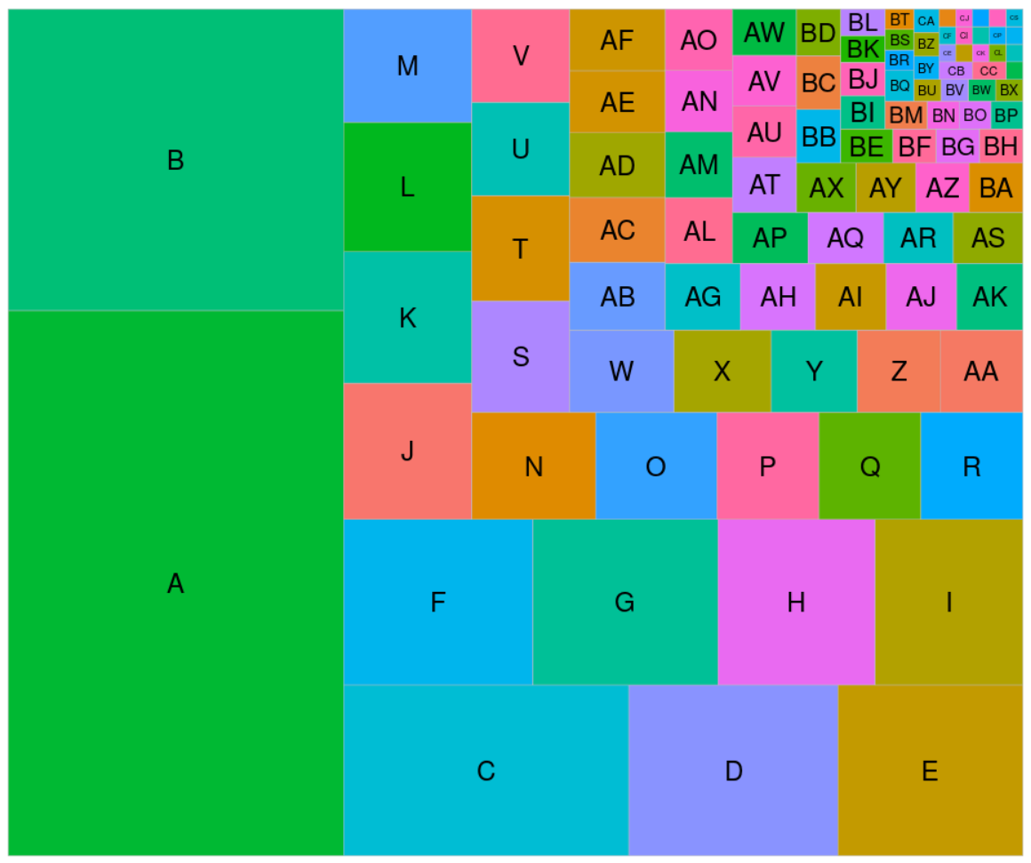
也许是树状地图?
library(ggplot2)
library(treemapify)

ggplot(testdat, aes(area = cts, fill = names)) +
    geom_treemap() +
    geom_treemap_text(aes(label = names), place = 'center') +
    scale_fill_discrete(guide = 'none', limits = sample(testdat$names))
Stack Overflow用户
发布于 2022-04-07 20:52:51
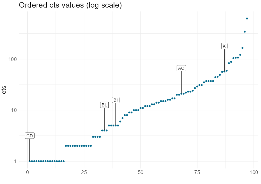
这里有两个问题。其一,一个有100个标签类别的情节总是太忙了。最好在数字轴上绘制排序的值,并标记一些重要的说明性类别:
library(tidyverse)
library(ggrepel)

set.seed(1)

plot_dat <- testdat %>%
  arrange(cts) %>%
  mutate(num = seq(nrow(.)))

  ggplot(plot_dat, aes(num, cts)) +
  geom_point(colour = "deepskyblue4") +
  geom_label_repel(data = plot_dat[sample(nrow(plot_dat), 5), ],
                   aes(label = names), nudge_y = 0.5) +
  scale_y_log10() +
  theme_minimal() +
  ggtitle("Ordered cts values (log scale)") +
  labs(x = "") +
  theme(text = element_text(size = 16))
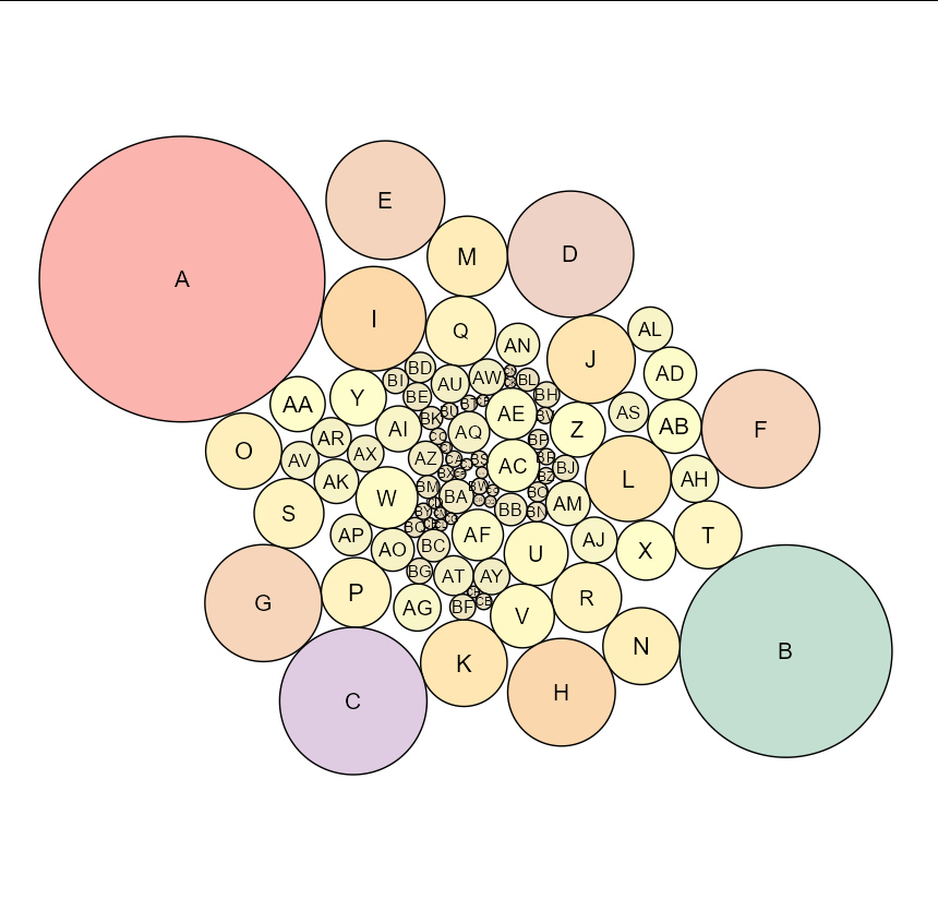
另一个问题是用一维信息填充2d空间。您可以使用树状地图或包装圈来完成此操作:
library(packcircles)
library(ggplot2)
library(ggforce)

testdat <- cbind(testdat, circleRepelLayout(testdat$cts)$layout)

ggplot(testdat, aes(x0 = x, y0 = y, fill = radius)) +
  geom_circle(aes(r = radius)) +
  geom_text(aes(x, y, label = names, size = order(radius))) +
  coord_equal() +
  theme_void() +
  scale_fill_distiller(palette = "Pastel1") +
  theme(legend.position = "none")
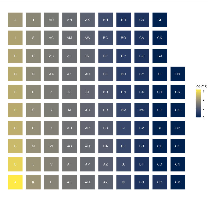
或者仅仅是一个颜色代表价值的华夫饼:
library(tidyverse)

testdat %>%
  mutate(x = rep(1:10, each = 10)[seq(nrow(.))],
         y = rep(1:10, 10)[seq(nrow(.))]) %>%
  ggplot(aes(x, y, fill = log(cts))) +
  geom_tile(width = 0.8, height = 0.8) +
  geom_text(aes(label = names), color = "white") +
  scale_fill_viridis_c(option = "E") +
  coord_equal() +
  theme_void()
Stack Overflow用户
发布于 2022-04-07 21:11:21
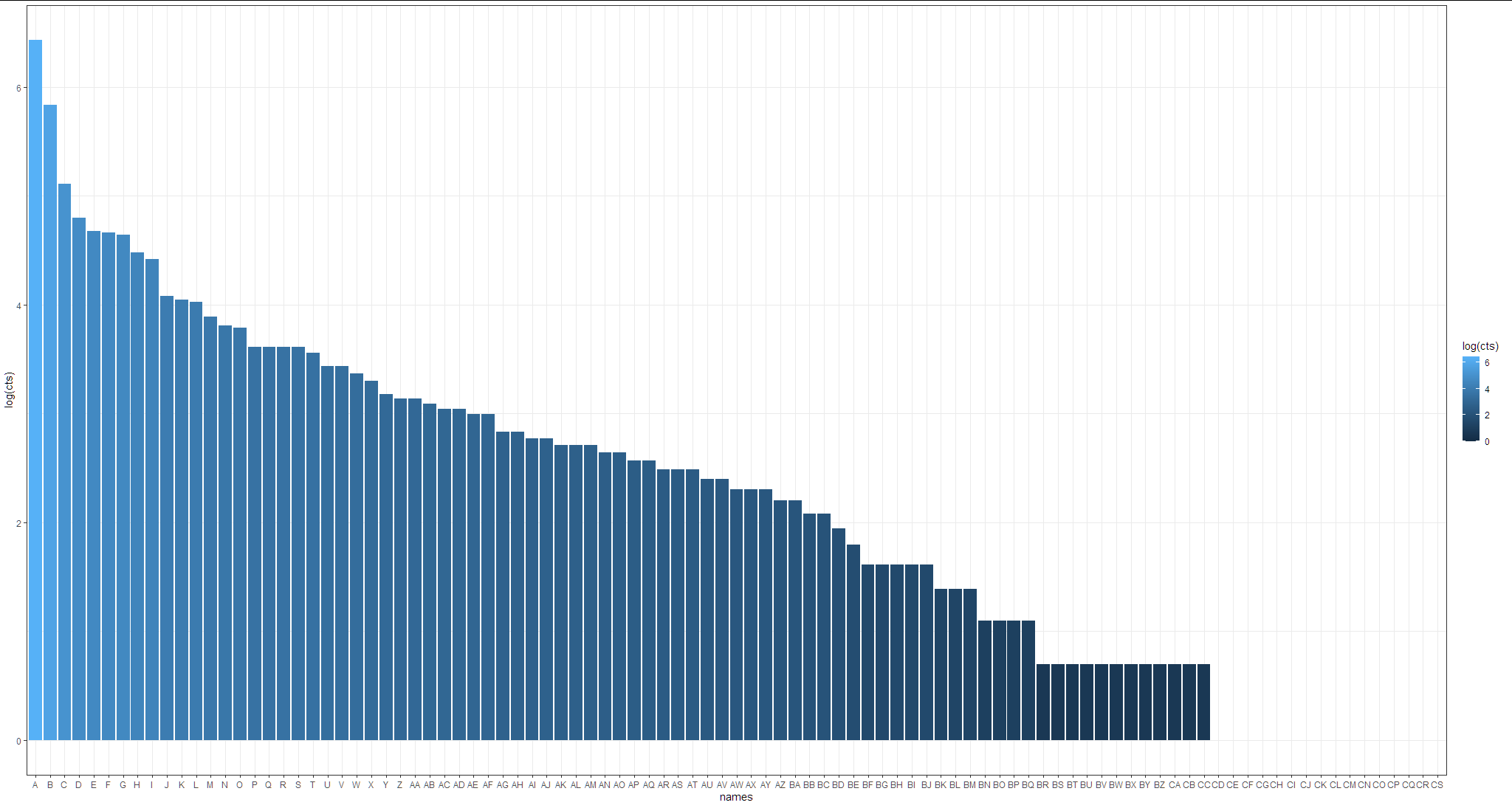
简单方法:
使用带有日志转换轴的条形图:
library(tidyverse)

testdat %>%
  mutate(names = factor(names, levels = names)) %>%
  ggplot(aes(x = names, y=log(cts), fill= log(cts)))+
  geom_col()+
  theme_bw()
https://stackoverflow.com/questions/71788127
复制相似问题
腾讯云开发者

Copyright © 2013 - 2026 Tencent Cloud. All Rights Reserved. 腾讯云 版权所有
深圳市腾讯计算机系统有限公司 ICP备案/许可证号:粤B2-20090059 ![]() 粤公网安备44030502008569号
粤公网安备44030502008569号
腾讯云计算(北京)有限责任公司 京ICP证150476号 | 京ICP备11018762号