
用双轴绘制熊猫线图并通过数据进行循环
用双轴绘制熊猫线图并通过数据进行循环
提问于 2022-03-30 14:45:15
我有这样的数据,
data = {'TIMEFRAME':['9/12/2014 17:52', '10/12/2014 5:02', '10/12/2014  8:04'],
        'Volumetric Flow Meter 1':[0.82, 0.88, 0.9],
        'Pump Speed (RPM)':[2.5,2.7,3.01],
        'Data Source':['raw data','raw data','raw data'],
        'PUMP FAILURE (1 or 0)':[0,0,1]}

df = pd.DataFrame(data)
df

TIMEFRAME       Volumetric Flow Meter 1  Pump Speed (RPM)  Data Source   PUMP FAILURE (1 or 0)
9/12/2014  17:52           0.82                   2.5      raw data           0
10/12/2014 5:02            0.88                   2.7      raw data           0
10/12/2014 8:04 0.90 3.01 raw data 1我试图循环遍历数据集,分别绘制每个数值变量,以防止泵故障来识别趋势。我必须在dataframe中创建每个数值列的列表,并循环遍历它,以便针对泵故障(1或0)列绘制它们。
对于每一幅图,我必须确保设置了一个双轴,以便在第二个Y轴上看到泵故障(0或1),在第一个Y轴上看到属性。
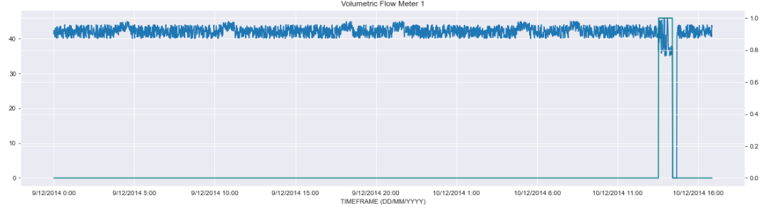
输出是这样的,
这是我的方法
ListOfVariables=[df["Pump Speed (RPM)"],df["Volumetric Flow Meter 1"]]

for item in ListOfVariables:
    first_axis = df[item].plot #Looping through every item in the dataframe.
    second_axis = first_axis.twinx() #The Twinx function is used to ensure we share the X-Axis for both plots
    second_axis.plot(df['PUMP FAILURE (1 or 0)'], color='teal')
    plt.title(item)
    plt.show()
这不会产生欲望输出。任何帮助都是非常感谢的。谢谢。
回答 1
Stack Overflow用户
回答已采纳
发布于 2022-03-30 14:56:24
使用:
import pandas as pd
import numpy as np
import matplotlib.dates as mdates
import matplotlib.pyplot as plt
data = {'TIMEFRAME': pd.date_range('9/12/2014 17:52', '10/12/2014 18:04', 100),
'Volumetric Flow Meter 1':np.random.randn(100),
'Pump Speed (RPM)':np.random.randn(100),
'Data Source':['raw data']*100,
'PUMP FAILURE (1 or 0)':np.random.randn(100)}
df = pd.DataFrame(data)
df['TIMEFRAME'] = pd.to_datetime(df['TIMEFRAME'])
cols = df.columns[:-1]
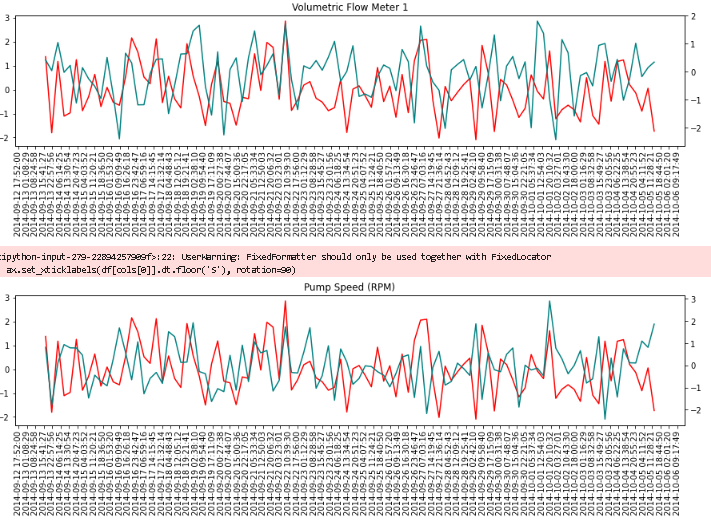
for col in cols[1:-1]:
fig, ax = plt.subplots(figsize=(15,3))
ax.plot(df[cols[0]], df['PUMP FAILURE (1 or 0)'], color = 'red')
ax2 = ax.twinx()
ax2.plot(df[cols[0]], df[col], color='teal')
ax.set_xticklabels(df[cols[0]].dt.floor('S'), rotation=90)
ax.xaxis.set_major_locator(mdates.MinuteLocator(interval=600))
plt.title(col)
plt.show()如果间隔为600,就意味着每10个小时。我用300测试了它,表示方式不太好。如果您想要更小的时间步骤,首先增加图的大小。
输出:
页面原文内容由Stack Overflow提供。腾讯云小微IT领域专用引擎提供翻译支持
原文链接:
https://stackoverflow.com/questions/71679408
复制相关文章
相似问题
腾讯云开发者

Copyright © 2013 - 2026 Tencent Cloud. All Rights Reserved. 腾讯云 版权所有
深圳市腾讯计算机系统有限公司 ICP备案/许可证号:粤B2-20090059 ![]() 粤公网安备44030502008569号
粤公网安备44030502008569号
腾讯云计算(北京)有限责任公司 京ICP证150476号 | 京ICP备11018762号