
移除x轴和gig-lot上的相关空间。
移除x轴和gig-lot上的相关空间。
提问于 2022-03-20 14:05:33
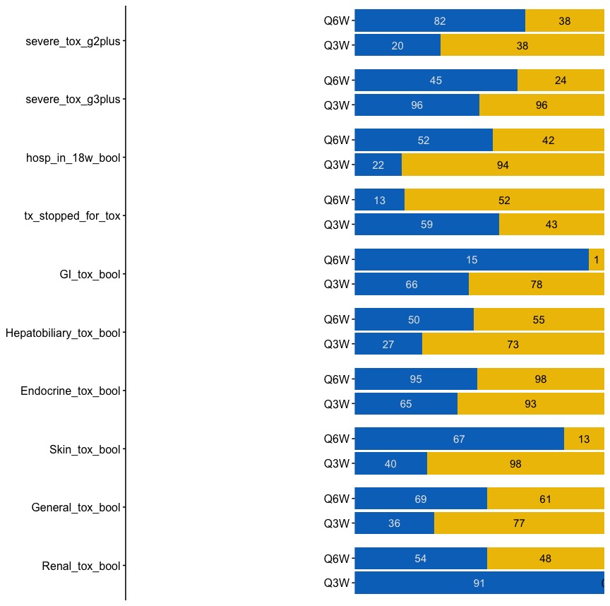
我试图使用grid.arrange()组合两个图(其中第一个图只是一个简单的y轴)。
但是第一个简单的y轴有大量的空间。有办法移除这个吗?
请参阅下面所附代码。还有put格式的数据。请参阅下面所附代码。还有put格式的数据。请参阅下面所附代码。还有put格式的数据。请参阅下面所附代码。还有put格式的数据。
left_axis <- ggplot(fig2_data, aes(y = tox_outcome)) +
  scale_y_discrete(limits = rev) +
  theme_manuscript(base_size = 12)

right_panel <- ggplot(fig2_data) +
  geom_bar(aes(x = n, y = cohort, fill = tox_outcome_bool), stat = 'identity', position = position_fill(reverse = TRUE)) +
  facet_wrap( ~ tox_outcome, ncol = 1, strip.position = 'top') +
  theme_manuscript(base_size = 12) +
  scale_fill_jco() +
  geom_text(aes(x = n, y = cohort, label = label_white), position = position_fill(reverse = TRUE, vjust = 0.5), size = 4, color = 'gray90') +
  geom_text(aes(x = n, y = cohort, label = label_black), position = position_fill(reverse = TRUE, vjust = 0.5), size = 4) +
  theme(strip.text.x = element_blank()) +
  scale_y_discrete(name = '', labels = c("Q3W", "Q6W")) +
  scale_x_continuous(expand = c(0, 0)) +
  theme(axis.text.x = element_blank(),
        axis.title.x = element_blank(),
        axis.ticks.x = element_blank(),
        axis.line.x = element_blank(),
        axis.line.y = element_blank(),
        legend.position = "none",
        panel.grid.major.x = element_blank(),
        panel.grid.major.y = element_blank()
  )

grid.arrange(left_axis, right_panel, nrow = 1)
以下是数据:
> dput(fig2_data)
structure(list(tox_outcome = structure(c(1L, 1L, 1L, 1L, 2L,
2L, 2L, 2L, 3L, 3L, 3L, 3L, 4L, 4L, 4L, 4L, 5L, 5L, 5L, 5L, 6L,
6L, 6L, 6L, 7L, 7L, 7L, 7L, 8L, 8L, 8L, 8L, 9L, 9L, 9L, 9L, 10L,
10L, 10L, 10L), .Label = c("severe_tox_g2plus", "severe_tox_g3plus",
"hosp_in_18w_bool", "tx_stopped_for_tox", "GI_tox_bool", "Hepatobiliary_tox_bool",
"Endocrine_tox_bool", "Skin_tox_bool", "General_tox_bool", "Renal_tox_bool"
), class = "factor"), cohort = c("q6w_post", "q6w_post", "q3w_post",
"q3w_post", "q6w_post", "q6w_post", "q3w_post", "q3w_post", "q6w_post",
"q6w_post", "q3w_post", "q3w_post", "q6w_post", "q6w_post", "q3w_post",
"q3w_post", "q6w_post", "q6w_post", "q3w_post", "q3w_post", "q6w_post",
"q6w_post", "q3w_post", "q3w_post", "q6w_post", "q6w_post", "q3w_post",
"q3w_post", "q6w_post", "q6w_post", "q3w_post", "q3w_post", "q6w_post",
"q6w_post", "q3w_post", "q3w_post", "q6w_post", "q6w_post", "q3w_post",
"q3w_post"), tox_outcome_bool = structure(c(1L, 2L, 1L, 2L, 1L,
2L, 1L, 2L, 1L, 2L, 1L, 2L, 1L, 2L, 1L, 2L, 1L, 2L, 1L, 2L, 1L,
2L, 1L, 2L, 1L, 2L, 1L, 2L, 1L, 2L, 1L, 2L, 1L, 2L, 1L, 2L, 1L,
2L, 1L, 2L), .Label = c("Yes", "No"), class = "factor"), n = c(82L,
38L, 20L, 38L, 45L, 24L, 96L, 96L, 52L, 42L, 22L, 94L, 13L, 52L,
59L, 43L, 15L, 1L, 66L, 78L, 50L, 55L, 27L, 73L, 95L, 98L, 65L,
93L, 67L, 13L, 40L, 98L, 69L, 61L, 36L, 77L, 54L, 48L, 91L, 0L
), label_white = c(82L, NA, 20L, NA, 45L, NA, 96L, NA, 52L, NA,
22L, NA, 13L, NA, 59L, NA, 15L, NA, 66L, NA, 50L, NA, 27L, NA,
95L, NA, 65L, NA, 67L, NA, 40L, NA, 69L, NA, 36L, NA, 54L, NA,
91L, NA), label_black = c(NA, 38L, NA, 38L, NA, 24L, NA, 96L,
NA, 42L, NA, 94L, NA, 52L, NA, 43L, NA, 1L, NA, 78L, NA, 55L,
NA, 73L, NA, 98L, NA, 93L, NA, 13L, NA, 98L, NA, 61L, NA, 77L,
NA, 48L, NA, 0L)), row.names = c(NA, -40L), class = "data.frame")
回答 2
Stack Overflow用户
发布于 2022-03-20 14:18:48
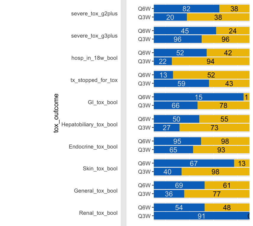
您可以更改您的比例图的margin。你的意思是这样的:
library(ggsci)
library(gridExtra)
    left_axis <- ggplot(fig2_data, aes(y = tox_outcome)) +
    scale_y_discrete(limits = rev) +
    theme(plot.margin=unit(c(0,-6,0,3), "cm"),
          element_blank())
    # theme_manuscript(base_size = 12)

  right_panel <- ggplot(fig2_data) +
    geom_bar(aes(x = n, y = cohort, fill = tox_outcome_bool), stat = 'identity', position = position_fill(reverse = TRUE)) +
    facet_wrap( ~ tox_outcome, ncol = 1, strip.position = 'top') +
   # theme_manuscript(base_size = 12) +
    scale_fill_jco() +
    geom_text(aes(x = n, y = cohort, label = label_white), position = position_fill(reverse = TRUE, vjust = 0.5), size = 4, color = 'gray90') +
    geom_text(aes(x = n, y = cohort, label = label_black), position = position_fill(reverse = TRUE, vjust = 0.5), size = 4) +
    theme(strip.text.x = element_blank()) +
    scale_y_discrete(name = '', labels = c("Q3W", "Q6W")) +
    scale_x_continuous(expand = c(0, 0)) +
    theme(axis.text.x = element_blank(),
          axis.title.x = element_blank(),
          axis.ticks.x = element_blank(),
          axis.line.x = element_blank(),
          axis.line.y = element_blank(),
          legend.position = "none",
          panel.grid.major.x = element_blank(),
          panel.grid.major.y = element_blank()
    )

  grid.arrange(left_axis, right_panel, nrow = 1)
Stack Overflow用户
发布于 2022-03-20 17:32:44
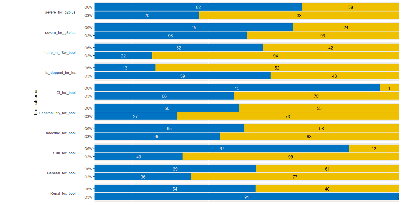
默认情况下,grid.arrange()为每个单元格提供了等量的空间。如果您想要在特定的grob,周围进行紧密匹配,您应该查询它的大小并显式地传递它。
样本代码:
grid.arrange(left_axis, right_panel, nrow = 1, widths=c(1,4))情节:

或者更好的grid.arrange(left_axis, right_panel, nrow = 1, widths=c(1,4.2))
页面原文内容由Stack Overflow提供。腾讯云小微IT领域专用引擎提供翻译支持
原文链接:
https://stackoverflow.com/questions/71547486
复制相关文章
相似问题
腾讯云开发者

Copyright © 2013 - 2026 Tencent Cloud. All Rights Reserved. 腾讯云 版权所有
深圳市腾讯计算机系统有限公司 ICP备案/许可证号:粤B2-20090059 ![]() 粤公网安备44030502008569号
粤公网安备44030502008569号
腾讯云计算(北京)有限责任公司 京ICP证150476号 | 京ICP备11018762号