
创建一个平均误差和标准差的散点图。
创建一个平均误差和标准差的散点图。
提问于 2022-03-17 14:32:27
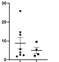
我正在尝试使用ggplot2创建一个散点图。除了个别值外,我还想显示每个组的平均值和平均值的标准误差。下面可以找到我使用GraphPad棱镜创建的所需结果的示例。
我提前感谢你宝贵的时间!BR
回答 2
Stack Overflow用户
回答已采纳
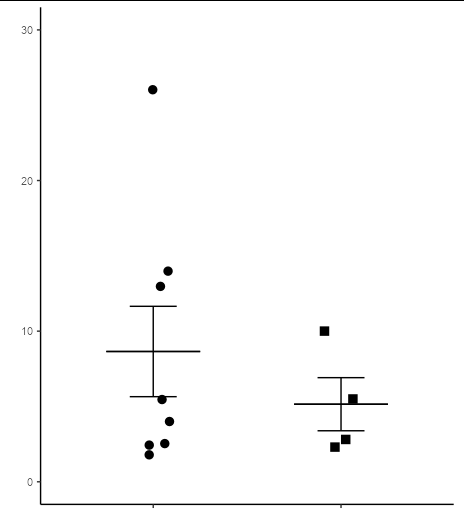
发布于 2022-03-17 14:53:06
以下代码很好地复制了您的绘图:
library(ggplot2)

ggplot(df, aes(x = group, y = y, group = group)) +
  geom_point(aes(shape = group), size = 3,
             position = position_jitter(width = 0.1)) +
  stat_summary(fun = mean,
               fun.min = function(x) mean(x) - sd(x)/sqrt(length(x)),
               fun.max = function(x) mean(x) + sd(x)/sqrt(length(x)),
               geom = 'errorbar',  width = 0.25) +
  stat_summary(fun = mean, fun.min = mean, fun.max = mean,
               geom = 'errorbar',  width = 0.5) +
  scale_y_continuous(limits = c(0, 30)) +
  scale_shape_manual(values = c(16, 15)) +
  labs(x = '', y = '') +
  theme_classic() +
  theme(axis.text.x = element_blank(),
        legend.position = 'none')
您的数据需要采用以下格式:
df <- data.frame(group = rep(c("A", "B"), times = c(8, 4)),
                 y = c(1.8, 2.5, 2.4, 4, 5.5, 13, 14, 26,
                       2.3, 2.8, 5.5, 10))

df
#>    group    y
#> 1      A  1.8
#> 2      A  2.5
#> 3      A  2.4
#> 4      A  4.0
#> 5      A  5.5
#> 6      A 13.0
#> 7      A 14.0
#> 8      A 26.0
#> 9      B  2.3
#> 10     B  2.8
#> 11     B  5.5
#> 12 B 10.0Stack Overflow用户
发布于 2022-03-17 14:44:10
查看一下geom_errorbar()函数在ggplot2中。您应该能够使用geom_errorbar()和geom_dotplot()再现一个类似于图中的情节。
页面原文内容由Stack Overflow提供。腾讯云小微IT领域专用引擎提供翻译支持
原文链接:
https://stackoverflow.com/questions/71514122
复制相关文章
相似问题
腾讯云开发者

Copyright © 2013 - 2026 Tencent Cloud. All Rights Reserved. 腾讯云 版权所有
深圳市腾讯计算机系统有限公司 ICP备案/许可证号:粤B2-20090059 ![]() 粤公网安备44030502008569号
粤公网安备44030502008569号
腾讯云计算(北京)有限责任公司 京ICP证150476号 | 京ICP备11018762号