
使R中的sjPlot显示和排序估计
使R中的sjPlot显示和排序估计
提问于 2022-03-06 21:36:20
我试图在sjPlot中绘制一个交互图,在我的预测变量的两个条件下显示出我的结果的概率百分比。除了show.values =T和sort.est =T参数之外,所有东西都工作得很完美,它们似乎什么也不做。有办法让这件事起作用吗?或者,如果不是,我如何提取用于创建此图的数据sjPlot?寻找某种方法来标记或表格显示的概率值。谢谢!
下面是一些示例数据,以及到目前为止我所掌握的数据:
set.seed(100)
dat <- data.frame(Species = rep(letters[1:10], each = 5),
threat_cat = rep(c("recreation", "climate", "pollution", "fire", "invasive_spp"), 10),
impact.pres = sample(0:1, size = 50, replace = T),
threat.pres = sample(0:1, size = 50, replace = T))
mod <- glm(impact.pres ~ 0 + threat_cat/threat.pres,
data = dat, family = "binomial")
library(sjPlot)
library(ggpubr)
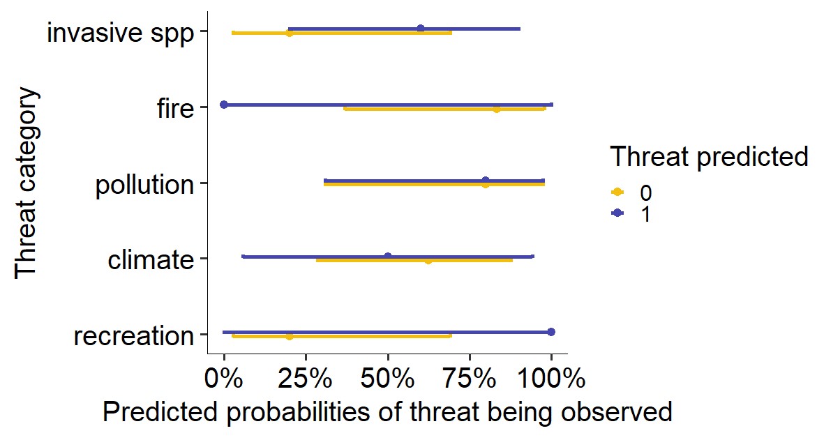
plot_model(mod, type = "int",
title = "",
axis.title = c("Threat category", "Predicted probabilities of threat being observed"),
legend.title = "Threat predicted",
colors = c("#f2bf10",
"#4445ad"),
line.size = 2,
dot.size = 4,
sort.est = T,
show.values = T)+
coord_flip()+
theme_pubr(legend = "right", base_size = 30)
回答 1
Stack Overflow用户
回答已采纳
发布于 2022-03-06 22:00:42
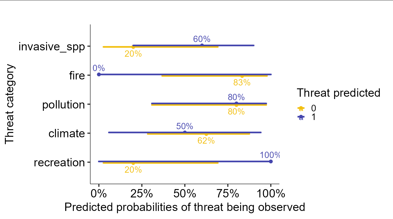
sjPlot生成一个ggplot对象,因此您可以检查美学映射和底层数据。在深入研究之后,您会发现默认的映射对于文本标签的x,y位置已经是正确的,所以您所需要做的就是向图中添加一个geom_text,并且只需要将标签指定为审美映射。您可以从一个名为predicted的列中获取标签,该列存储在ggplot对象中。
其结果是,如果您在您的情节中添加了以下层:
geom_text(aes(label = scales::percent(predicted)),
          position = position_dodge(width = 1), size = 8)
你会得到
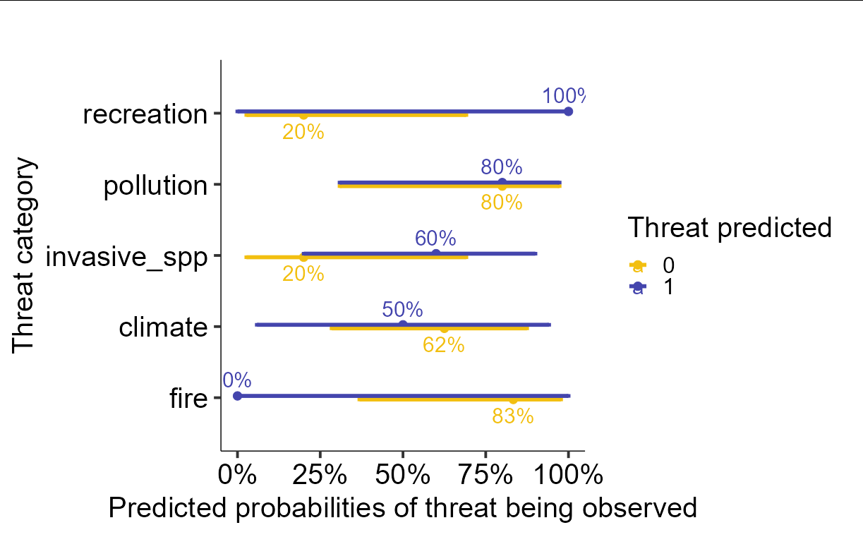
把标签弄得井井有条更棘手。你必须摆弄阴谋的内部成分才能做到这一点。假设我们将上面的图存储为p,那么我们可以通过以下操作根据预测的百分比进行排序:
p$data <- as.data.frame(p$data)
ord <- p$data$x[p$data$group == 1][order(p$data$predicted[p$data$group == 1])]
p$data$x <-  match(p$data$x, ord)
p$scales$scales[[1]]$labels <- p$scales$scales[[1]]$labels[ord]

p
页面原文内容由Stack Overflow提供。腾讯云小微IT领域专用引擎提供翻译支持
原文链接:
https://stackoverflow.com/questions/71374412
复制相关文章
相似问题
腾讯云开发者

Copyright © 2013 - 2026 Tencent Cloud. All Rights Reserved. 腾讯云 版权所有
深圳市腾讯计算机系统有限公司 ICP备案/许可证号:粤B2-20090059 ![]() 粤公网安备44030502008569号
粤公网安备44030502008569号
腾讯云计算(北京)有限责任公司 京ICP证150476号 | 京ICP备11018762号