
使用PyQtChart或绘制流数据的最佳方法?
我正在播放我想要高效绘制的TimeSeries (20+图表在一台小型计算机上运行)。我已经在PyQt5上尝试过PyQt5和pyqtgraph,但是使用这两个库,我最终会重新绘制我收到的每个数据的整个图表,这并不是最优的。我选择PyQtChart是因为它处理了更好的DatetimeSeries,但很高兴被证明是错误的(共享pyqtgraph,只是不想让帖子太大)。
Bellow是我使用PyQtChart使用随机数据的工作代码,因此您可以运行它:
import sys
from random import randint
from typing import Union

from PyQt5.QtChart import (QChart, QChartView, QLineSeries, QDateTimeAxis, QValueAxis)
from PyQt5.QtCore import Qt, QDateTime, QTimer
from PyQt5.QtWidgets import QApplication
from PyQt5.QtWidgets import (QWidget, QGridLayout)


class Window(QWidget):
    def __init__(self, window_name: str = 'Ticker'):
        QWidget.__init__(self)
        # GUI
        self.setGeometry(200, 200, 600, 400)
        self.window_name: str = window_name
        self.setWindowTitle(self.window_name)
        layout = QGridLayout(self)

        # change the color of the window
        self.setStyleSheet('background-color:black')

        # Series
        self.high_dataset = QLineSeries()
        self.low_dataset = QLineSeries()
        self.mid_dataset = QLineSeries()

        self.low_of_day: Union[float, None] = 5
        self.high_of_day: Union[float, None] = 15

        # Y Axis
        self.time_axis_y = QValueAxis()
        self.time_axis_y.setLabelFormat("%.2f")
        self.time_axis_y.setTitleText("Price")
        # X Axis
        self.time_axis_x = QDateTimeAxis()
        self.time_axis_x.setFormat("hh:mm:ss")
        self.time_axis_x.setTitleText("Datetime")

        # Events
        self.qt_timer = QTimer()
        # QChart
        self.chart = QChart()
        self.chart.addSeries(self.mid_dataset)
        self.chart.addSeries(self.high_dataset)
        self.chart.addSeries(self.low_dataset)

        self.chart.setTitle("Barchart Percent Example")
        self.chart.setTheme(QChart.ChartThemeDark)

        # https://linuxtut.com/fr/35fb93c7ca35f9665d9f/

        self.chart.legend().setVisible(True)
        self.chart.legend().setAlignment(Qt.AlignBottom)

        self.chartview = QChartView(self.chart)

        # using -1 to span through all rows available in the window
        layout.addWidget(self.chartview, 2, 0, -1, 3)

        self.chartview.setChart(self.chart)

    def set_yaxis(self):
        # Y Axis Settings
        self.time_axis_y.setRange(int(self.low_of_day * .9), int(self.high_of_day * 1.1))

        self.chart.addAxis(self.time_axis_y, Qt.AlignLeft)

        self.mid_dataset.attachAxis(self.time_axis_y)
        self.high_dataset.attachAxis(self.time_axis_y)
        self.low_dataset.attachAxis(self.time_axis_y)

    def set_xaxis(self):
        # X Axis Settings
        self.chart.removeAxis(self.time_axis_x)

        self.time_axis_x = QDateTimeAxis()
        self.time_axis_x.setFormat("hh:mm:ss")
        self.time_axis_x.setTitleText("Datetime")
        self.chart.addAxis(self.time_axis_x, Qt.AlignBottom)

        self.mid_dataset.attachAxis(self.time_axis_x)
        self.high_dataset.attachAxis(self.time_axis_x)
        self.low_dataset.attachAxis(self.time_axis_x)

    def start_app(self):
        self.qt_timer.timeout.connect(self.retrieveStream, )
        time_to_wait: int = 500  # milliseconds
        self.qt_timer.start(time_to_wait)

    def retrieveStream(self):
        date_px = QDateTime()
        date_px = date_px.currentDateTime().toMSecsSinceEpoch()
        print(date_px)

        mid_px = randint(int((self.low_of_day + 2) * 100), int((self.high_of_day - 2) * 100)) / 100

        self.mid_dataset.append(date_px, mid_px)
        self.low_dataset.append(date_px, self.low_of_day)
        self.high_dataset.append(date_px, self.high_of_day)

        print(f"epoch: {date_px}, mid: {mid_px:.2f}")

        self.update()

    def update(self):
        print("updating chart")

        self.chart.removeSeries(self.mid_dataset)
        self.chart.removeSeries(self.low_dataset)
        self.chart.removeSeries(self.high_dataset)

        self.chart.addSeries(self.mid_dataset)
        self.chart.addSeries(self.high_dataset)
        self.chart.addSeries(self.low_dataset)

        self.set_yaxis()
        self.set_xaxis()


if __name__ == '__main__':
    app = QApplication(sys.argv)
    window = Window()
    window.show()
    window.start_app()

    sys.exit(app.exec_())
使用此代码最大的担忧是:
- 基本上重新绘制chart=>I的每个元素的“update”方法会更倾向于一种deque、刷新/更新/重新触发类型的解决方案。
- QLineSeries似乎没有像deque集合那样的maxLen,所以我最终可能会得到大量的数据(理想情况下运行三个以上的QLineSeries)。
除此之外,我希望能收到关于如何优化这段代码的任何内部信息。我对Qt/Asyncio/线程很陌生,并且非常热衷于学习。
最好的
编辑图表现在更新,而不重新绘制所有,让我知道是否有更好的方法,或代码需要改进,因为我是新的Qt。
由于回答了bellow (@domarm),我纠正了我更新图表和链接的方式,让我意识到每次刷新时都需要为axis设置一个最小最大值,这样数据就在范围内。
import sys
from datetime import datetime
from random import randint
from typing import Union, Optional

from PyQt5.QtChart import (QChart, QChartView, QLineSeries, QDateTimeAxis, QValueAxis)
from PyQt5.QtCore import (Qt, QDateTime, QTimer, QPointF)
from PyQt5.QtGui import QFont
from PyQt5.QtWidgets import (QWidget, QGridLayout, QLabel, QApplication)


# https://doc.qt.io/qt-5/qtcharts-modeldata-example.html

class Window(QWidget):
    running = False

    def __init__(self, window_name: str = 'Chart',
                 chart_title: Optional[str] = None,
                 geometry_ratio: int = 2,
                 histo_tick_size: int = 200):
        QWidget.__init__(self)
        # GUI
        self.window_wideness: int = 300
        self.histo_tick_size: int = histo_tick_size
        self.setGeometry(200,
                         200,
                         int(self.window_wideness * geometry_ratio),
                         self.window_wideness
                         )
        self.window_name: str = window_name
        self.setWindowTitle(self.window_name)
        self.label_color: str = 'grey'
        self.text_color: str = 'white'
        # Layout
        layout = QGridLayout(self)

        # Gui components
        bold_font = QFont()
        bold_font.setBold(True)

        self.label_last_px = QLabel('-', self)
        self.label_last_px.setFont(bold_font)
        self.label_last_px.setStyleSheet("QLabel { color : blue; }")
        layout.addWidget(self.label_last_px)

        # change the color of the window
        self.setStyleSheet('background-color:black')
        # QChart
        self.chart = QChart()
        if chart_title:
            self.chart.setTitle(chart_title)
        # Series
        self.high_dataset = QLineSeries(self.chart)
        self.high_dataset.setName("High")

        self.low_dataset = QLineSeries(self.chart)
        self.low_dataset.setName("Low")

        self.mid_dataset = QLineSeries(self.chart)
        self.mid_dataset.setName("Mid")

        self.low_of_day: Union[float, None] = 5
        self.high_of_day: Union[float, None] = 15
        self.last_data_point: dict = {"last_date": None, "mid_px": None, "low_px": None, "high_px": None}

        # Y Axis
        self.time_axis_y = QValueAxis()
        self.time_axis_y.setLabelFormat("%.2f")
        self.time_axis_y.setTitleText("Price")

        # X Axis
        self.time_axis_x = QDateTimeAxis()
        self.time_axis_x.setTitleText("Datetime")

        # Events
        self.qt_timer = QTimer()

        self.chart.setTheme(QChart.ChartThemeDark)
        self.chart.addSeries(self.mid_dataset)
        self.chart.addSeries(self.low_dataset)
        self.chart.addSeries(self.high_dataset)
        # https://linuxtut.com/fr/35fb93c7ca35f9665d9f/

        self.chart.legend().setVisible(True)
        # self.chart.legend().setAlignment(Qt.AlignBottom)

        self.chartview = QChartView(self.chart)
        # self.chartview.chart().setAxisX(self.axisX, self.mid_dataset)

        # using -1 to span through all rows available in the window
        layout.addWidget(self.chartview, 2, 0, -1, 3)

        self.chartview.setChart(self.chart)

    def set_yaxis(self):
        # Y Axis Settings
        self.time_axis_y.setRange(int(self.low_of_day * .9), int(self.high_of_day * 1.1))

        self.chart.addAxis(self.time_axis_y, Qt.AlignLeft)

        self.mid_dataset.attachAxis(self.time_axis_y)
        self.high_dataset.attachAxis(self.time_axis_y)
        self.low_dataset.attachAxis(self.time_axis_y)

    def set_xaxis(self):
        # X Axis Settings
        self.chart.removeAxis(self.time_axis_x)
        # X Axis
        self.time_axis_x = QDateTimeAxis()
        self.time_axis_x.setFormat("hh:mm:ss")
        self.time_axis_x.setTitleText("Datetime")

        point_first: QPointF = self.mid_dataset.at(0)
        point_last: QPointF = self.mid_dataset.at(len(self.mid_dataset) - 1)

        # needs to be updated each time for chart to render
        # https://stackoverflow.com/questions/57079698/qdatetimeaxis-series-are-not-displayed
        self.time_axis_x.setMin(QDateTime().fromMSecsSinceEpoch(point_first.x()).addSecs(0))
        self.time_axis_x.setMax(QDateTime().fromMSecsSinceEpoch(point_last.x()).addSecs(0))

        self.chart.addAxis(self.time_axis_x, Qt.AlignBottom)

        self.mid_dataset.attachAxis(self.time_axis_x)
        self.high_dataset.attachAxis(self.time_axis_x)
        self.low_dataset.attachAxis(self.time_axis_x)

    def _update_label_last_px(self):
        last_point: QPointF = self.mid_dataset.at(self.mid_dataset.count() - 1)
        last_date: datetime = datetime.fromtimestamp(last_point.x() / 1000)
        last_price = last_point.y()
        self.label_last_px.setText(f"Date time: {last_date.strftime('%d-%m-%y %H:%M %S')}  "
                                   f"Price: {last_price:.2f}")

    def start_app(self):
        """Start Thread generator"""
        # This method is supposed to stream data but not the issue, problem is that chart is not updating
        self.qt_timer.timeout.connect(self.update, )
        time_to_wait: int = 250  # milliseconds
        self.qt_timer.start(time_to_wait)

    def update(self):
        """ Update chart and Label with the latest data in Series"""
        print("updating chart")
        self._update_label_last_px()
        # date_px = QDateTime()
        # self.last_data_point['last_date'] = date_px.currentDateTime().toMSecsSinceEpoch()

        date_px = datetime.now().timestamp() * 1000
        self.last_data_point['last_date'] = date_px
        # Make up a price
        self.last_data_point['mid_px'] = randint(int((self.low_of_day + 2) * 100),
                                                 int((self.high_of_day - 2) * 100)) / 100
        self.last_data_point['low_date'] = self.low_of_day
        self.last_data_point['high_date'] = self.high_of_day
        print(self.last_data_point)

        # Feed datasets and simulate deque
        # https://www.qtcentre.org/threads/67774-Dynamically-updating-QChart
        if self.mid_dataset.count() > self.histo_tick_size:
            self.mid_dataset.remove(0)
            self.low_dataset.remove(0)
            self.high_dataset.remove(0)

        self.mid_dataset.append(self.last_data_point['last_date'], self.last_data_point['mid_px'])
        self.low_dataset.append(self.last_data_point['last_date'], self.last_data_point['low_date'])
        self.high_dataset.append(self.last_data_point['last_date'], self.last_data_point['high_date'])
        self.set_xaxis()
        self.set_yaxis()


if __name__ == '__main__':
    app = QApplication(sys.argv)
    window = Window()
    window.show()
    window.start_app()

sys.exit(app.exec())回答 1
Stack Overflow用户
发布于 2022-03-13 19:57:05
您可以使用普格利夫包从活动流中绘制数据。它基于pyqtgraph,可以方便地处理~100 on的数据速率。
它使用DataConnector,它将数据存储在deque中,并使用pyqt信号来更新绘图线程安全。如果输入数据以高速率更新,也可以以Hz设置更新速率。
还有一些额外的功能,比如前导线或十字线,这使得在鼠标光标下显示精确的值变得很容易。
下面是一个基于输入的示例代码:
import sys
import time
from random import randint
from threading import Thread
from time import sleep
from typing import Union
from PyQt5.QtWidgets import QWidget, QApplication, QGridLayout
from pglive.kwargs import Axis
from pglive.sources.data_connector import DataConnector
from pglive.sources.live_axis import LiveAxis
from pglive.sources.live_plot import LiveLinePlot
from pglive.sources.live_plot_widget import LivePlotWidget
class Window(QWidget):
running = False
def __init__(self, parent=None):
super().__init__(parent)
layout = QGridLayout(self)
self.low_of_day: Union[float, None] = 5
self.high_of_day: Union[float, None] = 15
# Create one curve pre dataset
high_plot = LiveLinePlot(pen="blue")
low_plot = LiveLinePlot(pen="orange")
mid_plot = LiveLinePlot(pen="green")
# Data connectors for each plot with dequeue of 600 points
self.high_connector = DataConnector(high_plot, max_points=600)
self.low_connector = DataConnector(low_plot, max_points=600)
self.mid_connector = DataConnector(mid_plot, max_points=600)
# Setup bottom axis with TIME tick format
# You can use Axis.DATETIME to show date as well
bottom_axis = LiveAxis("bottom", **{Axis.TICK_FORMAT: Axis.TIME})
# Create plot itself
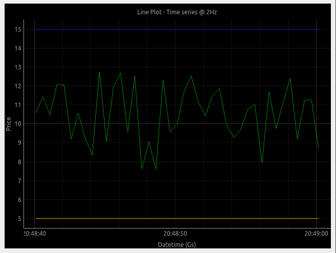
self.chart_view = LivePlotWidget(title="Line Plot - Time series @ 2Hz", axisItems={'bottom': bottom_axis})
# Show grid
self.chart_view.showGrid(x=True, y=True, alpha=0.3)
# Set labels
self.chart_view.setLabel('bottom', 'Datetime', units="s")
self.chart_view.setLabel('left', 'Price')
# Add all three curves
self.chart_view.addItem(mid_plot)
self.chart_view.addItem(low_plot)
self.chart_view.addItem(high_plot)
# using -1 to span through all rows available in the window
layout.addWidget(self.chart_view, 2, 0, -1, 3)
def update(self):
"""Generate data at 2Hz"""
while self.running:
timestamp = time.time()
mid_px = randint(int((self.low_of_day + 2) * 100), int((self.high_of_day - 2) * 100)) / 100
self.mid_connector.cb_append_data_point(mid_px, timestamp)
self.low_connector.cb_append_data_point(self.low_of_day, timestamp)
self.high_connector.cb_append_data_point(self.high_of_day, timestamp)
print(f"epoch: {timestamp}, mid: {mid_px:.2f}")
sleep(0.5)
def start_app(self):
"""Start Thread generator"""
self.running = True
Thread(target=self.update).start()
if __name__ == '__main__':
app = QApplication(sys.argv)
window = Window()
window.show()
window.start_app()
app.exec()
window.running = False下面是它在运行中的样子:
pyqtgraph的小缺点是对图的外观进行了一些笨拙的定制。但这是因为pqytgraph是为了速度而建的。pglive地址也缺乏您的时间和日期时间格式。
当然还有其他好的包来处理这个问题,但是如果您的目标是良好的性能,这可能是一个很好的选择。
https://stackoverflow.com/questions/71360222
复制相似问题
腾讯云开发者

Copyright © 2013 - 2026 Tencent Cloud. All Rights Reserved. 腾讯云 版权所有
深圳市腾讯计算机系统有限公司 ICP备案/许可证号:粤B2-20090059 ![]() 粤公网安备44030502008569号
粤公网安备44030502008569号
腾讯云计算(北京)有限责任公司 京ICP证150476号 | 京ICP备11018762号