
color=date在ggplot2中的控制
color=date在ggplot2中的控制
提问于 2022-03-04 12:48:20
在使用以下代码之前/之后,我正在做一个足够简单的行图:
ggplot() +
  geom_line(data = preMax, aes(x=buffer, y=max, color=date, linetype= "dashed")) +
  geom_line(data = postMax, aes(x=buffer, y=max, color=date, linetype= "solid"))
这让我得到了下面的情节:
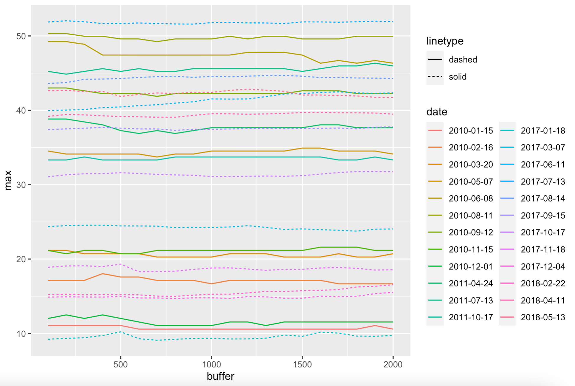
有些问题我似乎解决不了。
priority)
- Labelling
- 线型图例是倒的
- 月份的颜色调色板是颠倒的(这是在图的右边的每一行(我知道这会变得很混乱--这些只是诊断图)
虽然我已经为3)找到了很多解决方案,但我无法为我的实现找到语法。
我不知道该为1和2做些什么。
前后数据格式的摘录(请原谅从CSV导入中读取的杂乱无章的标题--“掩码”列在这里是多余的):
> dput(preMax[sample(1:nrow(preMax), 20),])
structure(list(type = c("Masked", "Masked", "Masked", "Masked",
"Masked", "Masked", "Masked", "Masked", "Masked", "Masked", "Masked",
"Masked", "Masked", "Masked", "Masked", "Masked", "Masked", "Masked",
"Masked", "Masked"), buffer = c(200, 1700, 600, 400, 900, 300,
1300, 600, 1500, 100, 400, 1700, 2000, 1800, 300, 1000, 100,
1000, 1900, 1800), max = c(44.864783808451, 45.9712411935412,
17.5829020162918, 12.4868639407346, 49.6003614709968, 45.2344134295274,
21.1563882993978, 10.5763618088791, 37.6644106683852, 11.057020709424,
33.3232497692325, 20.7153387275033, 37.6645113431222, 49.9596451668152,
11.0570186079038, 45.6029948612003, 21.156362982432, 37.6638859359373,
20.2727947583503, 21.5957031868673), date = c("2011-07-13", "2011-07-13",
"2010-02-16", "2010-12-01", "2010-08-11", "2011-07-13", "2010-11-15",
"2010-01-15", "2011-04-24", "2010-01-15", "2011-10-17", "2010-03-20",
"2011-04-24", "2010-08-11", "2010-01-15", "2011-07-13", "2010-03-20",
"2011-04-24", "2010-03-20", "2010-11-15")), row.names = c(NA,
-20L), class = c("tbl_df", "tbl", "data.frame"))> dput(postMax[sample(1:nrow(postMax), 20),])
structure(list(type = c("Masked", "Masked", "Masked", "Masked",
"Masked", "Masked", "Masked", "Masked", "Masked", "Masked", "Masked",
"Masked", "Masked", "Masked", "Masked", "Masked", "Masked", "Masked",
"Masked", "Masked"), buffer = c(1000, 500, 100, 200, 600, 1300,
300, 1100, 400, 1400, 100, 1400, 1900, 1800, 900, 1800, 400,
1700, 800, 1300), max = c(14.7852734070896, 14.9722784687354,
15.2029852639159, 43.729031912867, 15.1848393092082, 51.7461939052593,
24.5462660651035, 14.7020628187789, 51.660784286412, 51.6686452841226,
37.4059816958464, 31.1296293850412, 16.3389454899921, 14.9904419060676,
9.31826862882747, 37.5157587930802, 42.542644563124, 37.6102405759581,
24.2312294619778, 42.7078563816514), date = c("2017-12-04", "2017-12-04",
"2018-02-22", "2017-08-14", "2018-02-22", "2017-07-13", "2017-03-07",
"2017-12-04", "2017-07-13", "2017-07-13", "2017-09-15", "2017-10-17",
"2018-02-22", "2017-12-04", "2017-01-18", "2017-09-15", "2018-05-13",
"2017-09-15", "2017-03-07", "2018-05-13")), row.names = c(NA,
-20L), class = c("tbl_df", "tbl", "data.frame"))回答 1
Stack Overflow用户
发布于 2022-03-04 13:32:35
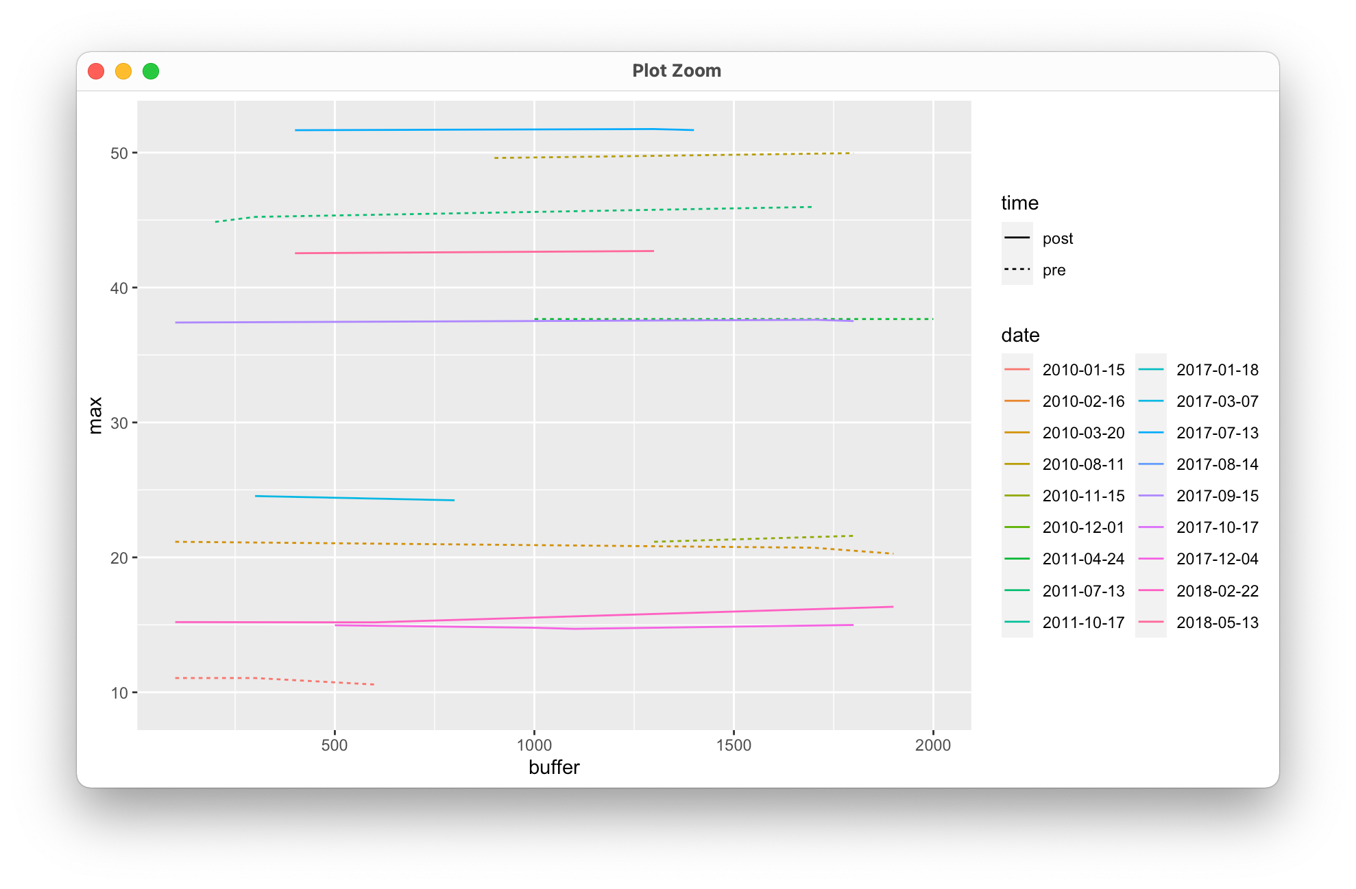
meant 的意思是每种美学都要使用一次。最好是对您的前数据和发布数据进行bind_rows,然后绘制合并的数据:
library(tidyverse)
df <- bind_rows(list(pre = preMax, post = postMax), .id = 'time')

ggplot() +
  geom_line(data = df, aes(x=buffer, y=max, color=date, linetype= time)) +
  guides(color = guide_legend(ncol = 2))
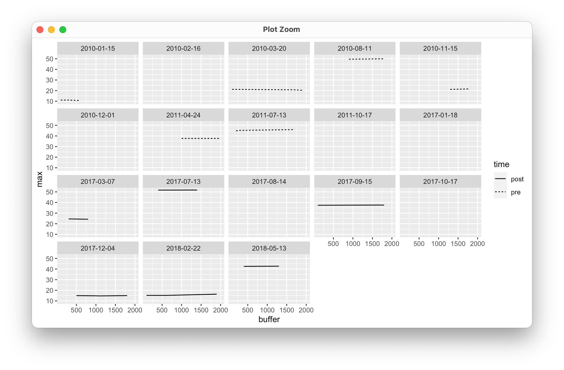
作为将日期放在颜色美学上的另一种选择,您可以使用面处理来保持清晰(虽然这看起来有点奇怪,但提供的样本有限,它应该给您一个大致的想法):
ggplot() +
  geom_line(data = df, aes(x=buffer, y=max, linetype= time)) +
  facet_wrap(facets = ~date)
页面原文内容由Stack Overflow提供。腾讯云小微IT领域专用引擎提供翻译支持
原文链接:
https://stackoverflow.com/questions/71351659
复制相关文章
相似问题
腾讯云开发者

Copyright © 2013 - 2026 Tencent Cloud. All Rights Reserved. 腾讯云 版权所有
深圳市腾讯计算机系统有限公司 ICP备案/许可证号:粤B2-20090059 ![]() 粤公网安备44030502008569号
粤公网安备44030502008569号
腾讯云计算(北京)有限责任公司 京ICP证150476号 | 京ICP备11018762号