
如何只绘制ggplot中的一列?
如何只绘制ggplot中的一列?
提问于 2022-03-01 07:20:35
考虑到这些简单的数据,我想画出相当于
plot(dat$value)但对ggplot来说。
 dat= structure(list(name = c("Cord", "Cord",
"amo", "amo",
 "amo", "ramo"),
value = c(7, 0.7, 9,
0.9, 0.8, 0.7)), row.names = c(NA,
 6L), class = "data.frame")
我试过:
> ggplot(data = dat) +      geom_point(aes(x = value, colour = name))
 Error in `check_required_aesthetics()`:
 ! geom_point requires the following missing aesthetics: y
我需要绘制y轴上的“计数”和x轴上的值。
回答 1
Stack Overflow用户
回答已采纳
发布于 2022-03-01 07:33:14
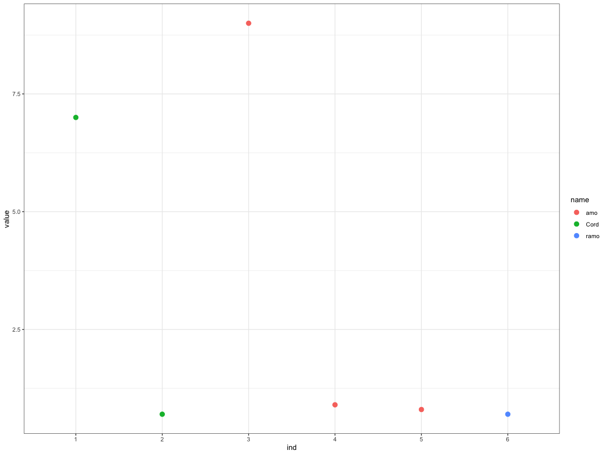
您可以使用tibble::rownames_to_column创建一个行索引,然后使用它沿着x轴绘制图,从而得到类似于plot(dat$value)的结果。
library(tidyverse)

dat %>%
  rownames_to_column("ind") %>%
  ggplot(aes(x = ind, y = value, color = name)) +
  geom_point(size = 3) +
  theme_bw()
输出
或者您可以将函数直接放入ggplot中。
ggplot(dat, aes(
  x = rownames_to_column(dat)$rowname,
  y = value,
  color = name
)) +
  geom_point(size = 3) +
theme_bw()或者另一个选择是使用row.names
ggplot(dat, aes(x = as.numeric(row.names(dat)), y = value, colour = name)) +
geom_point()页面原文内容由Stack Overflow提供。腾讯云小微IT领域专用引擎提供翻译支持
原文链接:
https://stackoverflow.com/questions/71304971
复制相关文章
相似问题
腾讯云开发者

Copyright © 2013 - 2026 Tencent Cloud. All Rights Reserved. 腾讯云 版权所有
深圳市腾讯计算机系统有限公司 ICP备案/许可证号:粤B2-20090059 ![]() 粤公网安备44030502008569号
粤公网安备44030502008569号
腾讯云计算(北京)有限责任公司 京ICP证150476号 | 京ICP备11018762号