
如何在python中添加矩形和文本注释?
如何在python中添加矩形和文本注释?
提问于 2022-02-27 06:01:48
Matplotlib使用plt.Rectangle()创建一个彩色矩形,ax.text为添加的每个矩形放置文本。链接在这里
样本数据
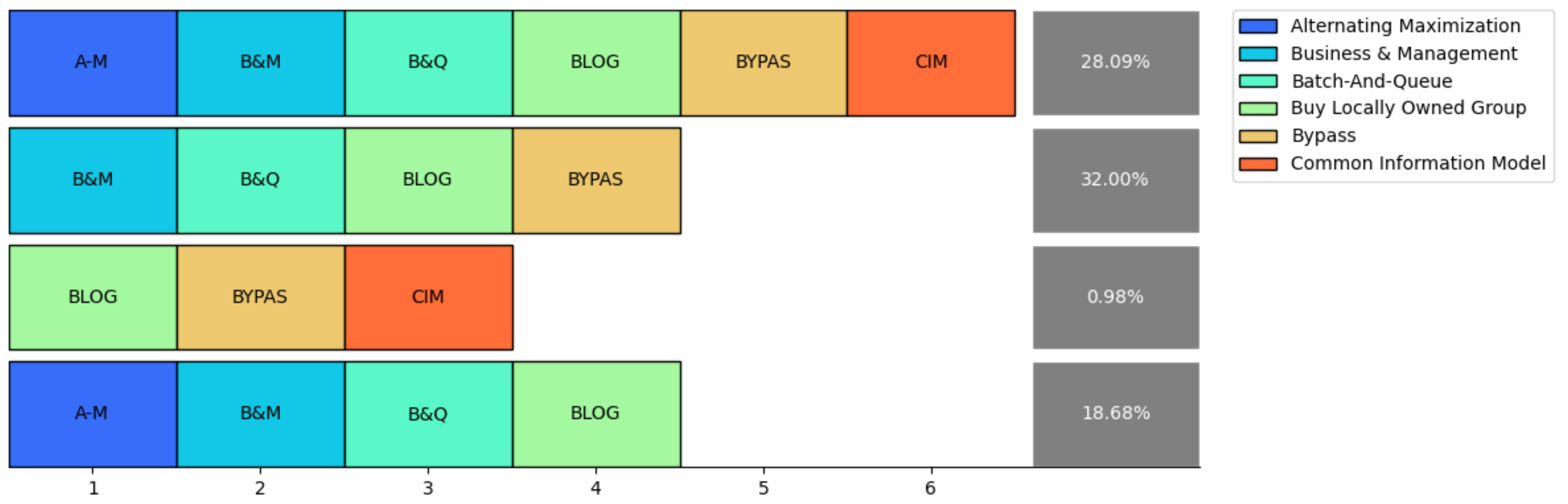
data_dict = {"Trace": [["A-M", "B&M", "B&Q", "BLOG", "BYPAS", "CIM"],
                       ["B&M", "B&Q", "BLOG", "BYPAS"],
                       ["BLOG", "BYPAS", "CIM"],
                       ["A-M", "B&M", "B&Q", "BLOG"]],
             "Percentage": [28.09, 32, 0.98, 18.68]}

acronym = {"A-M": "Alternating Maximization",
           "B&M": "Business & Management",
           "B&Q": "Batch-And-Queue",
           "BLOG": "Buy Locally Owned Group",
           "BYPAS": "Bypass",
           "CIM": "Common Information Model"
}plotly是否支持向图中添加矩形。如何巧妙地绘制一个“追踪探索者”的情节?
回答 1
Stack Overflow用户
回答已采纳
发布于 2022-03-02 06:31:37
为了让图例条目连接到所绘制的矩形,您需要使用go.Scatter绘制矩形。注释不起作用,因为它们没有相应的图例条目。
每个矩形将使用包含5个(x,y)坐标(从起始位置返回到原始起始位置)的go.Scatter跟踪绘制,并且我们可以用特定于其名称的颜色映射填充它。由于多个矩形具有相同的名称,因此我们希望通过使用图例组来避免重复条目。
还有其他一些与格式化有关的事情,比如行之间的填充、框的宽度和高度,以及设置y-轴的范围,这样选择和取消选择跟踪就不会调整绘图的大小(我认为这里不希望这样的默认行为)。
import pandas as pd
import plotly.graph_objects as go

data_dict = {"Trace": [["A-M", "B&M", "B&Q", "BLOG", "BYPAS", "CIM"],
                       ["B&M", "B&Q", "BLOG", "BYPAS"],
                       ["BLOG", "BYPAS", "CIM"],
                       ["A-M", "B&M", "B&Q", "BLOG"]],
             "Percentage": [28.09, 32, 0.98, 18.68]}

acronym = {"A-M": "Alternating Maximization",
           "B&M": "Business & Management",
           "B&Q": "Batch-And-Queue",
           "BLOG": "Buy Locally Owned Group",
           "BYPAS": "Bypass",
           "CIM": "Common Information Model"
           }

color_map = {"A-M": "DodgerBlue",
           "B&M": "DarkTurquoise",
           "B&Q": "Aquamarine",
           "BLOG": "LightGreen",
           "BYPAS": "Khaki",
           "CIM": "Tomato"
           }

check_legend_entry = {key:False for key in acronym.keys()}

fig = go.Figure()

## xaxis legnth is the number of categories + 1 for the percentage boxes
xaxis_length = max([len(trace_list) for trace_list in data_dict['Trace']]) + 1
width, height = 1, 1
y_row_padding = width/4
xaxis_padding = width/4

## draw out of the rectangles by iterating through each trace
## and plotting in coordinates starting from upper left to lower right
## the rectangles will be centered at (0,0), (1,0), ... (0,-1), (1,-1), ... ()
for row_number, trace_list in enumerate(data_dict['Trace']):

    ## this will add y-padding between any boxes that aren't in the first row
    y_pos = (row_number-1)*(1+y_row_padding)
    for x_pos, name in enumerate(trace_list):

        ## check whether a legend entry has been created for a particular name
        ## to avoid duplicate legend entries for the same type of rectangle

        if check_legend_entry[name] == False:
            check_legend_entry[name] = True
            showlegend=True
        else:
            showlegend=False

        fig.add_trace(go.Scatter(
            x=[x_pos-width/2, x_pos+width/2, x_pos+width/2, x_pos-width/2, x_pos-width/2],
            y=[-y_pos-height/2, -y_pos-height/2, -y_pos+height/2, -y_pos+height/2, -y_pos-height/2],
            mode='lines',
            name=acronym[name],
            meta=[name],
            hovertemplate='%{meta[0]}<extra></extra>',
            legendgroup=acronym[name],
            line=dict(color="black"),
            fill='toself',
            fillcolor=color_map[name],
            showlegend=showlegend
        ))

        ## add the text in the center of each rectangle
        ## skip hoverinfo since the rectangle itself already has hoverinfo
        fig.add_trace(go.Scatter(
            x=[x_pos],
            y=[-y_pos],
            mode='text',
            legendgroup=acronym[name],
            text=[name],
            hoverinfo='skip',
            textposition="middle center",
            showlegend=False
        ))

## add the percentage boxes
for row_number, percentage in enumerate(data_dict['Percentage']):
    y_pos = (row_number-1)*(1+y_row_padding)
    x_pos = max([len(trace_list) for trace_list in data_dict['Trace']]) + width/4
    fig.add_trace(go.Scatter(
        x=[x_pos-width/2, x_pos+width/2, x_pos+width/2, x_pos-width/2, x_pos-width/2],
        y=[-y_pos-height/2, -y_pos-height/2, -y_pos+height/2, -y_pos+height/2, -y_pos-height/2],
        mode='lines',
        line=dict(width=0),
        fill='toself',
        fillcolor='darkgrey',
        showlegend=False
    ))
    fig.add_trace(go.Scatter(
        x=[x_pos],
        y=[-y_pos],
        mode='text',
        text=[f"{percentage}%"],
        marker=dict(color="white"),
        hoverinfo='skip',
        textposition="middle center",
        showlegend=False
    ))

## prevent the axes from resizing if traces are removed
fig.update_xaxes(range=[-width+xaxis_padding, xaxis_length-xaxis_padding])
fig.update_layout(template='simple_white')
fig.update_yaxes(visible=False)
fig.show()
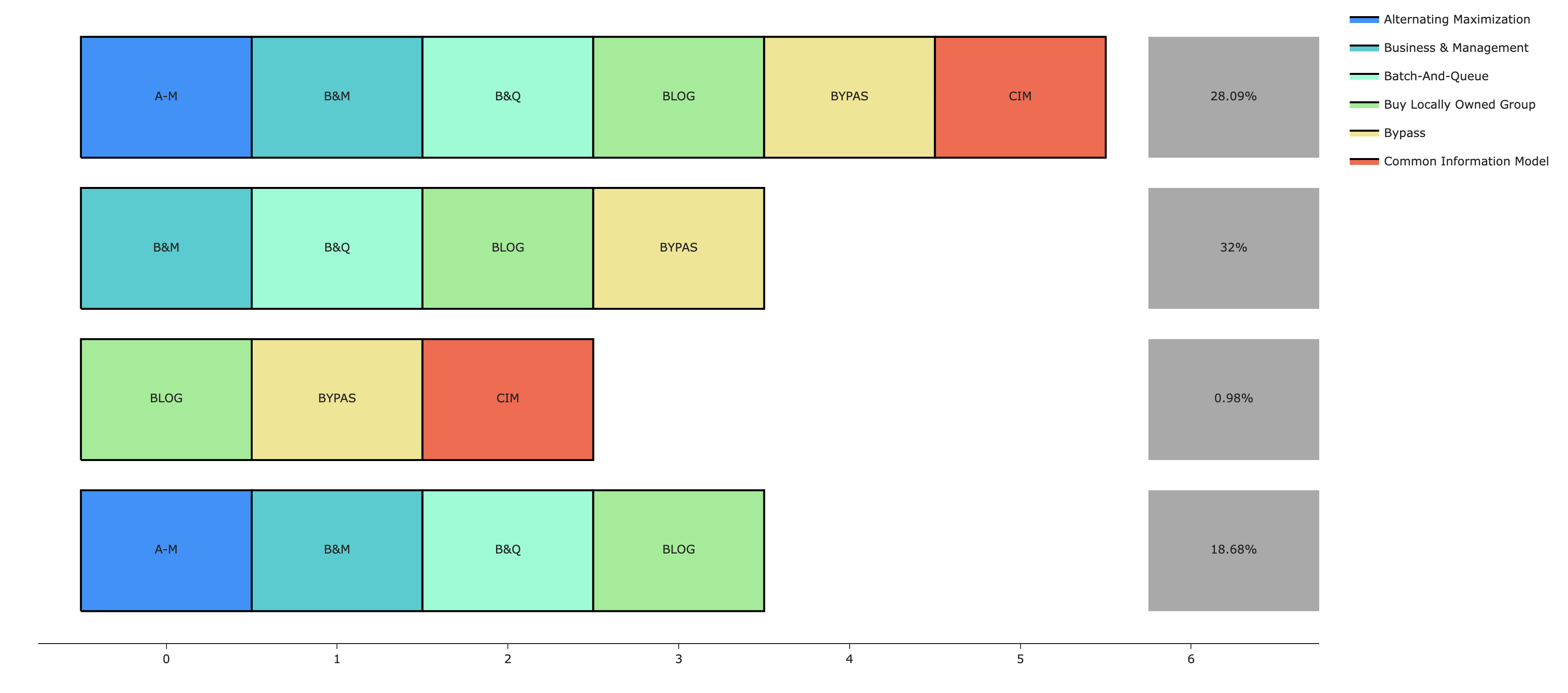
注意:我知道您没有要求从图例中选择或取消选择跟踪的功能,但是我不认为在plotly-python中禁用这个功能是不可能的,即使您愿意(请参阅此公开发行)。这个功能就是这样的:
页面原文内容由Stack Overflow提供。腾讯云小微IT领域专用引擎提供翻译支持
原文链接:
https://stackoverflow.com/questions/71282496
复制相关文章
相似问题
腾讯云开发者

Copyright © 2013 - 2026 Tencent Cloud. All Rights Reserved. 腾讯云 版权所有
深圳市腾讯计算机系统有限公司 ICP备案/许可证号:粤B2-20090059 ![]() 粤公网安备44030502008569号
粤公网安备44030502008569号
腾讯云计算(北京)有限责任公司 京ICP证150476号 | 京ICP备11018762号