
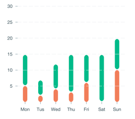
胜利图给出10的y轴范围。
胜利图给出10的y轴范围。
提问于 2022-02-24 12:59:12
我创建条形图。我想给y轴的范围,例如目前的y轴显示5,10,15,20,但我想要10,20,30范围10。我怎么能做到这一点?
   <VictoryAxis
        domain={{y: [0, 30]}}
        dependentAxis
        orientation="left"
        style={{
          tickLabels: {fontSize: 12},
          axis: {stroke: 'transparent'},
        }}
/>回答 1
Stack Overflow用户
回答已采纳
发布于 2022-07-20 13:40:35
为了更改图表的默认轴,您需要作为子组件提供一个或多个<VictoryAxis />组件。
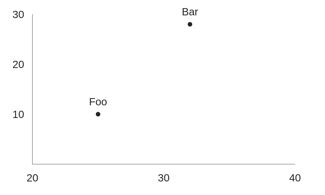
要改变滴答的间隔,只需在每个轴上设置tickCount支柱,其中tickCount等于将整个域范围除以所需的区间范围。
Y轴的30 / 10 = 3
和
20 / 10 = 2表示x轴,因为这里的域范围是实际的20,而不是40。
<VictoryChart
  domain={{ x: [ 20, 40 ], y: [ 0, 30 ]}}
>
  <VictoryAxis
    tickCount={ 3 }
    dependentAxis={ true } /* To target the y-axis */
  />
  <VictoryAxis
    tickCount={ 2 }
  />
  <VictoryScatter
    data={ [
      { x: 25, y: 10, label: 'Foo' },
      { x: 32, y: 28, label: 'Bar' }
    ] }
    size={ 3 }
  />
</VictoryChart>
页面原文内容由Stack Overflow提供。腾讯云小微IT领域专用引擎提供翻译支持
原文链接:
https://stackoverflow.com/questions/71252375
复制相关文章
相似问题
腾讯云开发者

Copyright © 2013 - 2026 Tencent Cloud. All Rights Reserved. 腾讯云 版权所有
深圳市腾讯计算机系统有限公司 ICP备案/许可证号:粤B2-20090059 ![]() 粤公网安备44030502008569号
粤公网安备44030502008569号
腾讯云计算(北京)有限责任公司 京ICP证150476号 | 京ICP备11018762号