
如何从CausalImpact包中添加图例到绘图?
我看到了关于这个的另一篇文章这里,但是我对R相对来说是比较新的,所以答案对我没有帮助。我真的很感激你能给我更多的帮助。
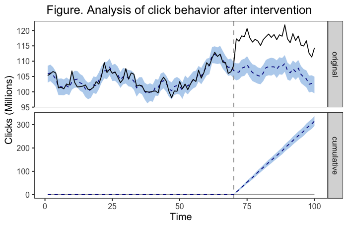
我已经用因果影响包中的命令绘制了一个图表。在包文档中,它清楚地说明这些情节是ggplot2对象,可以像其他任何类似的对象一样进行定制。我已经成功地做到了,添加标题和定制颜色。我需要添加一个图例(这是我提交给的日记所要求的)。下面是一个例子,说明我的图形现在是什么样子,以及我用来获得的代码。
library(ggplot2)
devtools::install_github("google/CausalImpact")
library(CausalImpact)

## note that I took this example code from the package documentation up until I customize the plot

#create data
set.seed(1)
x1 <- 100 + arima.sim(model = list(ar = 0.999), n = 100)
y <- 1.2 * x1 + rnorm(100)
y[71:100] <- y[71:100] + 10
data <- cbind(y, x1)

#causal impact analysis
> pre.period <- c(1, 70)
> post.period <- c(71, 100)
> impact <- CausalImpact(data, pre.period, post.period)

#graph
example<-plot(impact, c("original", "cumulative")) +
    labs(
        x = "Time",
        y = "Clicks (Millions)",
        title = "Figure. Analysis of click behavior after intervention.") +
    theme(plot.title = element_text(hjust = 0.5),
          plot.caption = element_text(hjust = 0),
          panel.background = element_rect(fill = "transparent"), # panel bg
          plot.background = element_rect(fill = "transparent", color = NA), # plot bg
          panel.grid.major = element_blank(), # get rid of major grid
          panel.grid.minor = element_blank())  # get rid of minor grid
在我的头脑中,我想要的解决方案是有一个图板的每一个图板。第一个图例(在“原始”面板旁边)将显示一条实线表示观测数据,虚线表示估计的反事实,而彩色带表示估计反事实周围95%的CrI。第二个图例(在“累积”面板旁边)将显示虚线表示与干预相关的趋势的估计变化,而有色带再次表示估计值周围的95%的CrI。也许有一个更好的解决方案,但这正是我所想的。
下面是在绘图时运行的底层代码的一个部分:
# Initialize plot
  q <- ggplot(data, aes(x = time)) + theme_bw(base_size = 15)
  q <- q + xlab("") + ylab("")
  if (length(metrics) > 1) {
    q <- q + facet_grid(metric ~ ., scales = "free_y")
  }

  # Add prediction intervals
  q <- q + geom_ribbon(aes(ymin = lower, ymax = upper),
                       data, fill = "slategray2")

  # Add pre-period markers
  xintercept <- CreatePeriodMarkers(impact$model$pre.period,
                                    impact$model$post.period,
                                    time(impact$series))
  q <- q + geom_vline(xintercept = xintercept,
                      colour = "darkgrey", size = 0.8, linetype = "dashed")

  # Add zero line to pointwise and cumulative plot
  q <- q + geom_line(aes(y = baseline),
                     colour = "darkgrey", size = 0.8, linetype = "solid",
                     na.rm = TRUE)

  # Add point predictions
  q <- q + geom_line(aes(y = mean), data,
                     size = 0.6, colour = "darkblue", linetype = "dashed",
                     na.rm = TRUE)

  # Add observed data
  q <- q + geom_line(aes(y = response), size = 0.6,  na.rm = TRUE)
  return(q)
}
在这篇老文章中,有一个答案是,我必须调整已有的功能,才能得到一个传奇,而且我还没有真正的技能去了解我需要改变或添加的东西。我原以为传说应该根据全球图形代码中的aes()位自动添加,所以我有点搞不懂为什么一开始就没有。有人能帮我吗?
回答 3
Stack Overflow用户
发布于 2022-02-12 17:53:50
以下是早期解决方案的更新/编辑版本,以便将美学合并到一个图例中。要求是将线型和填充(色带颜色)合并成一个图例。
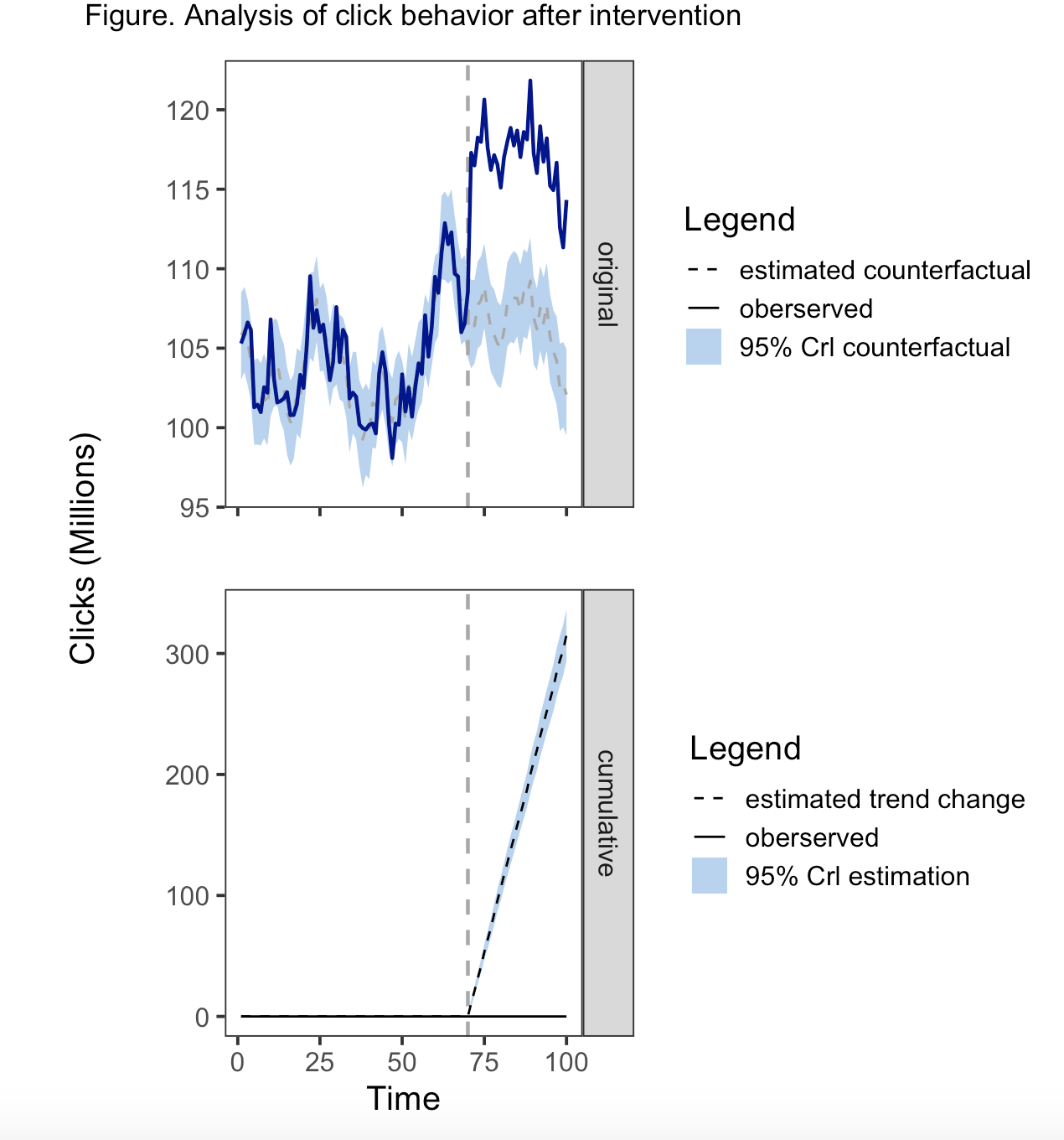
为了合并传说,同样的美学必须在地理上使用,尺度必须考虑不同的变量,具有相同的名称和相同的标签。因此,geom_ribbon()需要在aes()和geom_line()中都有一个行类型,而geom_line()需要填充aes()和linetype。将线型添加到geom_ribbon()中的一个副作用是,在带的两边都有一条线。另一方面,fill不适用于geom_line,因此您只会收到一条警告信息,即填充美学将被忽略。
解决这一问题的方法是对scale_linetype_manual()中的相关值应用“空白”行类型。类似地,我们在scale_fill_manual()中使用“透明”来避免将颜色应用于比例的其他元素。
在研究这个之前,我没有意识到的是,为多个变量的价值创造一个传奇是可能的。这些值只需在比例中适当地映射即可。所以我真的学到了一些新东西--把它组合在一起。
CreateImpactPlot <- function(impact, metrics = c("original",  "cumulative")) {
    # Creates a plot of observed data and counterfactual predictions.
    #
    # Args:
    #   impact:  \code{CausalImpact} results object returned by
    #            \code{CausalImpact()}.
    #   metrics: Which metrics to include in the plot. Can be any combination of
    #            "original", "pointwise", and "cumulative".
    #
    # Returns:
    #   A ggplot2 object that can be plotted using plot().

    # Create data frame of: time, response, mean, lower, upper, metric
    data <- CreateDataFrameForPlot(impact)

    # Select metrics to display (and their order)
    assert_that(is.vector(metrics))
    metrics <- match.arg(metrics, several.ok = TRUE)
    data <- data[data$metric %in% metrics, , drop = FALSE]
    data$metric <- factor(data$metric, metrics)

    # Make data longer
    data_long <- data %>%
        tidyr::pivot_longer(cols = c("baseline", "mean", "response"), names_to = "variable",
                            values_to = "value", values_drop_na = TRUE)

    # Initialize plot
    q1 <- ggplot(data, aes(x = time)) + theme_bw(base_size = 15)
    q1 <- q1 + xlab("") + ylab("")


    q3 <- ggplot(data %>%
                     filter(metric == "cumulative") %>%
                     mutate(metric = factor(metric, levels = c("cumulative"))), aes(x = time)) + theme_bw(base_size = 15)
    q3 <- q3 + xlab("") + ylab("")


    # Add prediction intervals

    q1 <- q1 + geom_ribbon(data = data %>%
                               filter(metric == "original") %>%
                               mutate(metric = factor(metric, levels = c("original"))), aes(x = time, ymin = lower, ymax = upper, fill = metric,
                                                                                            linetype = metric))
    q3 <- q3 + geom_ribbon(data = data %>%
                               filter(metric == "cumulative") %>%
                               mutate(metric = factor(metric, levels = c("cumulative"))), aes(x = time, ymin = lower, ymax = upper, fill = metric))


    # Add pre-period markers
    xintercept <- CreatePeriodMarkers(impact$model$pre.period,
                                      impact$model$post.period,
                                      time(impact$series))

    q1 <- q1 + geom_vline(xintercept = xintercept,
                          colour = "darkgrey", size = 0.8, linetype = "dashed")


    q3 <- q3 + geom_vline(xintercept = xintercept,
                          colour = "darkgrey", size = 0.8, linetype = "dashed")


    # Add zero line to cumulative plot
    # Add point predictions
    # Add observed data

    q1 <- q1 + geom_line(data = data_long %>% dplyr::filter(metric == "original"),
                         aes(x = time, y = value, linetype = variable, group = variable,
                             size = variable, fill = variable, color = variable),
                         na.rm = TRUE)+
        scale_linetype_manual(name = "Legend", labels = c("mean"= "estimated counterfactual", "response" = "oberserved", "original" = "95% Crl counterfactual"),
                              values = c("dashed", "solid", "blank"), limits = c("mean", "response","original")) +

        scale_fill_manual(name = "Legend", labels = c("mean"= "estimated counterfactual", "response" = "oberserved", "original" = "95% Crl counterfactual"),
                              values = c("transparent", "transparent","slategray2"), limits = c("mean", "response","original")) +  #limits controls the order in the legend

        scale_size_manual(values = c(0.6, 0.8, 0.5)) +
        scale_color_manual(values = c("darkgray", "darkblue")) +
        theme(legend.position = "right", axis.text.x = element_blank(), axis.title.y = element_blank()) +
        guides(size = "none", color = "none")+
        facet_wrap(~metric[1], strip.position = "right", drop = TRUE) #use facet_wrap to generate the stip


    q3 <- q3 + geom_line(data = data_long %>% dplyr::filter(metric == "cumulative"),
                         aes(x = time, y = value, linetype = variable, group = variable,
                              fill = variable),
                         na.rm = TRUE) +
        scale_linetype_manual(name = "Legend", labels = c("mean"= "estimated trend change", "baseline" = "oberserved", "cumulative" = "95% Crl estimation"),
                              values = c("dashed", "solid", "blank"), limits = c("mean", "baseline","cumulative")) +

        scale_fill_manual(name = "Legend", labels = c("mean"= "estimated trend change", "baseline" = "oberserved", "cumulative" = "95% Crl estimation"),
                          values = c("transparent", "transparent","slategray2"), limits = c("mean", "baseline","cumulative")) +  #limits controls the order in the legend

        theme(legend.position = "right", axis.title.y = element_blank())+
        labs(x = "Time") +
        facet_wrap(~metric, strip.position = "right", drop = TRUE) #use facet_wrap to generate the stip


    g1 <- grid::textGrob("Clicks (Millions)", rot = 90, gp=gpar(fontsize = 15), x= 0.85)

    wrap_elements(g1) | (q1/q3)

    patchwork <- wrap_elements(g1) | (q1/q3)

    q <- patchwork


    return(q)
}


# To run the function

plot(impact, c("original", "cumulative")) +
    plot_annotation(title = "Figure. Analysis of click behavior after intervention"
                    , theme = theme(plot.title = element_text(hjust = 0.5))) &
    theme(
        panel.background = element_rect(fill = "transparent"), # panel bg
        plot.background = element_rect(fill = "transparent", color = NA), # plot bg
        panel.grid.major = element_blank(), # get rid of major grid
panel.grid.minor = element_blank())Stack Overflow用户
发布于 2022-02-12 01:55:12
我重写了情节函数。我没有使用facet_wrap(),而是用自己的传说创建了单独的情节,并使用拼凑的方法将它们组合成一个单独的情节。为了运行这一点,您需要存储所有源代码,包括impact_analysis.R、impact_misc.R、impact_model.R、impact_inference.R和impact_plot.R,但我重新创建的CreateImpactPlot函数除外。因此,相反,运行我有以下内容。您还需要加载ggplot2、tidyr、dplyr和修补程序。这将只运行原始和累积的指标。虽然我在某种程度上修改了Pointwise,但我不想这样做,因为我没有一个可复制的例子。我将您的主题首选项直接输入到函数中的代码中。你应该能够在闲暇的时候识别和改变这些元素。要明确的是,这些情节是q1 =原始的,q2 =点态,q3 =累积的。我不知道如何将信任带带入传奇,因为它不是aes()的一部分。可能会从零开始创建一个grob。我只是在标题中引用了它,如果不适合你,你可以修改它。希望这能帮上忙。
                                                 "cumulative")) {
    # Creates a plot of observed data and counterfactual predictions.
    #
    # Args:
    #   impact:  \code{CausalImpact} results object returned by
    #            \code{CausalImpact()}.
    #   metrics: Which metrics to include in the plot. Can be any combination of
    #            "original", "pointwise", and "cumulative".
    #
    # Returns:
    #   A ggplot2 object that can be plotted using plot().

    # Create data frame of: time, response, mean, lower, upper, metric
    data <- CreateDataFrameForPlot(impact)

    # Select metrics to display (and their order)
    assert_that(is.vector(metrics))
    metrics <- match.arg(metrics, several.ok = TRUE)
    data <- data[data$metric %in% metrics, , drop = FALSE]
    data$metric <- factor(data$metric, metrics)

    # Initialize plot
    #q <- ggplot(data, aes(x = time)) + theme_bw(base_size = 15)
    #q <- q + xlab("") + ylab("")
    #if (length(metrics) > 1) {
    #    q <- q + facet_grid(metric ~ ., scales = "free_y")
    #}

    q1 <- ggplot(data, aes(x = time)) + theme_bw(base_size = 15)
    q1 <- q1 + xlab("") + ylab("")

    q2 <- ggplot(data, aes(x = time)) + theme_bw(base_size = 15)
    q2 <- q2 + xlab("") + ylab("")

    q3 <- ggplot(data, aes(x = time)) + theme_bw(base_size = 15)
    q3 <- q3 + xlab("") + ylab("")


    # Add prediction intervals
    #q <- q + geom_ribbon(aes(ymin = lower, ymax = upper),
    #                     data, fill = "slategray2")


    q1 <- q1 + geom_ribbon(data = data %>% dplyr::filter(metric == "original"), aes(x = time, ymin = lower, ymax = upper),
                         fill = "slategray2")

    q2 <- q2 + geom_ribbon(data = data %>% dplyr::filter(metric == "pointwise"), aes(x = time, ymin = lower, ymax = upper),
                           fill = "slategray2")

    q3 <- q3 + geom_ribbon(data = data %>% dplyr::filter(metric == "cumulative"), aes(x = time, ymin = lower, ymax = upper),
                           fill = "slategray2")


    # Add pre-period markers
    xintercept <- CreatePeriodMarkers(impact$model$pre.period,
                                      impact$model$post.period,
                                      time(impact$series))


    #q <- q + geom_vline(xintercept = xintercept,
    #                    colour = "darkgrey", size = 0.8, linetype = "dashed")

    q1 <- q1 + geom_vline(xintercept = xintercept,
                        colour = "darkgrey", size = 0.8, linetype = "dotted")

    q2 <- q2 + geom_vline(xintercept = xintercept,
                        colour = "darkgrey", size = 0.8, linetype = "dotted")

    q3 <- q3 + geom_vline(xintercept = xintercept,
                        colour = "darkgrey", size = 0.8, linetype = "dotted")


    data_long <- data %>%
        tidyr::pivot_longer(cols = c("baseline", "mean", "response"), names_to = "variable",
            values_to = "value", values_drop_na = TRUE)


    # Add zero line to pointwise and cumulative plot
    #q <- q + geom_line(aes(y = baseline),
    #                   colour = "darkgrey", size = 0.8, linetype = "solid",
    #                   na.rm = TRUE)

    q1 <- q1 + geom_line(data = data_long %>% dplyr::filter(metric == "original"),
                      aes(x = time, y = value, linetype = variable, group = variable,
                            size = variable),
                       na.rm = TRUE)+
                scale_linetype_manual(guide = "Legend", labels = c("estimated counterfactual", "oberserved"),
                                      values = c("dashed", "solid")) +
            scale_size_manual(values = c(0.6, 0.8)) +
            scale_color_manual(values = c("darkblue", "darkgrey")) +
            theme(legend.position = "right") +
            guides(linetype = guide_legend("Legend", nrow=2), size = "none", color = "none")+
            labs(title = "Original", y = "Clicks (Millions)") +
            theme(
                panel.background = element_rect(fill = "transparent"), # panel bg
                plot.background = element_rect(fill = "transparent", color = NA), # plot bg
                panel.grid.major = element_blank(), # get rid of major grid
                panel.grid.minor = element_blank())


    #q2 <- q2 + geom_line(data = data_long %>% dplyr::filter(metric == "pointwise"),
    #                     aes(x = time, y = value, linetype = Line, group = Line),
    #                     na.rm = TRUE) +
    #        scale_linetype_manual(title = "Legend", labels = c("estimated counterfactual", "observed"),
    #                          values = c("dashed", "solid")) +
    #        scale_size_manual(values = c(0.6, 0.8)) +
    #        scale_color_manual(values = c("darkblue", "darkgrey")) +
    #        theme(legend.position = "right") +
    #        guides(linetype = guide_legend("Legend", nrow=2), size = "none", color = "none")+
    #        labs(title = "Pointwise", y = "Clicks (Millions)")


    q3 <- q3 + geom_line(data = data_long %>% dplyr::filter(metric == "cumulative"),
                         aes(x = time, y = value, linetype = variable, group = variable),
                         na.rm = TRUE) +
        scale_linetype_manual(labels = c("observed", "estimated trend change"),
                              values = c("solid", "dashed")) +
            theme(legend.position = "right")+
            guides(linetype = guide_legend("Legend", nrow=2))+
            labs(title = "Cumulative",x = "Time",  y = "Clicks (Millions)")+
            theme(
                panel.background = element_rect(fill = "transparent"), # panel bg
                plot.background = element_rect(fill = "transparent", color = NA), # plot bg
                panel.grid.major = element_blank(), # get rid of major grid
                panel.grid.minor = element_blank())

    patchwork <- q1 / q3

    q <- patchwork + plot_annotation(title = "Figure. Analysis of click behavior after intervention with
                                95% Confidence Interval")

    # Add point predictions
    #q <- q + geom_line(aes(y = mean), data,
    #                   size = 0.6, colour = "darkblue", linetype = "dashed",
    #                   na.rm = TRUE)

    # Add observed data
    #q <- q + geom_line(aes(y = response), size = 0.6,  na.rm = TRUE)


    return(q)
}

plot(impact, c("original", "cumulative"))
Stack Overflow用户
发布于 2022-02-13 02:25:48
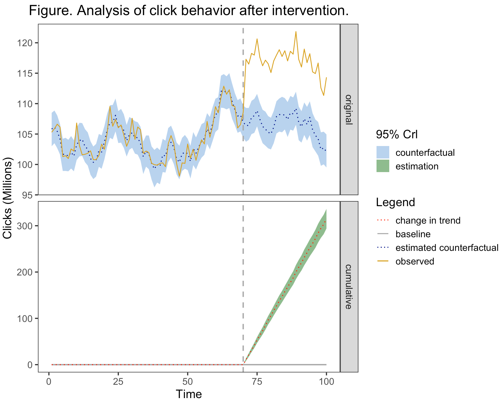
下面是对CreateImpactPlot()函数的重新构建,它将适用于所有三个指标。传说是可以修改的。我引入了更多的颜色和线型,以便传奇可以适用于所有方面。
基本情况如下:
plot(impact)
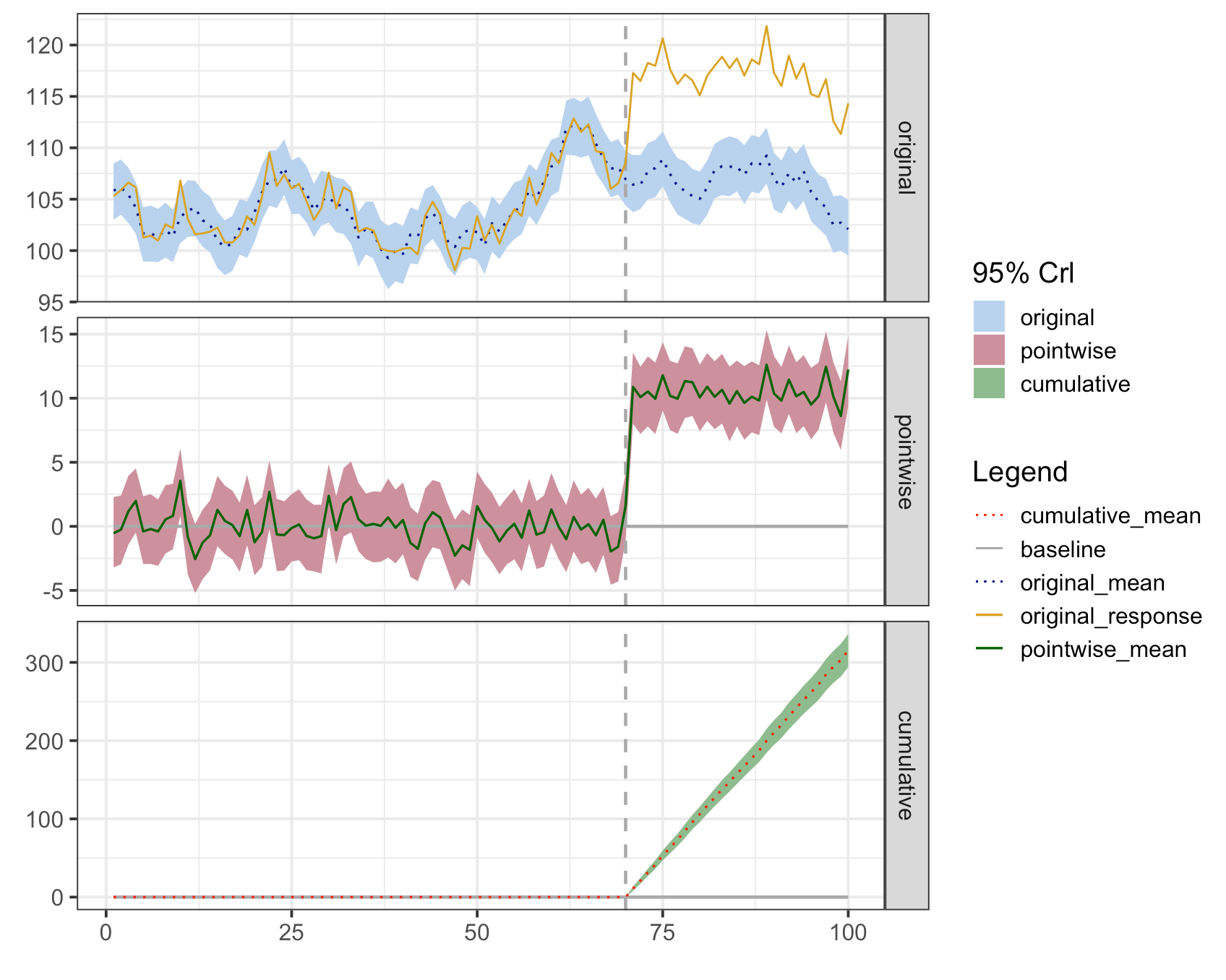
您将注意到,图例中的缎带和线条的标签引用了度量标准。这些是占位符标签,然后可以修改。
line_labels <- c("cumulative_mean" = "change in trend", "baseline" = "baseline", "original_mean" =
                     "estimated counterfactual", "original_response" = "observed")

plot(impact, c("original", "cumulative")) +
    labs(
        x = "Time",
        y = "Clicks (Millions)",
        title = "Figure. Analysis of click behavior after intervention.") +
    theme(plot.title = element_text(hjust = 0.5),
          plot.caption = element_text(hjust = 0),
          panel.background = element_rect(fill = "transparent"), # panel bg
          plot.background = element_rect(fill = "transparent", color = NA), # plot bg
          panel.grid.major = element_blank(), # get rid of major grid
          panel.grid.minor = element_blank()) + # get rid of minor grid

        scale_fill_manual(name = "95% Crl", values = c("original" = "slategray2", "cumulative" = "darkseagreen"),
                      labels = c("original" = "counterfactual", "cumulative" = "estimation")) +

        scale_linetype_manual(name = "Legend", labels = line_labels,
                          values = c("cumulative_mean" = "dotted", "baseline" = "solid", "original_mean" =
                                         "dotted", "original_response" = "solid")) +

        scale_color_manual(name = "Legend", labels = line_labels,
                       values = c("cumulative_mean" = "red", "baseline" = "darkgrey", "original_mean"= "darkblue", "original_response" = "goldenrod"))
向量"line_labels“是定义要在”图解“中显示的文本的地方。您将注意到,我删除了点相关值,因为我将点态度量从绘图中排除在外。scale_linetype_manual和scale_color_manual必须保持名称和标签的同步,这样才能有一个合并的传奇,否则就会有两个不同的传说。scale_fill_manual是给缎带的。对于这些比例,您可以根据需要更改名称、标签和值。您可以从函数中复制代码,修改它,并将其添加到上面所示的绘图调用中。
这是修改后的函数的代码。在本例中,应该运行所有内容,并从CausalImpact包中生成“影响”。然后,所有包代码都需要加载到内存中,包括impact_analysis.R、impact_misc.R、impact_model.R、impact_inference.R和impact_plot.R,然后加载下面的代码。
CreateImpactPlot2 <- function(impact, metrics = c("original", "pointwise","cumulative")) {
    # Creates a plot of observed data and counterfactual predictions.
    #
    # Args:
    #   impact:  \code{CausalImpact} results object returned by
    #            \code{CausalImpact()}.
    #   metrics: Which metrics to include in the plot. Can be any combination of
    #            "original", "pointwise", and "cumulative".
    #
    # Returns:
    #   A ggplot2 object that can be plotted using plot().

    # Create data frame of: time, response, mean, lower, upper, metric
    data <- CreateDataFrameForPlot(impact)

    # Select metrics to display (and their order)
    assert_that(is.vector(metrics))
    metrics <- match.arg(metrics, several.ok = TRUE)
    data <- data[data$metric %in% metrics, , drop = FALSE]
    data$metric <- factor(data$metric, metrics)

    data_long <- data %>%
        tidyr::pivot_longer(cols = c("baseline", "mean", "response"), names_to = "variable",
                            values_to = "value", values_drop_na = TRUE) %>%
        mutate(variable2 = factor(ifelse(variable == "baseline", variable, paste0(metric,"_", variable))),
               variable = factor(variable))


    # Initialize plot
    q <- ggplot(data, aes(x = time)) + theme_bw(base_size = 15)
    q <- q + xlab("") + ylab("")
    if (length(metrics) > 1) {
        q <- q + facet_grid(metric ~ ., scales = "free_y")
    }


     #Add prediction intervals
    q <- q + geom_ribbon(aes(x = time, ymin = lower, ymax = upper, fill = metric), data_long)


    # Add pre-period markers
    xintercept <- CreatePeriodMarkers(impact$model$pre.period,
                                      impact$model$post.period,
                                      time(impact$series))


    q <- q + geom_vline(xintercept = xintercept,
                        colour = "darkgrey", size = 0.8, linetype = "dashed")


    # Add zero line to pointwise and cumulative plot
    q <- q + geom_line(data = data_long %>% dplyr::filter(variable == "baseline"),
                       aes(x = time, y = value, linetype = variable2, group = variable2, size = variable2, color = variable2),
                       na.rm = TRUE)

    # Add point predictions
    q <- q + geom_line(data = data_long %>% dplyr::filter(variable == "mean"),
                       aes(x = time, y = value, linetype = variable2, group = variable2, size = variable2, color = variable2),
                       na.rm = TRUE)


    # Add observed data
    q <- q + geom_line(data = data_long %>% dplyr::filter(variable == "response"),
                       aes(x = time, y = value, linetype = variable2, group = variable2, size = variable2, color = variable2),
                       na.rm = TRUE)


    #Add scales
    line_labels <- c("cumulative_mean" = "cumulative_mean", "baseline" = "baseline", "original_mean" =
                         "original_mean", "original_response" = "original_response", "pointwise_mean"=
                         "pointwise_mean")

    q <- q + scale_linetype_manual(name = "Legend", labels = line_labels,
                                                        values = c("cumulative_mean" = "dotted", "baseline" = "solid", "original_mean" =
                                                                       "dotted", "original_response" = "solid", "pointwise_mean"=
                                                                       "solid")) +

            scale_size_manual(values = c("cumulative_mean" = 0.6, "baseline" = 0.8, "original_mean"= 0.6, "original_response" = 0.5,
                                         "pointwise_mean"= 0.6)) +

            scale_color_manual(name = "Legend", labels = line_labels,
                                                values = c("cumulative_mean" = "red", "baseline" = "darkgrey", "original_mean"= "darkblue", "original_response" = "goldenrod",
                                                            "pointwise_mean"= "darkgreen")) +

            scale_fill_manual(name = "95% Crl", values = c("original" = "slategray2", "pointwise" = "pink3", "cumulative" = "darkseagreen"),
                                         labels = c("original" = "original", "pointwise" = "pointwise", "cumulative" = "cumulative")) +

            guides(size = "none")

    return(q)
}


plot.CausalImpact <- function(x, ...) {
    # Creates a plot of observed data and counterfactual predictions.
    #
    # Args:
    #   x:   A \code{CausalImpact} results object, as returned by
    #        \code{CausalImpact()}.
    #   ...: Can be used to specify \code{metrics}, which determines which panels
    #        to include in the plot. The argument \code{metrics} can be any
    #        combination of "original", "pointwise", "cumulative". Partial matches
    #        are allowed.
    #
    # Returns:
    #   A ggplot2 object that can be plotted using plot().
    #
    # Examples:
    #   \dontrun{
    #   impact <- CausalImpact(...)
    #
    #   # Default plot:
    #   plot(impact)
    #
    #   # Customized plot:
    #   impact.plot <- plot(impact) + ylab("Sales")
    #   plot(impact.plot)
    #   }

    return(CreateImpactPlot2(x, ...))
}https://stackoverflow.com/questions/71073879
复制相似问题
腾讯云开发者

Copyright © 2013 - 2026 Tencent Cloud. All Rights Reserved. 腾讯云 版权所有
深圳市腾讯计算机系统有限公司 ICP备案/许可证号:粤B2-20090059 ![]() 粤公网安备44030502008569号
粤公网安备44030502008569号
腾讯云计算(北京)有限责任公司 京ICP证150476号 | 京ICP备11018762号