
bokeh: x轴上有标签的多行
bokeh: x轴上有标签的多行
提问于 2022-01-27 10:38:49
我创建了一个多行图表,跟踪一台机器每周的CPU消耗情况:
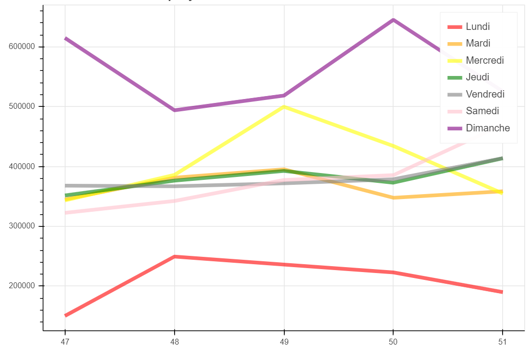
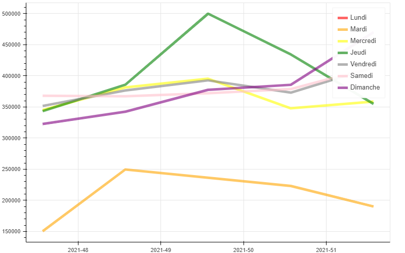
但是我想在x轴的图例中包括年份,就像这张图片:

当我试图通过字符串值更改索引值(47、48. 51)时,我有一个空白图。对于多行图表,可以在x轴中显示字符串标签值吗?
这是我的密码:
import pandas as pd
from bokeh.plotting import figure, show, output_file
from bokeh.models import ColumnDataSource
output_file('temp.html')

data = pd.read_csv("data.csv")
data.index = ['2021-51', '2021-52', '2022-1', '2022-2', '2022-2']

cpu_values_daily = data.values.T.tolist()

weeks = []
for i in range(0,len(data.columns)):
    weeks.append(data.index)

df = {'semaine': weeks,
      'jour': ['Lundi', 'Mardi', 'Mercredi', 'Jeudi', 'Vendredi', 'Samedi', 'Dimanche'],
      'color': ['red', 'orange', 'yellow', 'green', 'grey', 'pink', 'purple'],
      'HCPU': cpu_values_daily}

source = ColumnDataSource(df)

p = figure(width=800, height=500)
p.multi_line(xs='semaine', ys='HCPU', legend='jour', color='color',
             line_width=5, line_alpha=0.6, hover_line_alpha=1.0,
             muted_color='color', muted_alpha=0.2,
             source=source)
p.xaxis.visible = False
p.left[0].formatter.use_scientific = False
show(p)
我的档案"data.csv":
startdate_dayweek;1;2;3;4;5;6;7
47;150290;345005;343329;351631;368029;322604;615009
48;249414;381473;385862;376488;367117;342397;494052
49;236236;395367;499916;392677;372029;377518;518521
50;223065;347776;434387;372996;378691;385578;645206
51;190055;358690;354985;413861;414002;470053;525458回答 1
Stack Overflow用户
回答已采纳
发布于 2022-01-27 11:40:19
有两种选择,即如何实现这个目标:
p.xaxis.major_label_overrides使用
这是非常基本的。您只需定义一本带有位置和标签的字典。在您的示例中,这可能是:
from io import StringIO
import pandas as pd

from bokeh.plotting import figure, show, output_notebook
from bokeh.models import ColumnDataSource
output_notebook()

data_csv = """startdate_dayweek;1;2;3;4;5;6;7
47;150290;345005;343329;351631;368029;322604;615009
48;249414;381473;385862;376488;367117;342397;494052
49;236236;395367;499916;392677;372029;377518;518521
50;223065;347776;434387;372996;378691;385578;645206
51;190055;358690;354985;413861;414002;470053;525458
"""
data = pd.read_csv(StringIO(data_csv), sep=';')
startdate_dayweek = '2021-' + data.startdate_dayweek.astype(str)
data.drop('startdate_dayweek', axis=1, inplace=True)

df = {'semaine': [data.index]*len(data.columns),
      'jour': ['Lundi', 'Mardi', 'Mercredi', 'Jeudi', 'Vendredi', 'Samedi', 'Dimanche'],
      'color': ['red', 'orange', 'yellow', 'green', 'grey', 'pink', 'purple'],
      'HCPU': data.values.T}

source = ColumnDataSource(df)
p = figure(width=800, height=500)
p.multi_line(xs='semaine', ys='HCPU', legend_group='jour', color='color',
             line_width=5, line_alpha=0.6, hover_line_alpha=1.0,
             muted_color='color', muted_alpha=0.2,
             source=source)
p.left[0].formatter.use_scientific = False
p.xaxis.major_label_overrides = {i: val for i, val in enumerate(startdate_dayweek)}
show(p)- 使用
p = figure(x_axis_type='datetime')
这是更干净的,因为您正在处理日期,bokeh确实支持日期。首先将索引转换为datetime对象,然后使用%Y-%W-%w作为解决方案。here解释了为什么我需要这个。然后定义您想要的格式化程序,在您的例子中是%Y-%W。在您的示例中,这可能是:
from io import StringIO
import pandas as pd

from bokeh.plotting import figure, show, output_notebook
from bokeh.models import ColumnDataSource, DatetimeTickFormatter
output_notebook()

data_csv = """startdate_dayweek;1;2;3;4;5;6;7
47;150290;345005;343329;351631;368029;322604;615009
48;249414;381473;385862;376488;367117;342397;494052
49;236236;395367;499916;392677;372029;377518;518521
50;223065;347776;434387;372996;378691;385578;645206
51;190055;358690;354985;413861;414002;470053;525458
"""
data = pd.read_csv(StringIO(data_csv), sep=';')
data.startdate_dayweek = '2021-' + data.startdate_dayweek.astype(str) + '-0'
data.index = pd.to_datetime(data.startdate_dayweek, format='%Y-%W-%w')
data.drop('startdate_dayweek', axis=1, inplace=True)

df = {'semaine': [data.index]*len(data.columns),
      'jour': ['Lundi', 'Mardi', 'Mercredi', 'Jeudi', 'Vendredi', 'Samedi', 'Dimanche'],
      'color': ['red', 'orange', 'yellow', 'green', 'grey', 'pink', 'purple'],
      'HCPU': data.values.T}

source = ColumnDataSource(df)
p = figure(width=800, height=500, x_axis_type='datetime')
p.multi_line(xs='semaine', ys='HCPU', legend_group='jour', color='color',
             line_width=5, line_alpha=0.6, hover_line_alpha=1.0,
             muted_color='color', muted_alpha=0.2,
             source=source)
p.left[0].formatter.use_scientific = False
p.xaxis.formatter.days = ['%Y-%W']
show(p)
两次poutput看起来都是这样的:
页面原文内容由Stack Overflow提供。腾讯云小微IT领域专用引擎提供翻译支持
原文链接:
https://stackoverflow.com/questions/70877117
复制相关文章
相似问题
腾讯云开发者

Copyright © 2013 - 2026 Tencent Cloud. All Rights Reserved. 腾讯云 版权所有
深圳市腾讯计算机系统有限公司 ICP备案/许可证号:粤B2-20090059 ![]() 粤公网安备44030502008569号
粤公网安备44030502008569号
腾讯云计算(北京)有限责任公司 京ICP证150476号 | 京ICP备11018762号