
用Python从CSV中绘制纬度、经度、海拔和EMF数据
用Python从CSV中绘制纬度、经度、海拔和EMF数据
提问于 2022-01-26 20:00:55
我试图从CSV文件中绘制大量的纬度、经度、海拔和EMF值。CSV文件如下所示
dat,latitude,longitude,EMF,Elevation
1/20/2022 7:18:17,59.39556688,18.12773272,0,18.17260262
1/20/2022 7:18:18,59.39556685,18.12773267,0,18.17260262
1/20/2022 7:18:19,59.39556684,18.12773265,0,18.17260262
1/20/2022 7:18:20,59.39556693,18.1277326,4.1,18.17260262
1/20/2022 7:18:21,59.39556698,18.12773191,4,18.17260262
1/20/2022 7:18:22,59.39556714,18.1277315,4.1,18.17260262
1/20/2022 7:18:23,59.39556728,18.12773191,4.1,18.17260262
1/20/2022 7:18:24,59.39556718,18.12773088,4,18.17260262
1/20/2022 7:18:25,59.39556755,18.12773013,4.1,18.17260262
1/20/2022 7:18:26,59.39556755,18.1277296,131,18.17260262
1/20/2022 7:18:27,59.39556729,18.12772922,125.9,18.17260262
1/20/2022 7:18:28,59.39556682,18.1277278,9,18.17260262
1/20/2022 7:18:29,59.39556684,18.1277263,4.1,18.17260262
我想根据EMF值用不同的颜色来表示它们。
我的代码是
from mpl_toolkits.mplot3d import Axes3D
import matplotlib.pyplot as plt
import pandas

points = pandas.read_csv('data.csv')


fig = plt.figure()
ax = fig.add_subplot(111, projection='3d')


latitude = points['latitude'].values
longitude = points['longitude'].values
EMF = points['EMF'].values

plt.ticklabel_format(useOffset=False)

ax.scatter(latitude, longitude, EMF, c='r', marker='o')

plt.show()
我怎么能这么做?
回答 1
Stack Overflow用户
发布于 2022-01-26 20:36:00
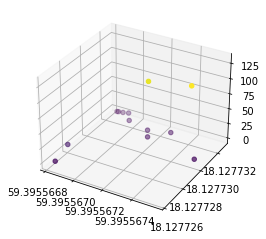
编辑:根据T先生的评论,您可以将EMF插入到c中
import pandas as pd
from io import StringIO
from mpl_toolkits.mplot3d import Axes3D
import matplotlib.pyplot as plt

s = """1/20/2022 7:18:17,59.39556688,18.12773272,0,18.17260262
1/20/2022 7:18:18,59.39556685,18.12773267,0,18.17260262
1/20/2022 7:18:19,59.39556684,18.12773265,0,18.17260262
1/20/2022 7:18:20,59.39556693,18.1277326,4.1,18.17260262
1/20/2022 7:18:21,59.39556698,18.12773191,4,18.17260262
1/20/2022 7:18:22,59.39556714,18.1277315,4.1,18.17260262
1/20/2022 7:18:23,59.39556728,18.12773191,4.1,18.17260262
1/20/2022 7:18:24,59.39556718,18.12773088,4,18.17260262
1/20/2022 7:18:25,59.39556755,18.12773013,4.1,18.17260262
1/20/2022 7:18:26,59.39556755,18.1277296,131,18.17260262
1/20/2022 7:18:27,59.39556729,18.12772922,125.9,18.17260262
1/20/2022 7:18:28,59.39556682,18.1277278,9,18.17260262
1/20/2022 7:18:29,59.39556684,18.1277263,4.1,18.17260262"""

df = pd.read_csv(StringIO(s), header=None)
df.columns = pd.Index(['dat','latitude','longitude','EMF','Elevation'])


fig = plt.figure()
ax = fig.add_subplot(111, projection='3d')
plt.ticklabel_format(useOffset=False)

x, y, z = df['latitude'], df['longitude'], df['EMF']
ax.scatter(x, y, z, c=z)


plt.show()
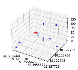
原始答案,无需求助于更时髦的方法,您可以选择几个阈值,并使用熊猫方便索引功能,以绘制不同颜色的不同阈值。
import pandas as pd
from io import StringIO
from mpl_toolkits.mplot3d import Axes3D
import matplotlib.pyplot as plt

s = """1/20/2022 7:18:17,59.39556688,18.12773272,0,18.17260262
1/20/2022 7:18:18,59.39556685,18.12773267,0,18.17260262
1/20/2022 7:18:19,59.39556684,18.12773265,0,18.17260262
1/20/2022 7:18:20,59.39556693,18.1277326,4.1,18.17260262
1/20/2022 7:18:21,59.39556698,18.12773191,4,18.17260262
1/20/2022 7:18:22,59.39556714,18.1277315,4.1,18.17260262
1/20/2022 7:18:23,59.39556728,18.12773191,4.1,18.17260262
1/20/2022 7:18:24,59.39556718,18.12773088,4,18.17260262
1/20/2022 7:18:25,59.39556755,18.12773013,4.1,18.17260262
1/20/2022 7:18:26,59.39556755,18.1277296,131,18.17260262
1/20/2022 7:18:27,59.39556729,18.12772922,125.9,18.17260262
1/20/2022 7:18:28,59.39556682,18.1277278,9,18.17260262
1/20/2022 7:18:29,59.39556684,18.1277263,4.1,18.17260262"""

df = pd.read_csv(StringIO(s), header=None)
df.columns = pd.Index(['dat','latitude','longitude','EMF','Elevation'])


fig = plt.figure()
ax = fig.add_subplot(111, projection='3d')
plt.ticklabel_format(useOffset=False)

below = df[df['EMF'] < 2]
x, y, z = below['latitude'], below['longitude'], below['EMF']
ax.scatter(x, y, z, c='r')

above = df[df['EMF'] >= 2]
x, y, z = above['latitude'], above['longitude'], above['EMF']
ax.scatter(x, y, z, c='b')

plt.show()
页面原文内容由Stack Overflow提供。腾讯云小微IT领域专用引擎提供翻译支持
原文链接:
https://stackoverflow.com/questions/70869531
复制相关文章
相似问题
腾讯云开发者

Copyright © 2013 - 2026 Tencent Cloud. All Rights Reserved. 腾讯云 版权所有
深圳市腾讯计算机系统有限公司 ICP备案/许可证号:粤B2-20090059 ![]() 粤公网安备44030502008569号
粤公网安备44030502008569号
腾讯云计算(北京)有限责任公司 京ICP证150476号 | 京ICP备11018762号