
如何生成协变量调整的cox生存/风险函数?
回答 2
Stack Overflow用户
发布于 2022-05-09 09:16:24
虽然是正确的,但我相信Dion的答案中所描述的方法并不是通常感兴趣的方法。通常,研究人员感兴趣的是对一个变量的因果效应进行可视化调整。简单地显示单个协变量组合的预测生存曲线并不能真正做到这一点。我建议阅读更复杂的调整后的生存曲线。例如,请参见https://arxiv.org/abs/2203.10002。
这些类型的曲线可以在R中使用adjustedCurves包:https://github.com/RobinDenz1/adjustedCurves计算
在您的示例中,可以使用以下代码:
library(survival)
library(devtools)

# install adjustedCurves from github, load it
devtools::install_github("/RobinDenz1/adjustedCurves")
library(adjustedCurves)

# "event" needs to be binary
lung$status <- lung$status - 1

# "variable" needs to be a factor
lung$ph.ecog <- factor(lung$ph.ecog)

fit <- coxph(Surv(time, status) ~  ph.ecog + age + sex, data=lung,
             x=TRUE)

# calculate and plot curves
adj <- adjustedsurv(data=lung, variable="ph.ecog", ev_time="time",
                    event="status", method="direct",
                    outcome_model=fit, conf_int=TRUE)
plot(adj)
产生下列产出:
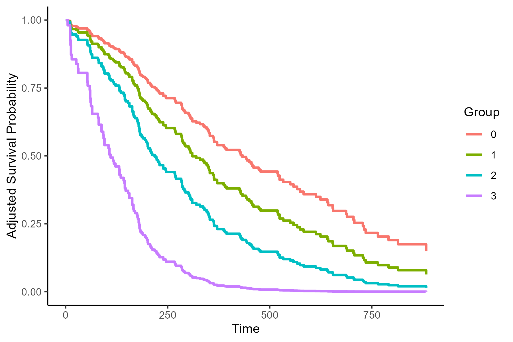
根据age和sex的作用,调整这些存活曲线。有关此调整如何工作的更多信息,可以在adjustedCurves包的文档或我前面引用的文章中找到。
Stack Overflow用户
发布于 2022-01-20 11:14:41
您希望从Cox模型中获得某些协变量感兴趣值的生存概率,同时对其他协变量进行调整。然而,由于我们没有对Cox模型中生存时间的分布作任何假设,所以我们不能直接从它得到生存概率。首先,我们必须估计基线风险函数,这通常是用非参数Breslow估计器来完成的。当Cox模型从coxph包中拟合survival时,通过调用survfit()函数就可以得到这样的概率。您可以咨询?survfit.coxph以获得更多信息。
让我们看看如何通过使用lung数据集来做到这一点。
library(survival)

# select covariates of interest
df <- subset(lung, select = c(time, status, age, sex, ph.karno))

# assess whether there are any missing observations
apply(df, 2, \(x) sum(is.na(x))) # 1 in ph.karno

# listwise delete missing observations
df <- df[complete.cases(df), ]

# Cox model
fit <- coxph(Surv(time, status == 2) ~ age + sex + ph.karno, data = df)

## Note that I ignore the fact that ph.karno does not satisfy the PH assumption.

# specify for which combinations of values of age, sex, and
# ph.karno we want to derive survival probabilies
ND1 <- with(df, expand.grid(
  age = median(age),
  sex = c(1,2),
  ph.karno = median(ph.karno)
))
ND2 <- with(df, expand.grid(
  age = median(age),
  sex = 1, # males
  ph.karno = round(create_intervals(n_groups = 3L))
))

# Obtain the expected survival times
sfit1 <- survfit(fit, newdata = ND1)
sfit2 <- survfit(fit, newdata = ND2)函数create_intervals()后面的代码可以在这个职位中找到。我只是在函数中将speed替换为ph.karno。
输出sfit1包含ND1中指定的协变量组合的预期中位生存期和相应的95%置信区间。
> sfit1
Call: survfit(formula = fit, newdata = ND)

    n events median 0.95LCL 0.95UCL
1 227    164    283     223     329
2 227 164 371 320 524用times方法的summary()参数求出了特定后续时间的生存概率.
# survival probabilities at 200 days of follow-up
summary(sfit1, times = 200)输出再次包含预期存活概率,但现在经过200天的随访,其中survival1对应于第一行ND1的预期生存概率,即中位数ph.karno的中位age的男性和女性患者。
> summary(sfit1, times = 200)
Call: survfit(formula = fit, newdata = ND1)

 time n.risk n.event survival1 survival2
200 144 71 0.625 0.751与这两种概率相关的95%置信限可以从summary()中手工提取。
sum_sfit <- summary(sfit1, times = 200)
sum_sfit <- t(rbind(sum_sfit$surv, sum_sfit$lower, sum_sfit$upper))
colnames(sum_sfit) <- c("S_hat", "2.5 %", "97.5 %")
# ------------------------------------------------------
> sum_sfit
      S_hat     2.5 %    97.5 %
1 0.6250586 0.5541646 0.7050220
2 0.7513961 0.6842830 0.8250914如果您想使用ggplot来描述ND1和ND2中指定的值组合的预期生存概率(以及相应的95%置信区间),我们首先需要使包含所有信息的data.frame以适当的格式。
# function which returns the output from a survfit.object
# in an appropriate format, which can be used in a call
# to ggplot()
df_fun <- \(surv_obj, newdata, factor) {
  len <- length(unique(newdata[[factor]]))
  out <- data.frame(
    time = rep(surv_obj[['time']], times = len),
    n.risk = rep(surv_obj[['n.risk']], times = len),
    n.event = rep(surv_obj[['n.event']], times = len),
    surv = stack(data.frame(surv_obj[['surv']]))[, 'values'],
    upper = stack(data.frame(surv_obj[['upper']]))[, 'values'],
    lower = stack(data.frame(surv_obj[['lower']]))[, 'values']
  )
  out[, 7] <- gl(len, length(surv_obj[['time']]))
  names(out)[7] <- 'factor'
  return(out)
}

# data for the first panel (A)
df_leftPanel <- df_fun(surv_obj = sfit1, newdata = ND1, factor = 'sex')

# data for the second panel (B)
df_rightPanel <- df_fun(surv_obj = sfit2, newdata = ND2, factor = 'ph.karno')现在我们已经定义了我们的data.frame,我们需要定义一个新的函数,它允许我们绘制95%的CIs。我们将其命名为geom_stepribbon。
library(ggplot2)

# Function for geom_stepribbon
geom_stepribbon <- function(
  mapping     = NULL,
  data        = NULL,
  stat        = "identity",
  position    = "identity",
  na.rm       = FALSE,
  show.legend = NA,
  inherit.aes = TRUE, ...) {
  layer(
    data        = data,
    mapping     = mapping,
    stat        = stat,
    geom        = GeomStepribbon,
    position    = position,
    show.legend = show.legend,
    inherit.aes = inherit.aes,
    params      = list(na.rm = na.rm, ... )
  )
}

GeomStepribbon <- ggproto(
  "GeomStepribbon", GeomRibbon,
  extra_params = c("na.rm"),
  draw_group = function(data, panel_scales, coord, na.rm = FALSE) {
    if (na.rm) data <- data[complete.cases(data[c("x", "ymin", "ymax")]), ]
    data   <- rbind(data, data)
    data   <- data[order(data$x), ]
    data$x <- c(data$x[2:nrow(data)], NA)
    data   <- data[complete.cases(data["x"]), ]
    GeomRibbon$draw_group(data, panel_scales, coord, na.rm = FALSE)
  }
)最后,我们可以绘制出ND1和ND2的预期生存概率。
yl <- 'Expected Survival probability\n'
xl <- '\nTime (days)'

# left panel
my_colours <- c('blue4', 'darkorange')
adj_colour <- \(x) adjustcolor(x, alpha.f = 0.2)
my_colours <- c(
  my_colours, adj_colour(my_colours[1]), adj_colour(my_colours[2])
)
left_panel <- ggplot(df_leftPanel,
                     aes(x = time, colour = factor, fill = factor)) +
  geom_step(aes(y = surv), size = 0.8) +
  geom_stepribbon(aes(ymin = lower, ymax = upper), colour = NA) +
  scale_colour_manual(name = 'Sex',
                      values = c('1' = my_colours[1],
                                 '2' = my_colours[2]),
                      labels = c('1' = 'Males',
                                 '2' = 'Females')) +
  scale_fill_manual(name = 'Sex',
                    values = c('1' = my_colours[3],
                               '2' = my_colours[4]),
                    labels = c('1' = 'Males',
                               '2' = 'Females')) +
  ylab(yl) + xlab(xl) +
  theme(axis.text = element_text(size = 12),
        axis.title = element_text(size = 12),
        legend.text = element_text(size = 12),
        legend.title = element_text(size = 12),
        legend.position = 'top')

# right panel
my_colours <- c('blue4', 'darkorange', '#00b0a4')
my_colours <- c(
  my_colours, adj_colour(my_colours[1]),
  adj_colour(my_colours[2]), adj_colour(my_colours[3])
)
right_panel <- ggplot(df_rightPanel,
                      aes(x = time, colour = factor, fill = factor)) +
  geom_step(aes(y = surv), size = 0.8) +
  geom_stepribbon(aes(ymin = lower, ymax = upper), colour = NA) +
  scale_colour_manual(name = 'Ph.karno',
                      values = c('1' = my_colours[1],
                                 '2' = my_colours[2],
                                 '3' = my_colours[3]),
                      labels = c('1' = 'Low',
                                 '2' = 'Middle',
                                 '3' = 'High')) +
  scale_fill_manual(name = 'Ph.karno',
                    values = c('1' = my_colours[4],
                               '2' = my_colours[5],
                               '3' = my_colours[6]),
                    labels = c('1' = 'Low',
                               '2' = 'Middle',
                               '3' = 'High')) +
  ylab(yl) + xlab(xl) +
  theme(axis.text = element_text(size = 12),
        axis.title = element_text(size = 12),
        legend.text = element_text(size = 12),
        legend.title = element_text(size = 12),
        legend.position = 'top')

# composite plot
library(ggpubr)
ggarrange(left_panel, right_panel,
          ncol = 2, nrow = 1,
          labels = c('A', 'B'))
输出
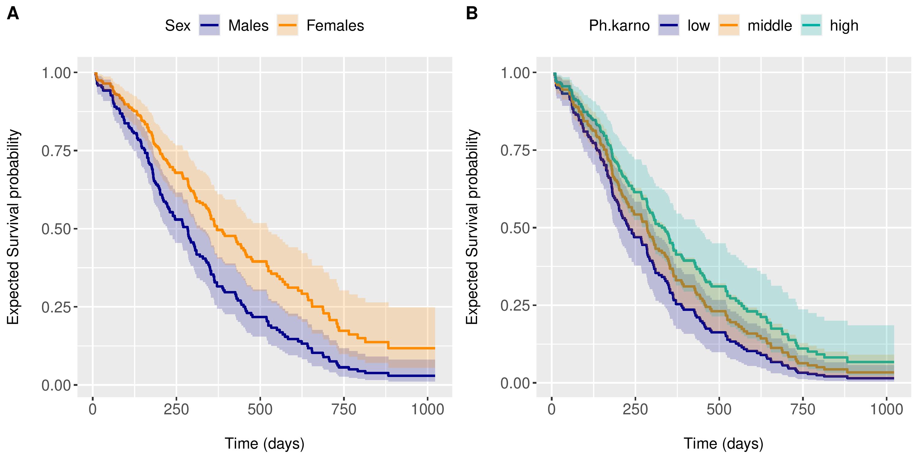
Interpretation
- 小组A显示了中位
age和中位数ph.karno的男性和女性患者的预期生存概率。 - B组显示3例男性中位
age患者的预期生存概率,ph.karnos分别为67 (低)、83 (中)和100 (高)。
这些存活曲线总是满足PH假设,因为它们是由Cox模型导出的。
注意:如果使用R <4.1.0的版本,则使用function(x)而不是\(x)
https://stackoverflow.com/questions/70783093
复制相似问题
腾讯云开发者

Copyright © 2013 - 2026 Tencent Cloud. All Rights Reserved. 腾讯云 版权所有
深圳市腾讯计算机系统有限公司 ICP备案/许可证号:粤B2-20090059 ![]() 粤公网安备44030502008569号
粤公网安备44030502008569号
腾讯云计算(北京)有限责任公司 京ICP证150476号 | 京ICP备11018762号