
实际悬停数据和悬停文本
实际悬停数据和悬停文本
提问于 2022-01-17 07:11:06
我的意见:
df=(pd.DataFrame({'label_color':['white','white','cyan','cyan','cyan','cyan','white','white'],
                  'label_quality':['white','white','red','green','green','red','white','white'],
'label':['foo','foo','foo','foo','foo','foo','foo','foo']}))
我的代码:
df['color_value'] = 1
df['quality_value'] = 1

fig = px.bar(df, y=['color_value','quality_value'],
             x=[1]*len(df),
             orientation='h',
             barmode='group',
             template='plotly_white', hover_data=[df.index.values,df.label])

fig.data[0]['marker']['color'] = df['label_color'].tolist()
fig.data[1]['marker']['color'] = df['label_quality'].tolist()
fig.update_traces(marker_line_color='rgb(8,48,107)')
fig.update_layout(showlegend=False, yaxis_title='foo', xaxis_title='')
fig.show()
我的产出:
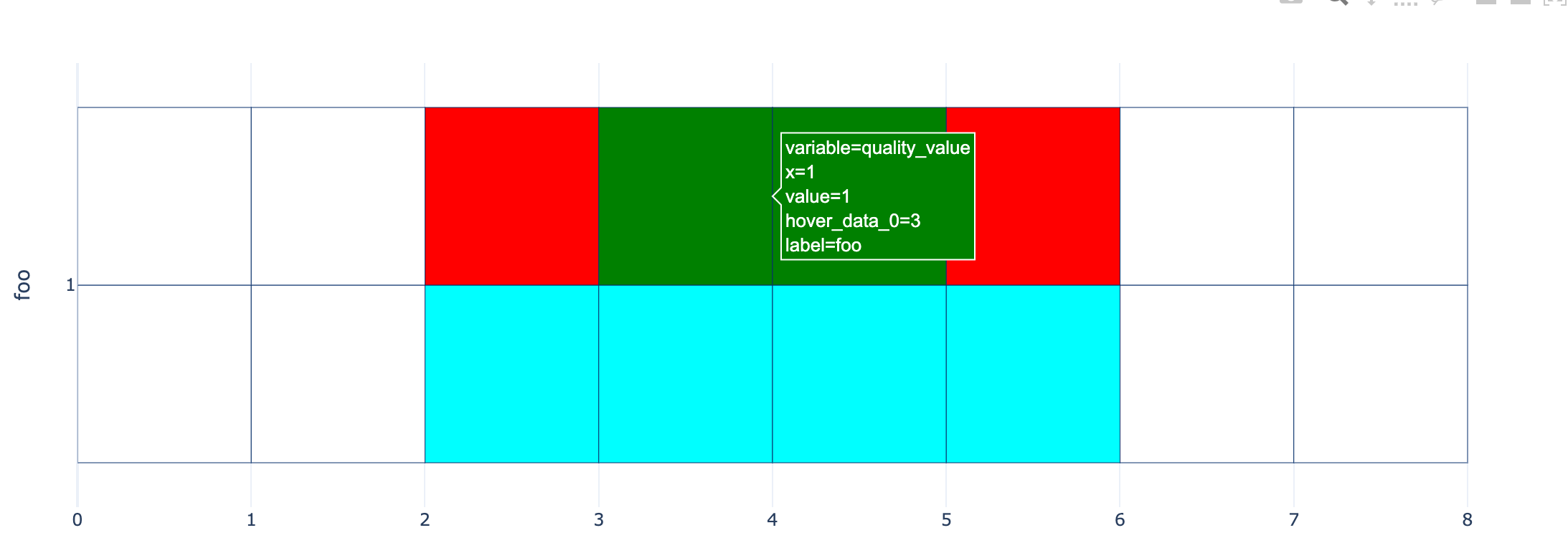
。
如您所见,我在条形图中创建了一些自定义的绘图。现在我试着制造一些“闪光”,但有点困惑。I想要的&expect:我尝试隐藏在弹出(悬停文本)任何x=1,variable=quality_value (即从x和y轴的值),只留下标签从hover_data的自定义名称不像现在(hover_data_0和label)
回答 1
Stack Overflow用户
回答已采纳
发布于 2022-01-17 07:26:27
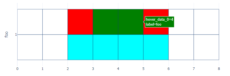
您可以在以下设置中使用fig.update_traces(hovertemplate):
fig.update_traces(hovertemplate = 'hover_data_0=%{customdata[0]}<br>label=%{customdata[1]}<extra></extra>')第1地块:
完整代码:
import plotly.express as px
import plotly.graph_objects as go
import pandas as pd

df=(pd.DataFrame({'label_color':['white','white','cyan','cyan','cyan','cyan','white','white'],
                  'label_quality':['white','white','red','green','green','red','white','white'],
'label':['foo','foo','foo','foo','foo','foo','foo','foo']}))

df['color_value'] = 1
df['quality_value'] = 1

fig = px.bar(df, y=['color_value','quality_value'],
             x=[1]*len(df),
             orientation='h',
             barmode='group',
             template='plotly_white', hover_data=[df.index.values,df.label])

fig.data[0]['marker']['color'] = df['label_color'].tolist()
fig.data[1]['marker']['color'] = df['label_quality'].tolist()
fig.update_traces(marker_line_color='rgb(8,48,107)')
fig.update_layout(showlegend=False, yaxis_title='foo', xaxis_title='')
fig.update_traces(hovertemplate = 'hover_data_0=%{customdata[0]}<br>label=%{customdata[1]}<extra></extra>')
fig.show()页面原文内容由Stack Overflow提供。腾讯云小微IT领域专用引擎提供翻译支持
原文链接:
https://stackoverflow.com/questions/70737668
复制相关文章
相似问题
腾讯云开发者

Copyright © 2013 - 2026 Tencent Cloud. All Rights Reserved. 腾讯云 版权所有
深圳市腾讯计算机系统有限公司 ICP备案/许可证号:粤B2-20090059 ![]() 粤公网安备44030502008569号
粤公网安备44030502008569号
腾讯云计算(北京)有限责任公司 京ICP证150476号 | 京ICP备11018762号