
对2014年塞拉利昂埃博拉疫情的设想
我一直试图使用ggplot2和gganimate来实现“2014年塞拉利昂埃博拉疫情的可视化”,如https://aberdeenstudygroup.github.io/studyGroup/lessons/Visualising%20Spatial%20Data/Visualising_Spatial_Data_in_R/文章所述,使用https://data.humdata.org/dataset/a4816317-a913-4619-b1e9-d89e21c056b4上的shp文件和https://github.com/AberdeenStudyGroup/SG-T14_ggmap_gganimate/blob/master/SG-T14-data/ebola.csv提供的数据集(只是为了简单起见)。
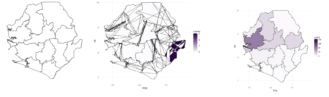
我面临的挑战是第二幅图(ebola_plot_sub),它是通过使用本文中描述的以下代码组合埃博拉数据集和shp信息来获得的。我所得到的情节有许多线条相交,与原作中所呈现的不同。完全扭曲国家地图边距)。
(注意:由于包中的变化,整个数据集的动画部分有点棘手,但可能会忘记它)。
ebola <- read.csv("ebola.csv")

ebola <- gather(ebola,key="date",value="cases",-admin2Name) ##convert to long format

ebola_data <- merge(SL.df,ebola,by="admin2Name")

## Subset the ebola data to plot just one week
ebola_data_sub <- ebola_data[ebola_data$date.y=="X.2014.W51.",]

#ebola_data_sub <- ebola_data[ebola_data$date.x=="X.2014.W51.",] #if the above code fails try this one

## create ggplot object ##
ebola_plot_sub <- ggplot(data = ebola_data_sub, aes(x = long, y = lat, group=group)) +
  geom_polygon(aes(fill = cases),color="black") +
  scale_fill_gradient(low = "#fcfbfd", high = "#2d004b") +
coord_map() + theme_minimal()回答 1
Stack Overflow用户
发布于 2022-01-12 10:31:11
您应该努力提供所有的数据和代码,因此这个示例是完全独立的。在您的示例中,尚不清楚SL.df对象是如何创建的,因此下面的内容可能会浪费时间。
我假设您使用的是sf包,并且找到了一个可以轻松下载的合适的形状文件。我还提供了一个指向ebola.csv文件的链接。希望这能给你足够的时间继续下去。
library(tidyr)
library(rgdal)
library(ggplot2)
library(gganimate)
library(animation)
library(sp)
# Download the 8 files needed from
# https://github.com/AberdeenStudyGroup/SG-T14_ggmap_gganimate/raw/master/SG-T14-data/Sierra_leone/sle_admbnda_adm2_1m_gov_ocha.shp
# Other files apart from the one above are needed
# And change the folder where the download is
SL.df <- st_read('Sierra_leone/sle_admbnda_adm2_1m_gov_ocha.shp')
# Download this file from
# https://raw.githubusercontent.com/AberdeenStudyGroup/SG-T14_ggmap_gganimate/master/SG-T14-data/ebola.csv
# Change the folder for you
ebola <- read.csv('ebola.csv')
ebola_long <- gather(ebola, key='date', value='cases', -admin2Name)
# Merge shape and Ebola data and select one week
ebola_data <- merge(SL.df,ebola_long,by="admin2Name")
ebola_data_sub <- ebola_data[ebola_data$date.y=="X.2014.W51.",]
# Plot - this uses geom_sf
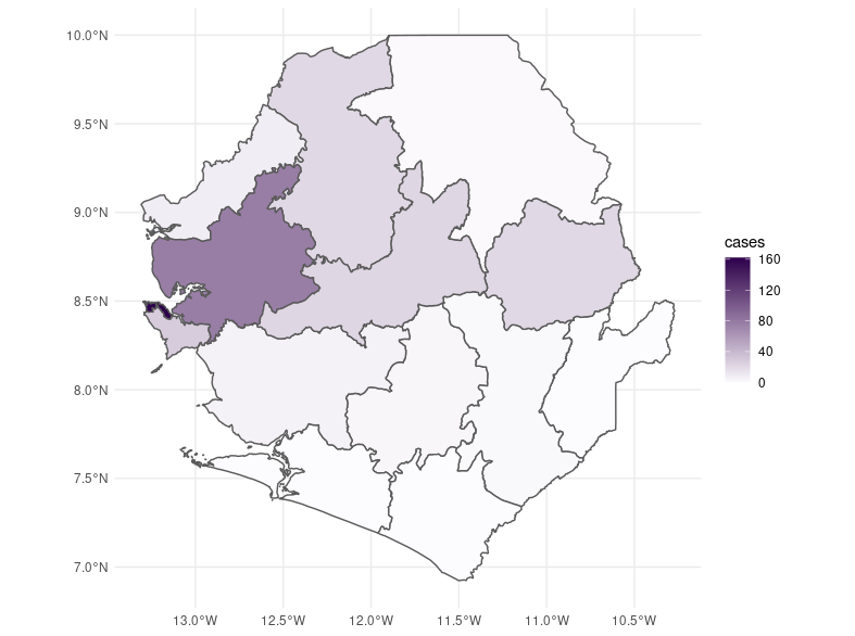
ebola_plot_sub <-
ggplot(ebola_data_sub) +
geom_sf(aes(fill=cases)) +
scale_fill_gradient(low = "#fcfbfd", high = "#2d004b") +
theme_minimal()
ebola_plot_sub
https://stackoverflow.com/questions/70678446
复制相似问题
腾讯云开发者

Copyright © 2013 - 2026 Tencent Cloud. All Rights Reserved. 腾讯云 版权所有
深圳市腾讯计算机系统有限公司 ICP备案/许可证号:粤B2-20090059 ![]() 粤公网安备44030502008569号
粤公网安备44030502008569号
腾讯云计算(北京)有限责任公司 京ICP证150476号 | 京ICP备11018762号