
使用facet包装分组的堆积百分比桶图
使用facet包装分组的堆积百分比桶图
提问于 2021-12-23 09:14:06
我已经绘制了我的数据,但希望将条形图按百分比排列(数据已经达到100%)。
TestData <- tibble(Ethnicity = c(rep("Black",2), rep("Asian",2), rep("White",2)),
                   Stroke = c(0,1,0,1,0,1),
                   Percent = c(0.33, 0.67, 0.50, 0.50, 0.20, 0.80))
所以,我只想要一个可变笔划的条
        ggplot(TestData, aes(x=as.factor(Stroke),
                            y=Percent,
                            label = scales::percent(Percent),
                            fill = as.factor(Stroke) ) ) +
            geom_bar(stat="identity", position="stack") +
            facet_wrap(~ Ethnicity, ncol = 3, strip.position = "bottom")+
            scale_y_continuous(labels = scales::percent)+
            scale_fill_manual(values = c("#1380A1", "#FAAB18")) +
            geom_text(position = position_stack(vjust=0.5), colour="white", size = 3) +
            theme_bw() +
            theme(legend.position="none") +
            theme(axis.text.x = element_text(size=8)) +
            xlab("") +
            ylab("") +
            ggtitle("Stroke among different ethnicities") +
            theme(plot.title = element_text(hjust = 0.5, size=10, face="bold")) +
            coord_flip()
我也尝试过将数据转换成长格式,但我仍然无法让这个情节看起来正确。我哪里出问题了?注:我已经复习了其他的答案,没有一个涉及到我所需要的方面。
library(reshape2)
TestDataMelted <- melt(TestData, id=c("Stroke", "Ethnicity"))回答 2
Stack Overflow用户
回答已采纳
发布于 2021-12-23 09:21:01
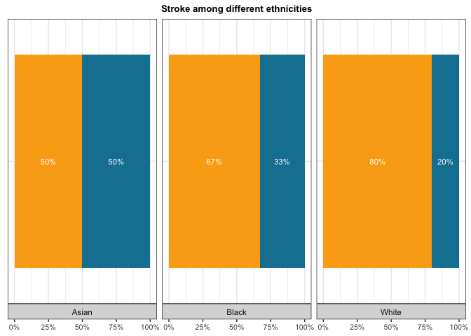
问题是您在x上映射了x。由于您只希望一个堆叠的条形映射为x上的一个常量,例如,factor(1)并使用主题选项来消除y轴文本和勾号:
library(ggplot2)

ggplot(TestData, aes(
  x = factor(1),
  y = Percent,
  label = scales::percent(Percent),
  fill = as.factor(Stroke)
)) +
  geom_col(position = "stack") +
  facet_wrap(~Ethnicity, ncol = 3, strip.position = "bottom") +
  scale_y_continuous(labels = scales::percent) +
  scale_fill_manual(values = c("#1380A1", "#FAAB18")) +
  geom_text(position = position_stack(vjust = 0.5), colour = "white", size = 3) +
  theme_bw() +
  theme(legend.position = "none") +
  theme(axis.text.x = element_text(size = 8),
        axis.text.y = element_blank(),
        axis.ticks.y = element_blank()) +
  labs(x = NULL, y = NULL, title = "Stroke among different ethnicities") +
  theme(plot.title = element_text(hjust = 0.5, size = 10, face = "bold")) +
  coord_flip()
Stack Overflow用户
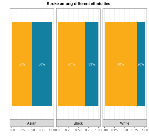
发布于 2021-12-23 09:35:11
下面是一种与亲爱的@stefan略有不同的方法。这里我们使用x=""
library(tidyverse)

TestData %>%
  ggplot(aes(x = "", y= Percent, fill=factor(Stroke), label = scales::percent(Percent))) +
  geom_col(position = position_stack()) +
  facet_wrap(~ Ethnicity, ncol = 3, strip.position = "bottom") +
  scale_fill_manual(values = c("#1380A1", "#FAAB18")) +
  geom_text(position = position_stack(vjust=0.5), colour="white", size = 3) +
  theme_bw() +
  theme(legend.position="none") +
  theme(axis.text.x = element_text(size=8)) +
  xlab("") +
  ylab("") +
  ggtitle("Stroke among different ethnicities") +
  theme(plot.title = element_text(hjust = 0.5, size=10, face="bold")) +
  coord_flip()
页面原文内容由Stack Overflow提供。腾讯云小微IT领域专用引擎提供翻译支持
原文链接:
https://stackoverflow.com/questions/70459907
复制相关文章
相似问题
腾讯云开发者

Copyright © 2013 - 2026 Tencent Cloud. All Rights Reserved. 腾讯云 版权所有
深圳市腾讯计算机系统有限公司 ICP备案/许可证号:粤B2-20090059 ![]() 粤公网安备44030502008569号
粤公网安备44030502008569号
腾讯云计算(北京)有限责任公司 京ICP证150476号 | 京ICP备11018762号