
Plotnine:按列排列的面
Plotnine:按列排列的面
提问于 2021-12-19 09:59:58
我的dataframe MedComp有以下结构:
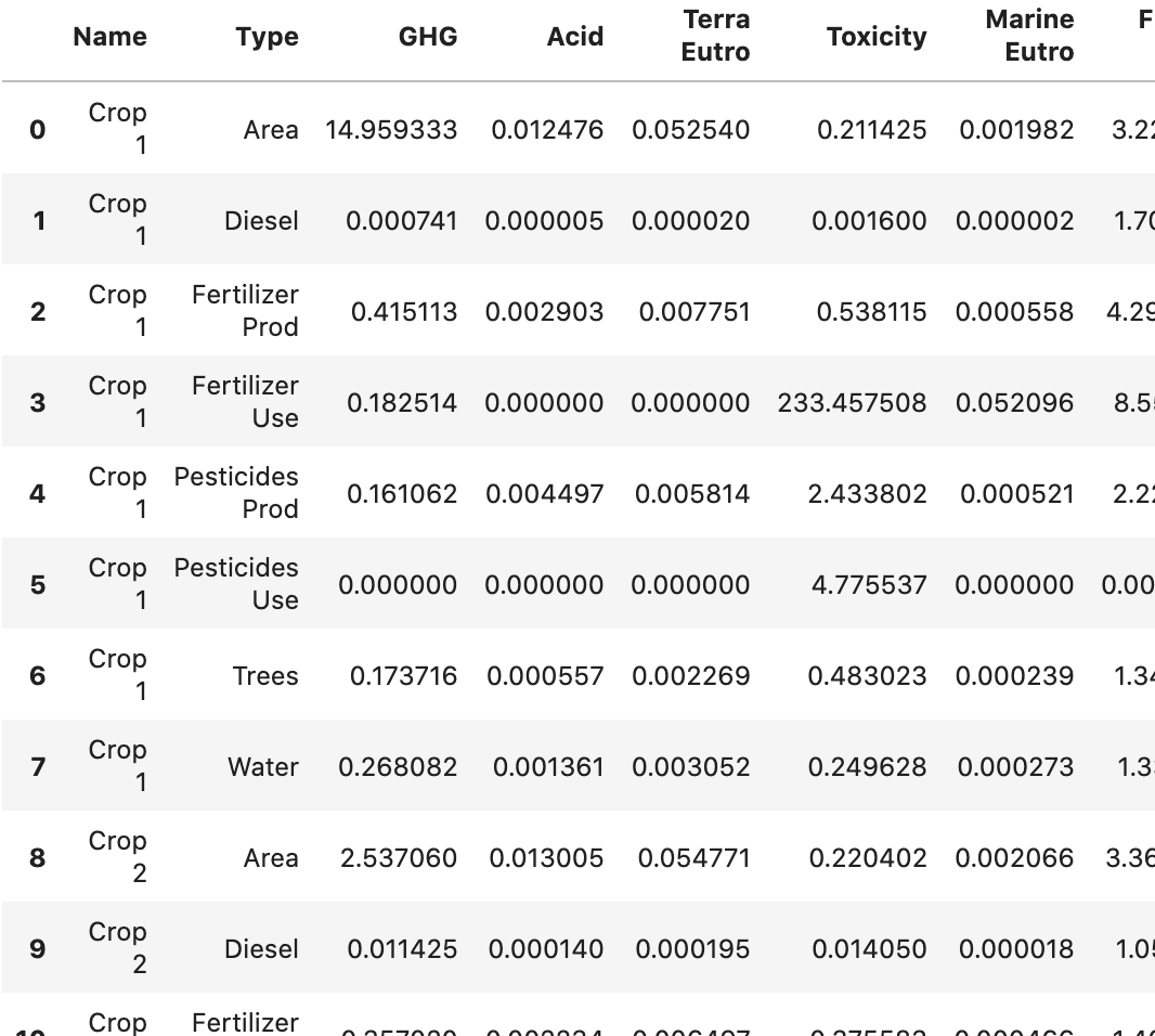
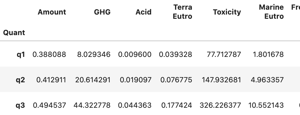
我现在想要做一个堆叠的条形图,每个Name一个(有两个不同的),由Type堆叠(目前使用颜色)。Y轴是其余的列,由于范围不同,每列都有一个单独的图。对于Name中的一种作物,我还想为总数显示一个错误栏,目前在一个名为FarmQuant的单独数据中计算,如下所示:
到目前为止,我只使用了一个循环,从而创建了每个列的一个数字:
Midpoint = [['GHG', 'Total climate change [kg CO2e]'],
            ['Acid', 'Freshwater & ter. acidification [mol H+-Eq]'],
            ['Terra Eutro', 'Terrestrial eutrophication [mol N-Eq]'],
            ['Toxicity', 'Freshwater ecotoxicity [CTU]'],
            ['Marine Eutro', 'Marine eutrophication [kg N-Eq]' ],
           ]

for MPID in range(0, len(Midpoint)):
    print(MPID+1, len(Midpoint), ' ', end='')

    q = (ggplot(Farm_Quant))
         + geom_col(MedComb, aes('Name', Midpoint[MPID][0], fill='Type'))
         + scale_fill_brewer(type='div', palette=2)
         + geom_point(Farm_Quant, aes(x=1, y=Farm_Quant.loc['q2',Midpoint[MPID][0]]))
         + geom_errorbar(aes(x=1,ymin = Farm_Quant.loc['q1',Midpoint[MPID][0]], ymax = Farm_Quant.loc['q3',Midpoint[MPID][0]]))
         + theme_matplotlib()
         + theme(figure_size=(2.2, 4), legend_position = (1.25, 0.5),
            axis_title_x =element_blank(),
            axis_ticks_major_x=element_blank())
         + scale_y_continuous(name=Midpoint[MPID][1])
         + labs(title = Midpoint[MPID][0])
    )

    fig = q.draw()
fig.show()
然而,我想要这样做,使用方面,使所有在一个数字,只有一个传奇。有谁知道怎么用这个吗?
请只提供matplotlib (据我所知不支持面设置)或plot9的示例,因为我已经完成了其他几个情节,并且希望保持相同的外观。另外,这些也是我最熟悉的。
编辑:这里还有一些要处理的测试数据:
MedComb = pd.DataFrame({
    'Name' : ['Crop1', 'Crop1', 'Crop1', 'Crop1', 'Crop2', 'Crop2', 'Crop2', 'Crop2'],
    'Type' : ['Area', 'Diesel', 'Fert', 'Pest', 'Area', 'Diesel', 'Fert', 'Pest'],
    'GHG':   [14.9, 0.0007, 0.145, 0.1611, 2.537, 0.011, 0.1825, 0.115],
    'Acid':  [0.0125, 0.0005, 0.0029, 0.0044, 0.013, 0.00014, 0.0033, 0.0055],
    'Terra Eutro': [0.053, 0.0002, 0.0077, 0.0001, 0.0547, 0.00019, 0.0058, 0.0002]
})

Farm_Quant = pd.DataFrame({
    'Amount': [0.388, 0.4129, 0.1945],
    'GHG':    [8.029, 20.61, 44.32],
    'Acid':   [0.009, 0.019, 0.044],
    'Terra Eutro': [0.039, 0.077, 0.0177]},
    index = ['q1', 'q2', 'q3']
)回答 1
Stack Overflow用户
回答已采纳
发布于 2021-12-28 01:43:53
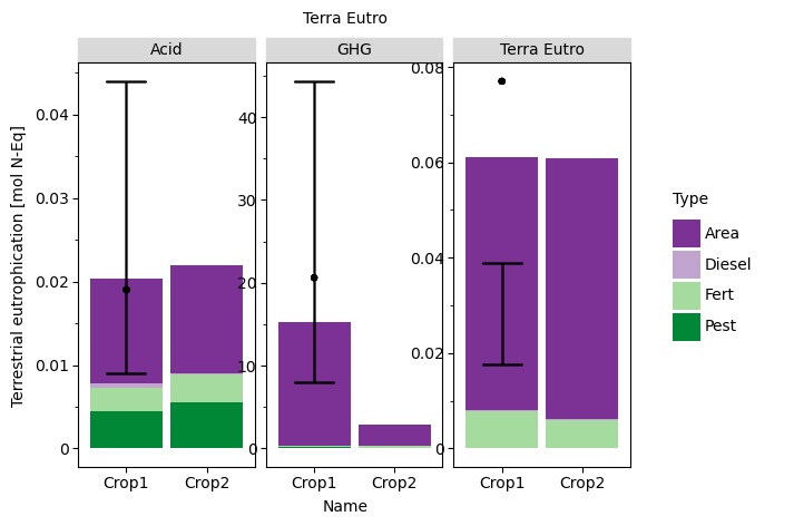
当您的geom美学在他们自己的专栏中时,Plotnine的效果最好,因此您可以通过使用melt来实现这一点。另外,如果您将Farm_Quant数据remove加入到您融化的MedComb数据文件中,那么您只需引用该单个数据并删除for循环即可。
# Sample Data
MedComb = pd.DataFrame({
    'Name' : ['Crop1', 'Crop1', 'Crop1', 'Crop1', 'Crop2', 'Crop2', 'Crop2', 'Crop2'],
    'Type' : ['Area', 'Diesel', 'Fert', 'Pest', 'Area', 'Diesel', 'Fert', 'Pest'],
    'GHG':   [14.9, 0.0007, 0.145, 0.1611, 2.537, 0.011, 0.1825, 0.115],
    'Acid':  [0.0125, 0.0005, 0.0029, 0.0044, 0.013, 0.00014, 0.0033, 0.0055],
    'Terra Eutro': [0.053, 0.0002, 0.0077, 0.0001, 0.0547, 0.00019, 0.0058, 0.0002]
})

Farm_Quant = pd.DataFrame({
    'Amount': [0.388, 0.4129, 0.1945],
    'GHG':    [8.029, 20.61, 44.32],
    'Acid':   [0.009, 0.019, 0.044],
    'Terra Eutro': [0.039, 0.077, 0.0177]},
    index = ['q1', 'q2', 'q3']
)

# melt the MedComb df from wide to long
med_comb_long = pd.melt(MedComb,id_vars=['Name','Type'],
                        var_name='midpoint',value_name='value')

# Basically transpose the Farm_Quant df in two steps to join with med_comb_long
    # convert the Farm_Quant df from wide to long and make the quarters a column
midpoint_long = pd.melt(Farm_Quant.reset_index().drop(columns=['Amount']),
                        id_vars=['index'],var_name='midpoint',value_name='error_bar')
    # make long farm quant df wide again, but with the quarters as the columns and facet names as index
midpoint_reshape = pd.pivot(midpoint_long,index='midpoint',columns='index',
                            values='error_bar')

# Join the data for the bar charts and error bars/points into single df
plot_data = med_comb_long.join(midpoint_reshape,on='midpoint')

# make the plot
q2 = (ggplot(plot_data)
      + geom_col(aes('Name','value',fill='Type'))
      + scale_fill_brewer(type='div', palette=2)
      + facet_wrap('midpoint',scales='free')
      + geom_errorbar(aes(x=1,ymin='q1',ymax='q3'))
      + geom_point(aes(x=1,y='q2'))
      + theme_matplotlib()
         # + theme(figure_size=(2.2, 4), legend_position = (1.25, 0.5),
         #    axis_title_x =element_blank(),
         #    axis_ticks_major_x=element_blank())
         + scale_y_continuous(name=Midpoint[MPID][1])
         + labs(title = Midpoint[MPID][0])
      )
q2
页面原文内容由Stack Overflow提供。腾讯云小微IT领域专用引擎提供翻译支持
原文链接:
https://stackoverflow.com/questions/70410415
复制相关文章
相似问题
腾讯云开发者

Copyright © 2013 - 2026 Tencent Cloud. All Rights Reserved. 腾讯云 版权所有
深圳市腾讯计算机系统有限公司 ICP备案/许可证号:粤B2-20090059 ![]() 粤公网安备44030502008569号
粤公网安备44030502008569号
腾讯云计算(北京)有限责任公司 京ICP证150476号 | 京ICP备11018762号