
迭代子集数据及其在R绘图函数中的应用
迭代子集数据及其在R绘图函数中的应用
提问于 2021-12-14 05:53:45
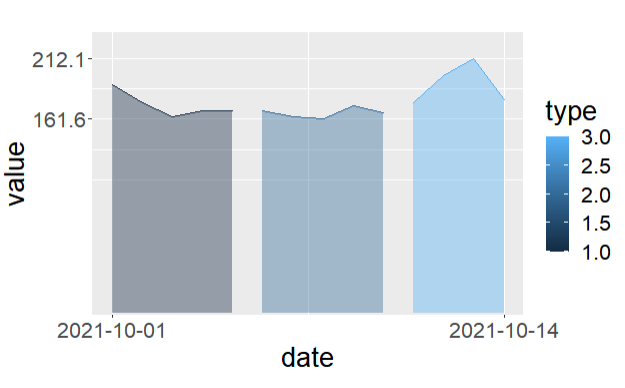
给定一个dataframe df并将其子集sub1 <- df[, c('date', 'price', 'type')]绘制成以下代码:
df <- structure(list(date = c("2021-10-1", "2021-10-2", "2021-10-3",
"2021-10-4", "2021-10-5", "2021-10-6", "2021-10-7", "2021-10-8",
"2021-10-9", "2021-10-10", "2021-10-11", "2021-10-12", "2021-10-13",
"2021-10-14"), value = c(190.3, 174.9, 163.2, 168.4, 168.6,
168.2, 163.5, 161.6, 172.9, 166.5, 175.2, 197.7, 212.1, 177.9
), price = c(191.3, 175.9, 164.2, 169.4, 169.6, 169.2, 164.5,
162.6, 173.9, 167.5, 176.2, 198.7, 213.1, 178.9), quantity = c(192.3,
176.9, 165.2, 170.4, 170.6, 170.2, 165.5, 163.6, 174.9, 168.5,
177.2, 199.7, 214.1, 179.9), type = c(1L, 1L, 1L, 1L, 1L, 2L,
2L, 2L, 2L, 2L, 3L, 3L, 3L, 3L)), class = "data.frame", row.names = c(NA,
-14L))
情节代码:
df$date <- as.Date(df$date)
df$type <- as.factor(df$type)
df %>%
  select(date, price, type) %>%
  mutate(date = as.Date(date)) %>%
  rename(value = price) %>%
  ggplot(aes(x=date, y=value, group=type, color = type, fill = type)) +
  geom_area(alpha=0.4, position = "identity") +
  theme(
    text = element_text(size=20),
    plot.margin=unit(c(1, 1, 1.5, 1.2), 'cm')
  ) +
  scale_y_continuous(breaks = range(df$value),
                 expand = expansion(mult = c(0, 0.1), add = c(1, 0))) +
  scale_x_date(breaks = range(df$date))
ggsave(filename = './{value}.png', device = 'png')
退出:
现在,我希望迭代地生成多个子数据格式,例如(请注意date和type是两个常见的列):
sub1 <- df[, c('date', 'value', 'type')]
sub2 <- df[, c('date', 'price', 'type')]
sub3 <- df[, c('date', 'quantity', 'type')]
...并循环所有数据以绘制代码,最后使用value.png、price.png、.
我怎么能在R里这么做?非常感谢。
EDIT1:
lapply(c("value", "price", "quantity"), function(variable) {
  png(paste0(variable, ".png"))
  ggplot(aes(x=date, y=value, group=type, color = type, fill = type)) +
  geom_area(alpha=0.4, position = "identity") +
  theme(
    text = element_text(size=20),
    plot.margin=unit(c(1, 1, 1.5, 1.2), 'cm')
  ) +
  scale_y_continuous(breaks = range(df$value),
                 expand = expansion(mult = c(0, 0.1), add = c(1, 0))) +
  scale_x_date(breaks = range(df$date))
dev.off()})回答 1
Stack Overflow用户
回答已采纳
发布于 2021-12-14 06:52:21
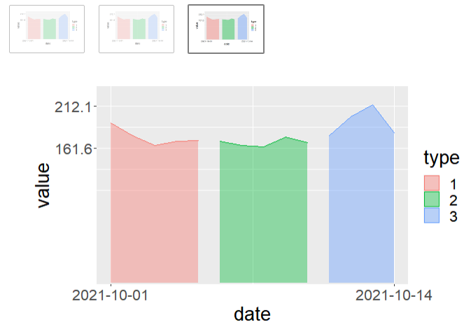
我使用循环,它工作,欢迎分享其他解决方案:
df$date <- as.Date(df$date)
df$type <- as.factor(df$type)

cols <- c('value', 'price', 'quantity')
for (col in cols){
  p <- df %>%
  select(date, col, type) %>%
  mutate(date = as.Date(date)) %>%
  rename(value = col) %>%
  ggplot(aes(x=date, y=value, group=type, color = type, fill = type)) +
  geom_area(alpha=0.4, position = "identity") +
  theme(
    text = element_text(size=20),
    plot.margin=unit(c(1, 1, 1.5, 1.2), 'cm')
  ) +
  scale_y_continuous(breaks = range(df$value),
                 expand = expansion(mult = c(0, 0.1), add = c(1, 0))) +
  scale_x_date(breaks = range(df$date))
  print(p)
}
退出:
页面原文内容由Stack Overflow提供。腾讯云小微IT领域专用引擎提供翻译支持
原文链接:
https://stackoverflow.com/questions/70344350
复制相关文章
相似问题
腾讯云开发者

Copyright © 2013 - 2026 Tencent Cloud. All Rights Reserved. 腾讯云 版权所有
深圳市腾讯计算机系统有限公司 ICP备案/许可证号:粤B2-20090059 ![]() 粤公网安备44030502008569号
粤公网安备44030502008569号
腾讯云计算(北京)有限责任公司 京ICP证150476号 | 京ICP备11018762号