4.控件与布局

4.控件与布局
步步为营DotNet
发布于 2026-06-17 09:14:11
发布于 2026-06-17 09:14:11
| GroupItem | Label | ListBoxItem | ListViewItem | NavigationWindow | | RepeatButton | ScrollViewer | StatusBarItem | ToggleButton | ToolTip | | UserControl | Window | | | |
HeaderedContentControl
- 派生自HeaderedContentControl类,HeaderedContentControl是ContentControl的子类
- 内容属性为Content和Header
- 无论是Content还是Header都只能容纳一个元素
包含控件:
Expander | GroupBox | HeaderedContentControl | TabItem |
|---|
ItemsControl
- 派生自ItemsControl
- 内容属性为Items和ItemsSource
- 每种ItemsControl都有自己的条目容器(Item Container)
Menu | MenuBase | ContextMenu | ComboBox | ItemsControl | ListBox |
|---|---|---|---|---|---|
ListView | TabControl | TreeView | Selector | StatusBar |
该类控件会自动使用相应的条目容器对提交给它的内容进行包装,合法的ItemsControl内容一定是集合,这个集合不会直接个给ItemsControl使用,而是先使用条目容器进行包装,这样的好处是允许程序员向ItemsControl提交各种类型的数据集合。
public class Person {
    public int Id { set; get; }
    public string Name { set; get; }
}
 List<Person> people = new List<Person>()
 {
     new Person(){Id=1,Name="a"},
     new Person(){Id=2,Name="b"},
     new Person(){Id=3,Name="c"},
     new Person(){Id=4,Name="d"},

 };
 //DisplayMebberPath只能显示字符串,更复杂的数据使用DataTemplate
 this.lst.DisplayMemberPath = "Name";//显示数据的那个属性,listBox会调用这个属性的ToString()方法
 this.lst.SelectedValuePath = "Id";//与SelectedValue属性配合使用,作为value的键
 this.lst.ItemsSource = people;
HeaderedItemsControl
- 内容属性为Items、ItemsSource、Header MenuItemTreeViewItemToolBar
Decorator
在UI上起装饰效果
- 派生自Decorator类
- 内容属性为Child
- 只能由单一元素充当内容
ButtonChrome | ClassicBorderDecorator | ListBoxChrome | SystemDropShadowChrome | Border |
|---|---|---|---|---|
InkPresenter | BulletDecorator | Viewbox | AdornerDecorator |
TextBlock和TextBox
- TextBlock只能显示静态文本,但可以使用丰富的印刷格式和排版效果,内容属性为Inlines和Text
- TextBox内容属性为Text
Shape
- 派生自Shape类
- 用于绘制2D图形
- 无内容属性
- 可以使用Fill填充,使用Stroke属性设置边线
Panel
- 派生自Panel抽象类
- 主要功能是控制UI布局
- 内容属性为Children
- 内容可以是多个元素
包括控件:
Canvas | DockPanel | Grid | TabPenel | ToolBarOVerFlowPanel | StackPanel |
|---|---|---|---|---|---|
ToolBarPanel | UniformGrid | VirtualizingPanel | VirtualizingStackPanel | WrapPanel |
UI布局
- Grid:网格,可以自定义行和列
- StackPanel:栈式面板,可将包含的元素在数值或者水平方向排成一条直线,当移除一个元素时,后面的会自动向前移动
- Canvas:画布,以像素为单位的绝对左边定位,类似于Windows Form
- DockPanel:泊靠式面板,类似于Windows Form中控件的Dock属性
- WrapPanel:自动折行面板
Grid
- 行和列可以使用绝对值、相对比例或者自动调整,并可设置最大最小值
- 内部元素可以设置所在的行和列,及跨行跨列
- 可以设置Children对齐方向
Grid适合场景:
- UI布局大框架
- 大量元素需要排成行列
- UI整体尺寸改变,元素需保持长宽比
<Grid>
    <Grid.ColumnDefinitions>
        <ColumnDefinition/>
        <ColumnDefinition/>
        <ColumnDefinition/>
        <ColumnDefinition/>
        <ColumnDefinition/>
    </Grid.ColumnDefinitions>
    <Grid.RowDefinitions>
        <RowDefinition/>
        <RowDefinition/>
        <RowDefinition/>
        <RowDefinition/>
    </Grid.RowDefinitions>
</Grid>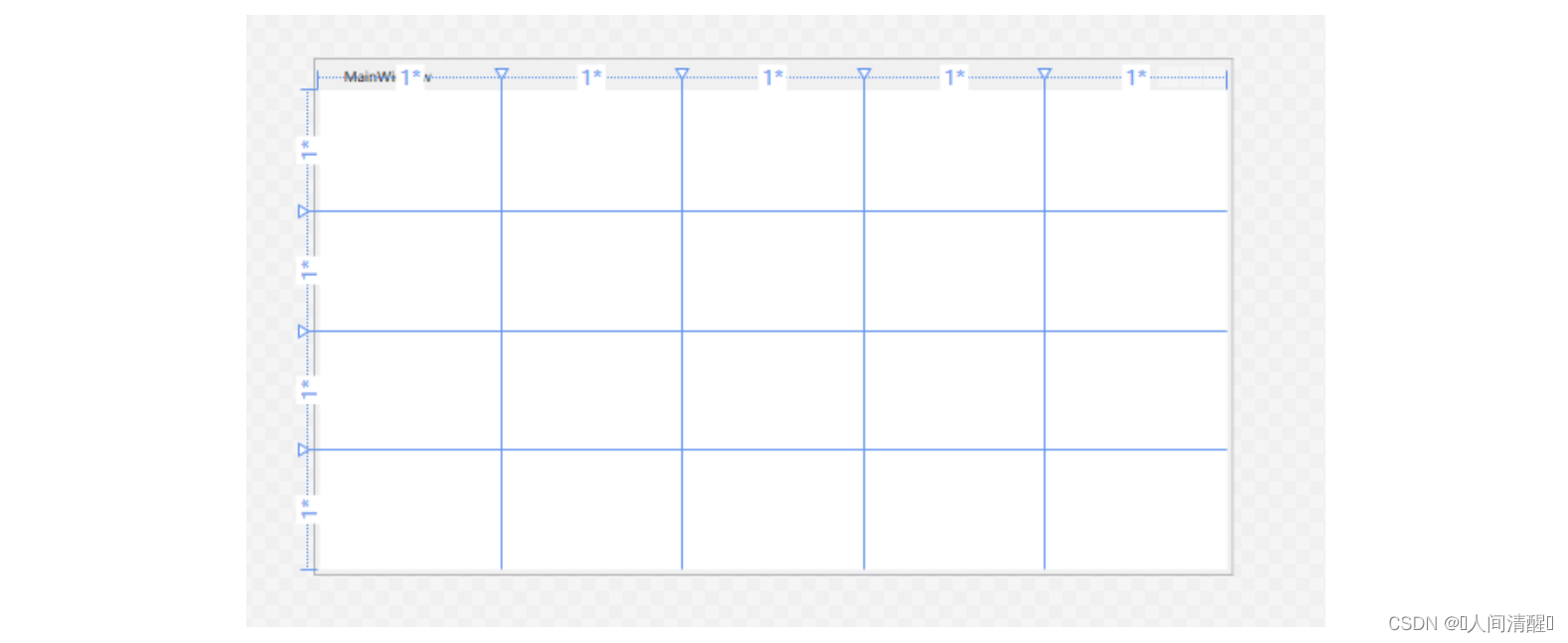
通过代码
this.grid.ColumnDefinitions.Add(new ColumnDefinition());
this.grid.RowDefinitions.Add(new RowDefinition());
长度单位
英文名称 | 中文名称 | 简写 | 换算 |
|---|---|---|---|
Pixel | 像素 | px | 图形基本单位 |
Inch | 英寸 | in | 1in=96px |
Centimeter | 厘米 | cm | 1cm=(96/2.54)px |
Point | 点 | pt | 1pt=(96/72)px |
值类型:
- 绝对值:如30px。属性为double类型,默认是px(可以不写)
<RowDefinition Height="30px"/>
- 比例值:double后面加*。把所有的比例数值的和作为分母,每个比例值作为分子然后乘以未被占用的像素数
<RowDefinition Height="130*"/>
- 自动值:Auto。由控件的高度或者宽度确定
案例:
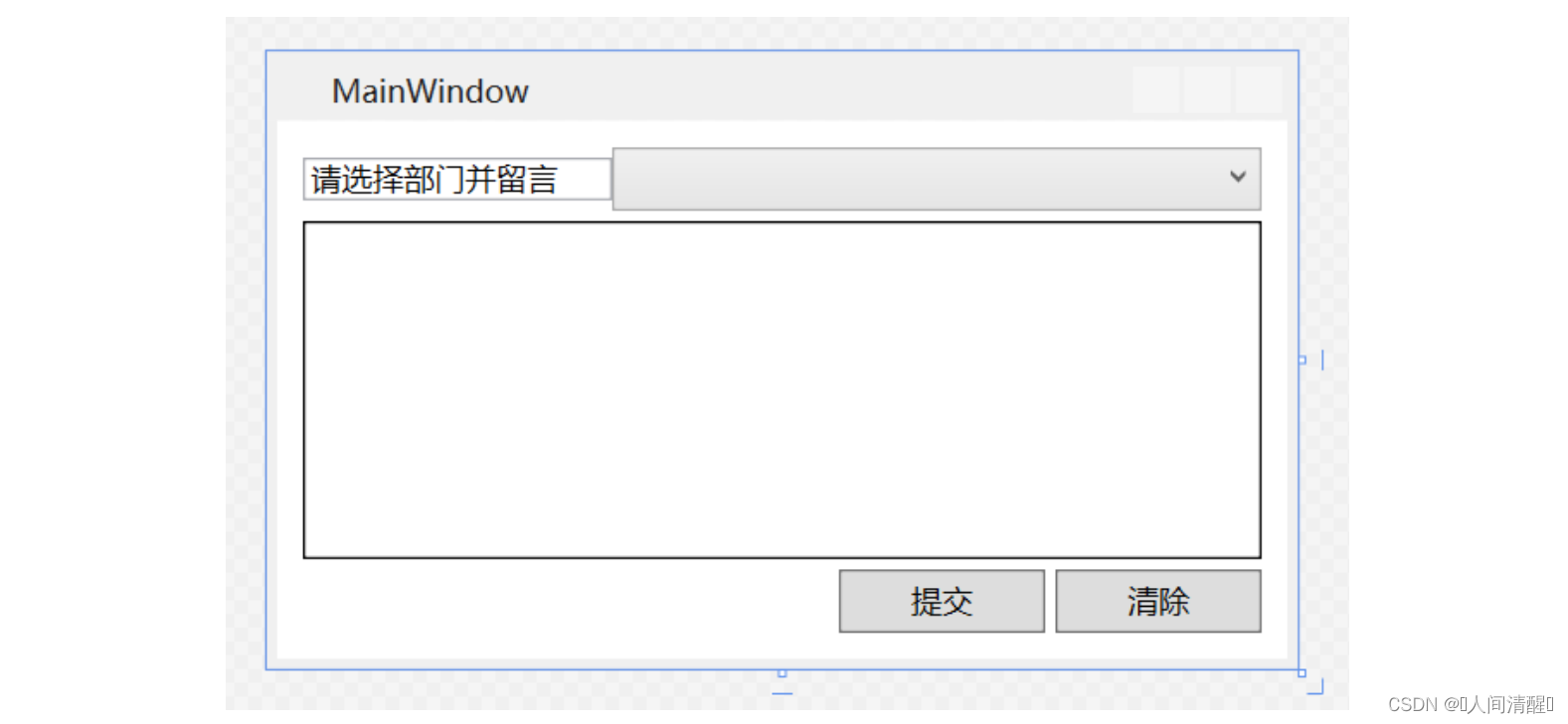
<!--Margin按照顺时针左、上、右、下-->
<Grid Margin="10" x:Name="grid">
    <Grid.ColumnDefinitions>
        <ColumnDefinition Width="Auto" MinWidth="120"/>
        <ColumnDefinition Width="*"/>
        <ColumnDefinition Width="80"/>
        <ColumnDefinition Width="4"/>
        <ColumnDefinition Width="80"/>
    </Grid.ColumnDefinitions>
    <Grid.RowDefinitions>
        <RowDefinition Height="25"/>
        <RowDefinition Height="4"/>
        <RowDefinition Height="*"/>
        <RowDefinition Height="4"/>
        <RowDefinition Height="25"/>
    </Grid.RowDefinitions>
    <!--Grid.xxx等是附加属性-->
    <TextBox Text="请选择部门并留言" Grid.Column="0" Grid.Row="0" VerticalAlignment="Center"/>
    <ComboBox Grid.Column="1" Grid.Row="0" Grid.ColumnSpan="4" />
    <TextBox Grid.Column="0" Grid.Row="2" Grid.ColumnSpan="5" BorderBrush="Black"/>
    <Button Content="提交" Grid.Column="2" Grid.Row="4"/>
    <Button Content="清除" Grid.Column="4" Grid.Row="4"/>
</Grid>- 行列从0开始
- 如果把不同元素放在同一Grid单元格内,则后面的会覆盖前面的
StackPanel
内部元素可以横向和纵向紧凑排列,删除一个元素后面的自动移动到前面
适用场景:
- 同类元素需要紧凑排列(如菜单)
- 移除元素可自动补缺
常用的3个属性
属性名称 | 数据类型 | 可取值 | 描述 |
|---|---|---|---|
Orientation | Orientation枚举 | Horizongtal、Vertial | 横向排列还是纵向排列 |
HorizontalAlignment | HorizontalAlignment枚举 | Left、Center、Right、Stretch | 内部元素水平方向上的对齐方式 |
VerticalAlignment | VerticalAlignment枚举 | Top、Center、Bottom、Stretch | 内部元素竖直方向上的对齐方式 |
Canvas
类似于Winform
使用场景:
- 不会随便改动的布局
- 艺术性较强的布局
- 需要大量横纵左边进行绝对定位的布局
- 依赖于坐标的对话
<Canvas>
    <TextBox Canvas.Left="12" Canvas.Top="20" Width="200"/>
</Canvas>
DockPanel
- 有一个重要属性LastChildFill,默认值为True,即最后一个元素的DockPanel.Dock属性被忽略,填满剩余空间
WrapPanel
内部采用流式布局,使用Orientation属性来控制流延伸的方向,使用HorizontalAlignment和VerticalAlignment两个属性控制内部控件的对齐。 =“20” Width=“200”/>
### DockPanel

+ 有一个重要属性LastChildFill,默认值为True,即最后一个元素的DockPanel.Dock属性被忽略,填满剩余空间

### WrapPanel

内部采用流式布局,使用Orientation属性来控制流延伸的方向,使用HorizontalAlignment和VerticalAlignment两个属性控制内部控件的对齐。
本文参与 腾讯云自媒体同步曝光计划,分享自作者个人站点/博客。
原始发表:2026-06-16,如有侵权请联系 cloudcommunity@tencent.com 删除
目录
腾讯云开发者

Copyright © 2013 - 2026 Tencent Cloud. All Rights Reserved. 腾讯云 版权所有
深圳市腾讯计算机系统有限公司 ICP备案/许可证号:粤B2-20090059  粤公网安备44030502008569号
腾讯云计算(北京)有限责任公司 京ICP证150476号 | 京ICP备11018762号