利用条形图绘制人口金字塔

利用条形图绘制人口金字塔

HsuHeinrich
发布于 2025-07-08 19:39:37
发布于 2025-07-08 19:39:37
利用条形图绘制人口金字塔
import matplotlib.pyplot as plt
import seaborn as sns
import pandas as pd
以下数据如果有需要的同学可关注公众号HsuHeinrich,回复【数据可视化】自动获取~
# 导入数据
df = pd.read_csv("https://raw.githubusercontent.com/selva86/datasets/master/email_campaign_funnel.csv")

df.head()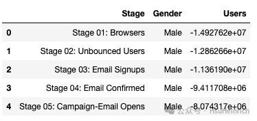
# 布局
fig, ax = plt.subplots(figsize=(4, 8))

# 分组变量
group_col = 'Gender'

# 按阶段排序
order_of_bars = df.Stage.unique()[::-1]

# 为分组别量每个类别分配颜色
colors = [plt.cm.Spectral(i / float(len(df[group_col].unique()) - 1)) for i in range(len(df[group_col].unique()))]

# 遍历为每组每个阶段绘制一个条形图
for color, group in zip(colors, df[group_col].unique()):

    # sns绘制条形图
    sns.barplot(x='Users',
                y='Stage',
                data=df.loc[df[group_col] == group, :],  # 筛选数据
                order=order_of_bars,
                color=color,
                label=group,
                ax=ax,  # 指定轴
               )

# 自定义轴
ax.set_xlabel("Users")
ax.set_ylabel("Stage of Purchase")
ax.set_title("Population Pyramid of the Marketing Funnel", fontsize=22)

# 图例
ax.legend()

plt.show()
参考:Population pyramid of a marketing funnel[1]
共勉~
参考资料
[1]
Population pyramid of a marketing funnel: https://python-graph-gallery.com/web-population-pyramid/
本文参与 腾讯云自媒体同步曝光计划,分享自微信公众号。
原始发表:2025-07-07,如有侵权请联系 cloudcommunity@tencent.com 删除
评论
登录后参与评论
推荐阅读
目录
腾讯云开发者

Copyright © 2013 - 2026 Tencent Cloud. All Rights Reserved. 腾讯云 版权所有
深圳市腾讯计算机系统有限公司 ICP备案/许可证号:粤B2-20090059 ![]() 粤公网安备44030502008569号
粤公网安备44030502008569号
腾讯云计算(北京)有限责任公司 京ICP证150476号 | 京ICP备11018762号